


Cyber Weekend is a very important weekend for ecommerce shops. Shopify store owners collectively made a whopping $6.3 billion USD in sales globally on Cyber Weekend, a 23% increase from 2020 (source). In this post, I’ve collected some important information, resources and best practices for this weekend. Make sure to check out the loom video where I show an example template I designed that uses these best practices. In the video, I also show real Klaviyo customer’s successful Cyber Weekend emails (and explain why they worked well!). Let’s get started!
- First, as always, my list of General Email Design Resources Here (many of the topics I go over in the video can be found here).
- Data driven - Can try AB testing a month or two before cyber weekend and use the winning practices in your cyber weekend emails.
- Ideas for AB testing: Different color CTAs, subject lines, header link bars (using 1 Header linkbar with links in one email, different email just an image of the logo - seeing if the links get clicks, different imagery: lifestyle shots vs just product shots).
- Notes overall from the high performing Cyber Weekend emails:
- Can see that they are short, punchy, usually have a coupon that relates to Cyber Weekend, strong photography/graphics, graphics reflect the coupon/code. Can design those externally, save them as images, upload into the email template through an image block. One or two large buttons. CTAs at the top/middle of email.
- Most subject lines mention the Cyber Weekend deal. Ex: “SUBJECT LINE: Black Friday Sale: Up to 40% Off Fragrance Favorites. PREVIEW TEXT: You Don't Want to Miss This Sale”.
- Very fine to use all image based emails, just add alt text to all image blocks. Can only have one big graphic that’s well designed, and just lead them to click to the website - less is more principle:

- Mobile: same practices - keep it short with high quality images/graphics. Email mobile design help here. Mobile is only 600px - let content vertically stack rather than too much on a horizontal screen because then it can be hard to read. Again, if the email is short and to the point, then email stacking is fine because there’s not much to scroll through.
- Bad design: too long so it starts to gmail clip, having all the CTAs only on the bottom, advertising too many products at once - busy. We see emails with too many links actually get less clicks.
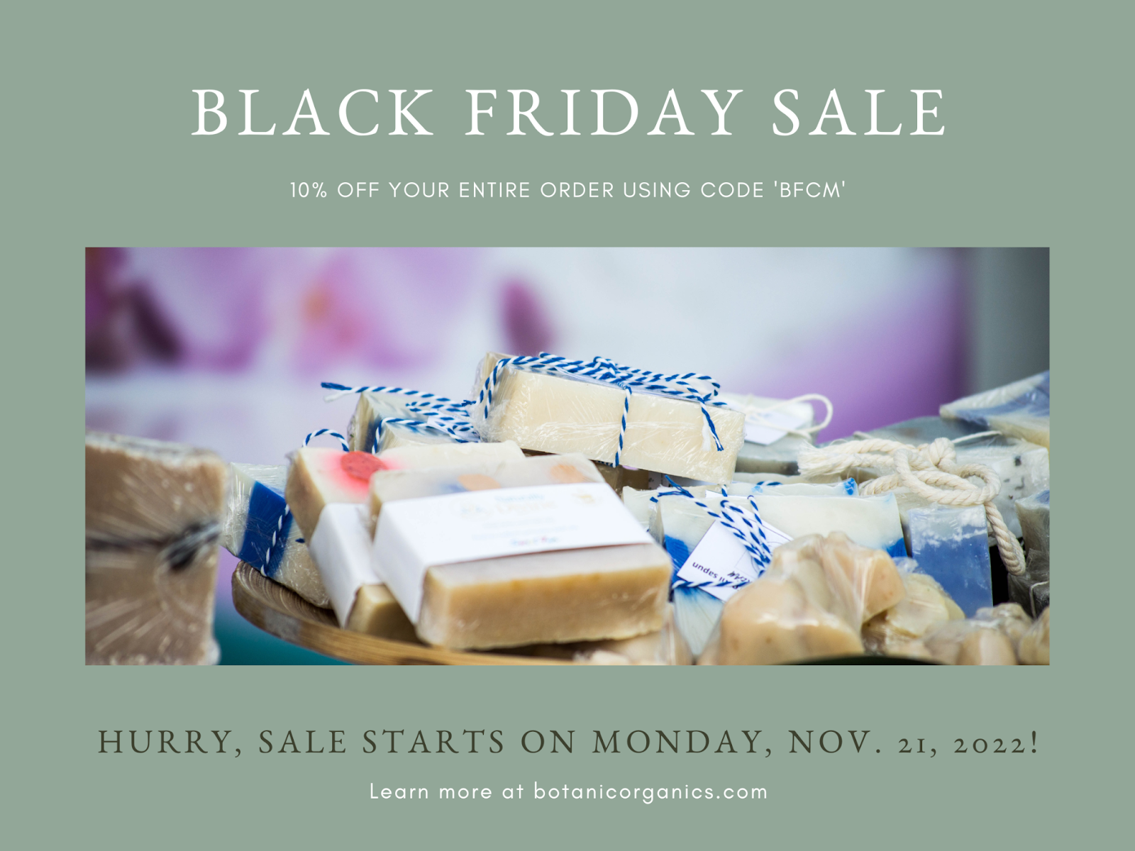
- Example graphic:
I hope these principles and practices help you this Cyber Weekend, happy emailing! 😁