I’m having a strange issue with horizontal rules in email designs. We have a horizontal rule that shows up correctly in desktop, but doesn’t in mobile view.
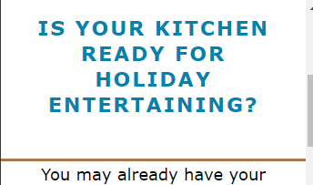
Here is the horizontal rule (dark orange/bronze color) working perfectly in desktop view.
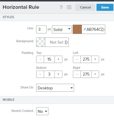
These are the specs of the horizontal rule in desktop.
So I duplicate this horizontal rule exactly as it is but set it to show on Mobile instead...and this is what happens.
It has the exact same specs as its desktop counterpart, but for some reason it stretches across the entire area and nothing changes when I try to tweak the padding.
Is anyone else having the same issue? How do you fix it?
Certain blocks/elements within Klaviyo’s template builder doesn’t support padding for mobile view, which would be causing this sort of behavior. You’ll notice the same behavior when setting an Image Block to only display on Mobile and attempting to adjust it’s padding as well. The content would still be automatically stretched fit the content.
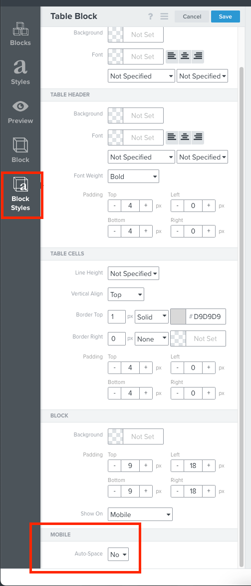
A work around for this however, would be leveraging a Table Block and disabling the Mobile Auto-Spacing setting under the Table Block’s Block Styles. Turning this setting off will allow you to better customize those paddings you would want to implement on the specific block. From my experience, when using a table block to mimic a horizontal rule, it’s easiest to only use one column with a Border Top set with the padding you desire.
Certain blocks/elements within Klaviyo’s template builder doesn’t support padding for mobile view, which would be causing this sort of behavior. You’ll notice the same behavior when setting an Image Block to only display on Mobile and attempting to adjust it’s padding as well. The content would still be automatically stretched fit the content.
A work around for this however, would be leveraging a Table Block and disabling the Mobile Auto-Spacing setting under the Table Block’s Block Styles. Turning this setting off will allow you to better customize those paddings you would want to implement on the specific block. From my experience, when using a table block to mimic a horizontal rule, it’s easiest to only use one column with a Border Top set with the padding you desire.


