Solved

Issue formatting split columns with one image and one text box

  • October 20, 2023
  • 1 reply
  • 269 views

Forum|alt.badge.img+1

Hoping someone has a solution to this issue!

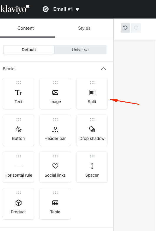
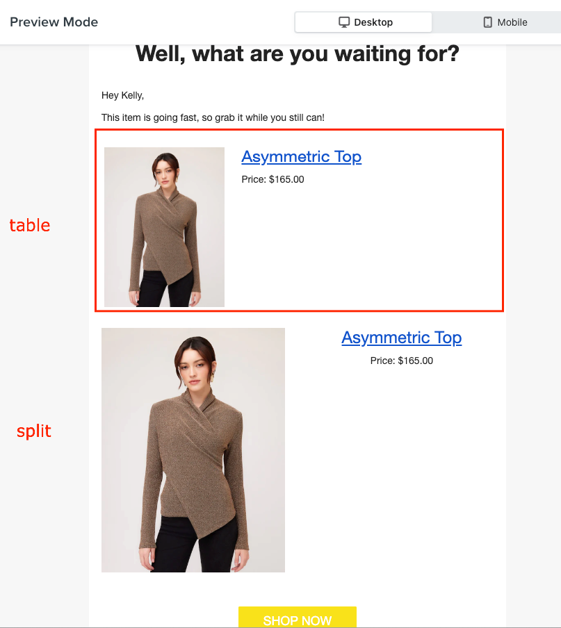
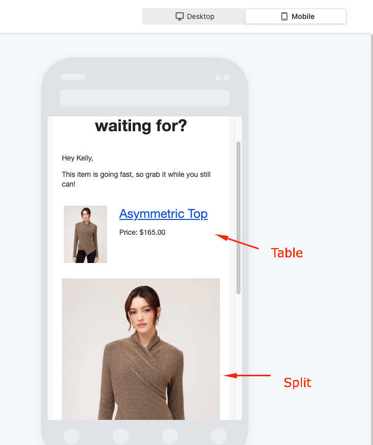
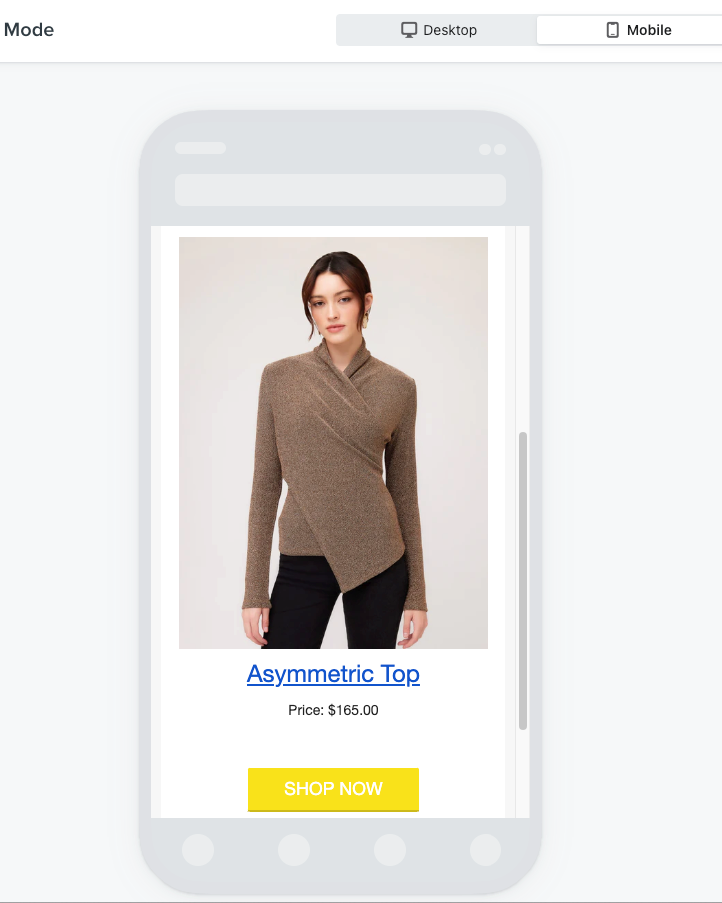
I have created 2 columns on my email - one picture and one text box. The format looks great and they equally fit side by side on the page in desktop view. But when I move to mobile view the image and text can only be stacked (doesn’t look good for this specific email) or the image is small and the text is super long in comparison.

How can i make the image adapt and fill the entire space next to the text?

Really hoping this makes sense without a visual example.

Thanks in advance!

Best answer by ArpitBanjara

hi @CJones 
 

Welcome to Klaviyo Community,

I would suggest using a ‘split’ instead of a ‘table’ for this. This optimises quite well with the mobile version


So to show you the difference between ‘table’ and a ‘split’ please check below screenshots

Desktop Version
 

The same when previewed in Mobile version
Table block

Split block


Additionally it looks better when both image and text are aligned in centre

Does this answer your question. Please let me know if not, and we can dig deeper into this.

Thanks,
Arpit
Linkedin

View original
Did this topic or the replies in the thread help you find an answer to your question?

1 reply

ArpitBanjara
Principal User I
Forum|alt.badge.img+36
  • Principal User I
  • 371 replies
  • Answer
  • October 20, 2023

hi @CJones 
 

Welcome to Klaviyo Community,

I would suggest using a ‘split’ instead of a ‘table’ for this. This optimises quite well with the mobile version


So to show you the difference between ‘table’ and a ‘split’ please check below screenshots

Desktop Version
 

The same when previewed in Mobile version
Table block

Split block


Additionally it looks better when both image and text are aligned in centre

Does this answer your question. Please let me know if not, and we can dig deeper into this.

Thanks,
Arpit
Linkedin