
Bonjour,
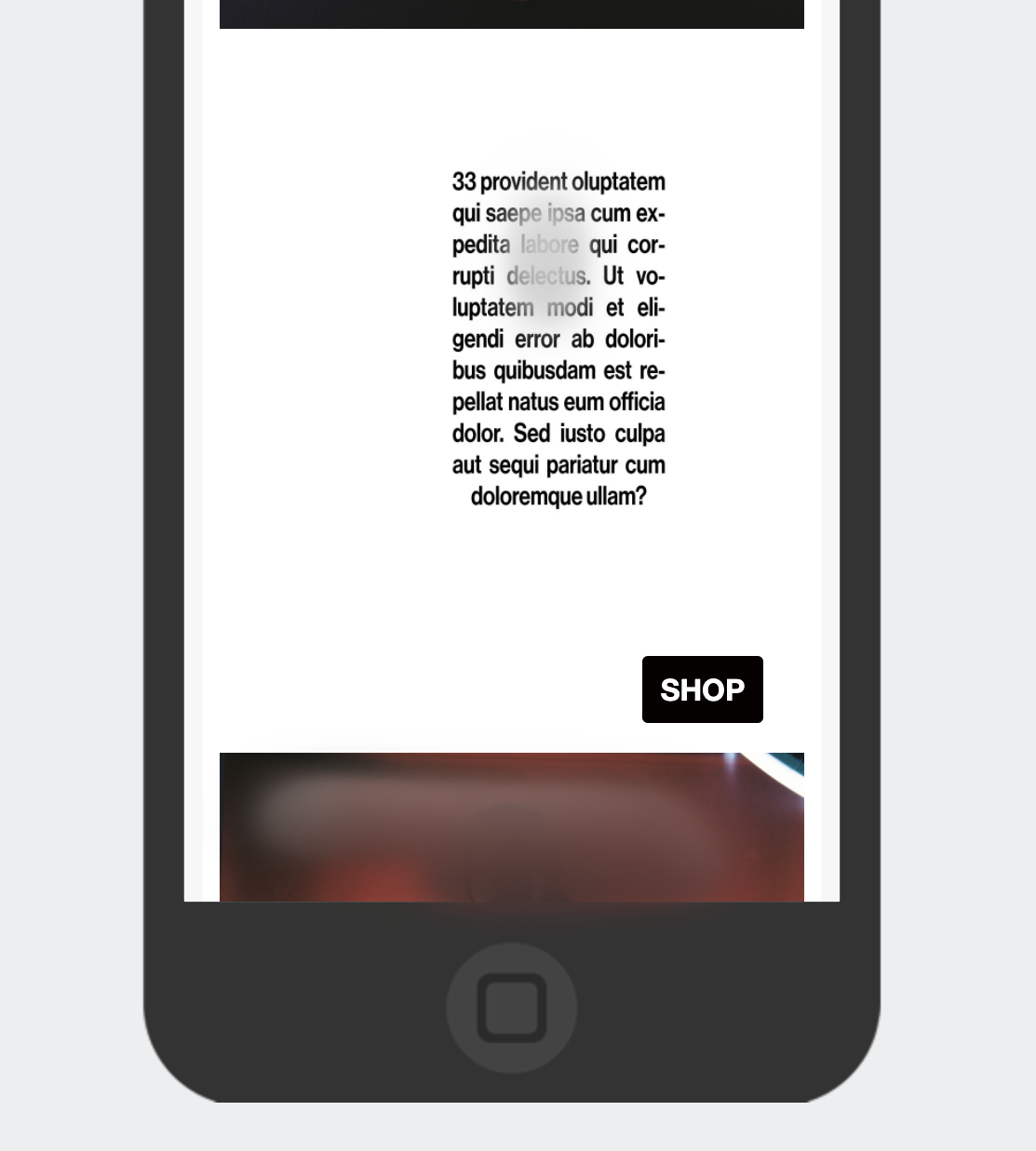
j’ai mis un bloc texte à coté d’une image mais lorsque je passe en mode Phone, elles ne sont plus à coté ! Quel est le le probleme? merci
Alix :)
Best answer by alex.hong
View original +2
+2


Bonjour,
j’ai mis un bloc texte à coté d’une image mais lorsque je passe en mode Phone, elles ne sont plus à coté ! Quel est le le probleme? merci
Alix :)
Best answer by alex.hong
View originalBonjour
First, apologies if this may not be the most accurate support as I am translating your message directly so some things may be off. But I will try my best to offer you the information you need!
I see you are trying to understand why the text and image are not next to each other in mobile correct? They appear side-by-side in desktop and you would like to carry that format over to display on phones?
If you add a "table" instead of individual blocks, you should be able to pick the columns and they should stay there on both mobile and desktop. One way to do this would be to use Split Blocks. You can control the stacking order on mobile for split blocks:

I would also recommend always optimizing your emails for mobile and reviewing your mobile optimization settings for all your templates :)
Please let me know if this was helpful or if you have further questions!
Alex
Enter your E-mail address. We'll send you an e-mail with instructions to reset your password.