


I’m having a strange issue with horizontal rules in email designs. We have a horizontal rule that shows up correctly in desktop, but doesn’t in mobile view.

Here is the horizontal rule (dark orange/bronze color) working perfectly in desktop view.
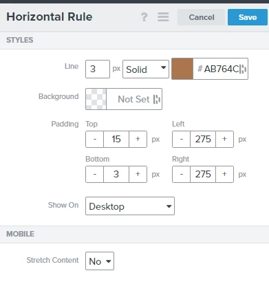
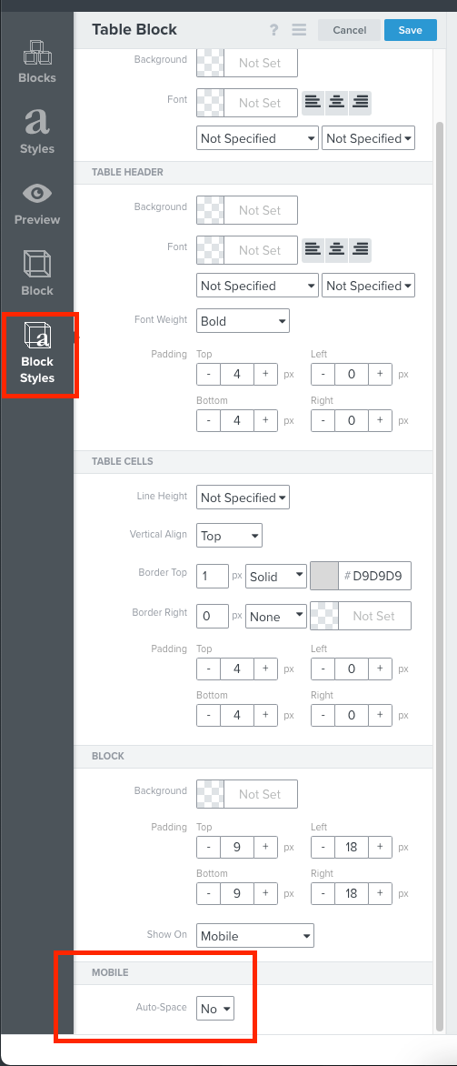
These are the specs of the horizontal rule in desktop.
So I duplicate this horizontal rule exactly as it is but set it to show on Mobile instead...and this is what happens.

It has the exact same specs as its desktop counterpart, but for some reason it stretches across the entire area and nothing changes when I try to tweak the padding.
Is anyone else having the same issue? How do you fix it?
Best answer by David To
View original