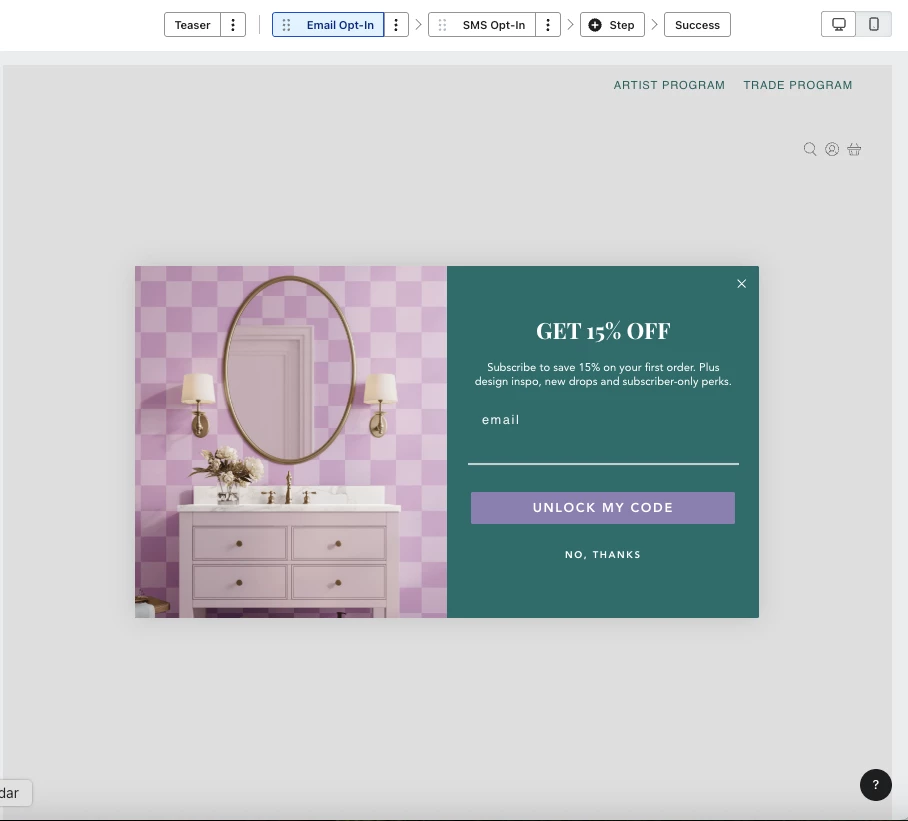
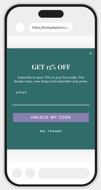
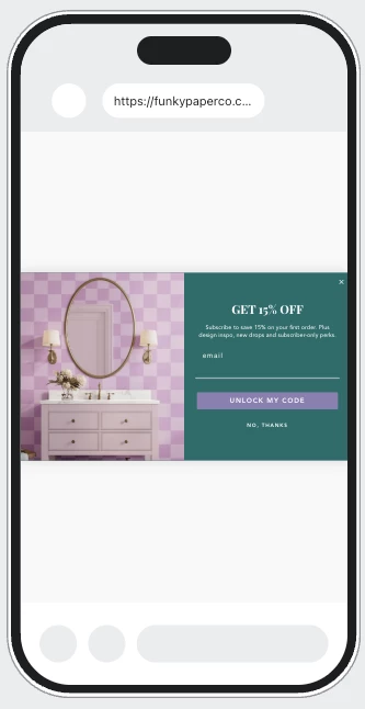
Hello! I have setup a welcome email & SMS popup. I like the way it displays on desktop (with left image) and the ‘email input’ block on the right. However, on mobile it reads small if I keep the left image. And if I make the left image desktop only, the mobile design looks plain.
Ideally, on mobile I’m looking to do: the no side image layout with a background image (and a color overlay at around 90% opacity) without effecting the popup design on desktop -- similar to how it’s done in email templates / campaigns.
Is this possible without creating separate popup forms? I can’t find a way to touch the left side ‘email input’ block (in solid green here) on mobile only. Not sure if there is a feature I’m missing. Tyia!
