So Klaviyo has officially rolled out their new overview Dashboard and removed the green circle charts...
Clearly they seem to think this clean look is better.
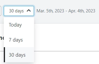
But for the life of me, I don’t know why it’s now limited the filter dates to only today → 7 days → 30 days.
The old overview you could filter by month, 180 days, past year, etc - that was WAY better.
This is so restrictive:

It give us way less control over our data at the high level and literally made it impossible to see the total store revenue and total email revenue + percentages in one view, for custom date range or previous month.
Really bad move.
I seriously hope this is fixed soon...


![[Academy] SMS Strategy Certificate Badge](https://uploads-us-west-2.insided.com/klaviyo-en/attachment/2f867798-26d9-45fd-ada7-3e4271dcb460_thumb.png)