Solved

Mobile display issue with email confirmation form

  • 31 January 2023
  • 5 replies
  • 184 views

Badge +2

Hello,


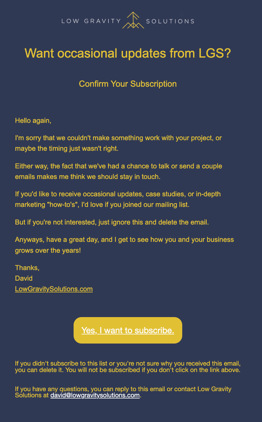
I am having a display issue with the confirm subscription email on mobile. Hoping someone can help. I am receiving the confirmation emails very small on mobile, while the emails look just fine on desktop. The mobile preview in the editor looks fine, like this:


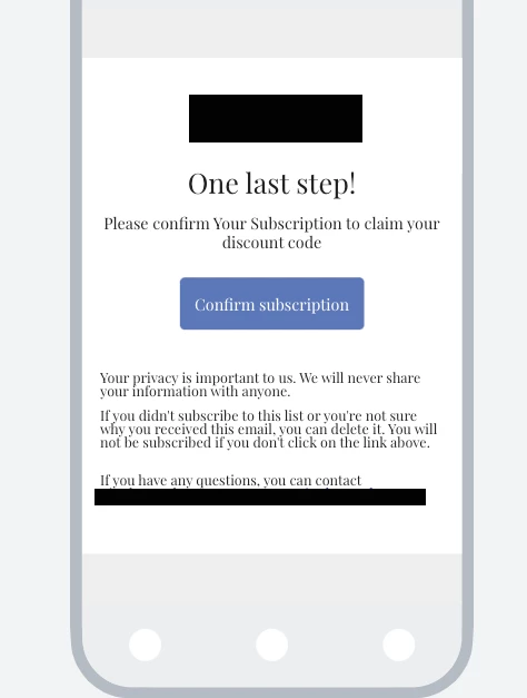
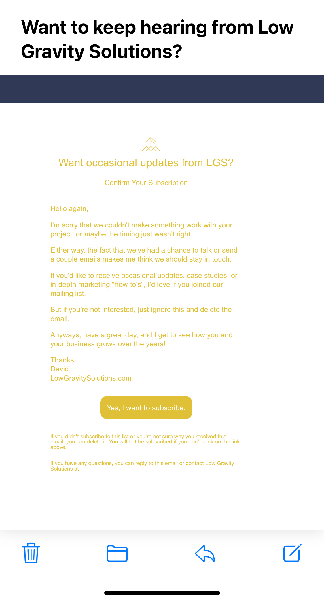
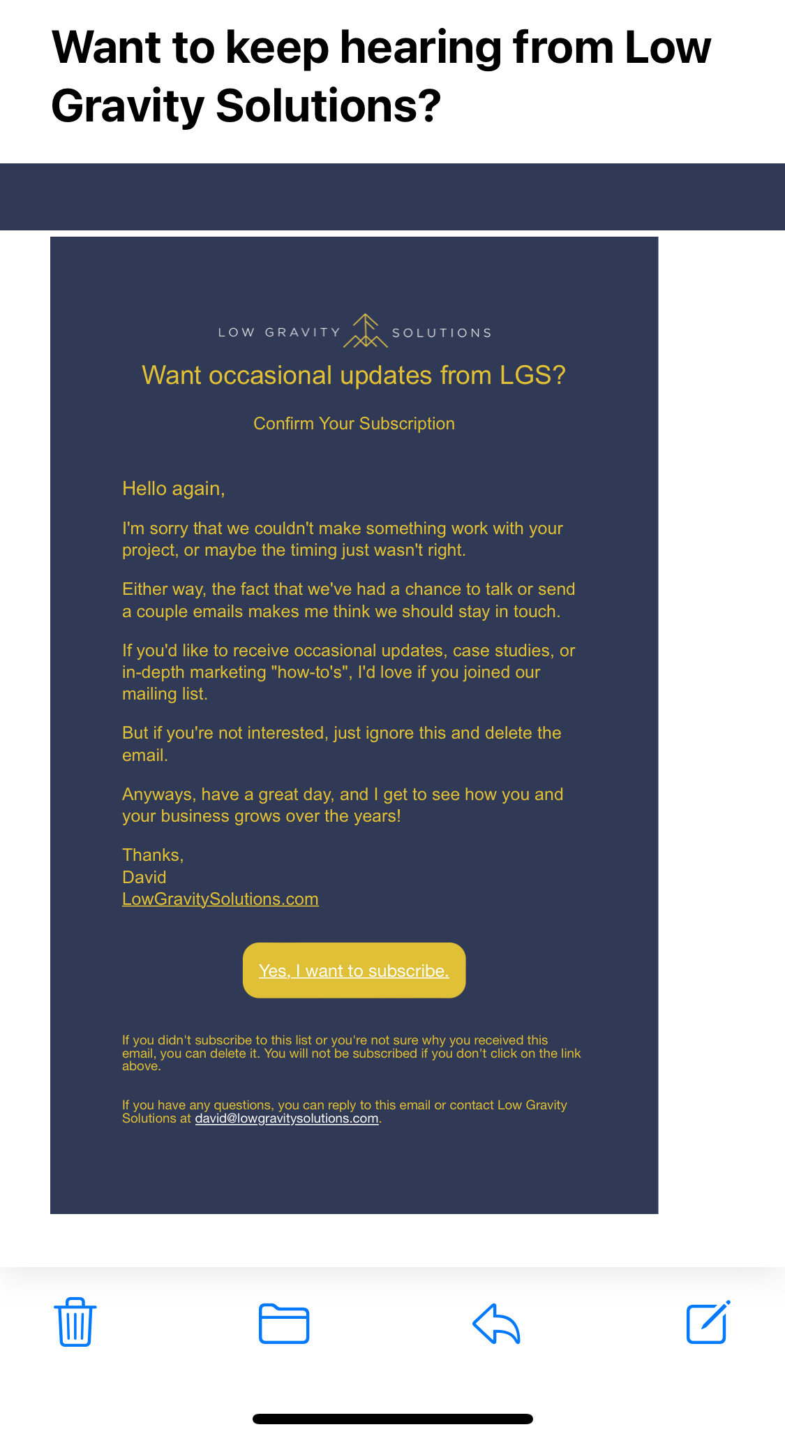
But when it is received in both my ios inbox as well as in the gmail app, it appears like this:


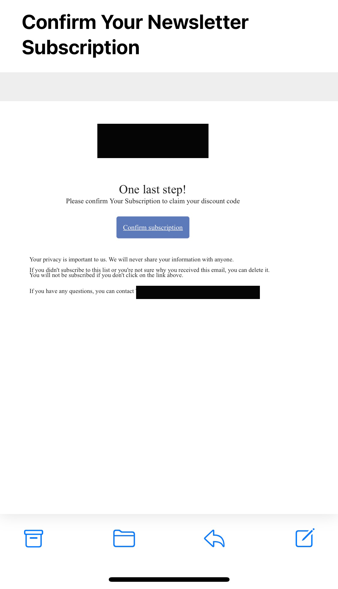
I have compared all settings to other templates that are displaying just fine in mobile, and made similar settings in this form. I have the form width set to 600 px. The editor for this email form is rather limited and seems like the classic editor, so not really much to play around with. Am I missing something?


Thanks in Advance!

icon

Best answer by Taylor Tarpley 31 January 2023, 20:16

View original

5 replies

Userlevel 7
Badge +60

Hi @AdamB


Thanks for sharing your question with us, happy to help! 


So unfortunately, Gmail App doesn't support medial query and its default is to show the desktop display, why the mobile confirmation email doesn’t look as it does in the mobile view editor. In this case, there are a few outcomes that may occur when a media query is not supported, which you’ve experienced:

  •  The device/app takes desktop and scales it down to fit mobile screen.
  • The device/app provider takes desktop and just displays all blocks at a "normal" desktop size, so it can look pretty messy.
  • If there are desktop or mobile-only blocks - the device/app will display all blocks. 


While our desktop/mobile view editor tries to give a general feel what a user will likely see on each device, the most accurate way to confirm what an email will look in an email or phone would be to send a test email or use other resources such as litmus.com and emailonacid.com for more a more accurate preview of emails.


Thanks for participating in the Community! 

-Taylor 

Badge +2

Thanks for your response, @Taylor Tarpley 

So there is no solution for this mobile display error? I find it odd that Klaviyo, with all its functionality doesn’t have a way to properly display this opt in email. As it is often the first email a potential customer may receive from a company, it does not instill customer confidence that a company “has their stuff together”.

do you know if this issue is being addressed anytime soon?


Thanks!

Adam

Userlevel 7
Badge +60

Hi @AdamB


Very sorry about the delay, happy to share about this further!


The issue is due to how Gmail app and ios is rending the message, not a Klaviyo issue. However, I would utilize the resources mentioned previously to workaround this. 


I wonder if any Champions or other superusers can share their strategies around their experience with the Gmail app? @Mailbox Manny, @In the Inbox, @retention ? 


Wondering if there are any other strategies we can employ or consider when working with the limitations of the app? 


-Taylor

Userlevel 5
Badge +18

So, I think this is a pretty big problem, and I know it’s not all the fault of Klaviyo, but *FOR SURE* Klaviyo could give us more editing/styling options.


If I set the page background to a color and the form background to transparent, everything renders fine on desktop, but on mobile (iOS), all backgrounds render white except for a bar across the top (which is the correct color I’ve set).


Desktop


Mobile iOS


When I set BOTH backgrounds to the same color, the desktop version once again renders correctly, but now only the form background renders on mobile (with form width set to 600).


Mobile iOS with form background color


In addition to this background problem there’s also a problem with the font sizing. In the editor, if I set the font size to 18px, that’s exactly how it renders on desktop. However, on mobile, it renders something significantly smaller. So small, that I need to Zoom in to read it.


But then, if I adjust the size to 28px so that I can read it in mobile, it’s absolutely huge on desktop.


I understand the company line is still going to be “it’s not our fault, it’s Apple’s” and probably there will be no suggestions you can give me, but like I said, you absolutely can make the editor much more flexible and give us more options.


And however the editor’s code is written such that the form background can render properly, surely the page background code can be written in the same way so that they both render the same on mobile.


Anyways, as it stands now, the only way to make sure this email looks good, is to set all backgrounds white...which really sucks in the day and age of dark mode responsive. I wish there were a workaround to this email, but at this point, there is not, so we are all stuck sending extremely unprofessional and/or behind-the-times opt-in confirmations.

I am experiencing the same issue. There is no problem with the way campaigns are displayed on mobile devices, so why would there be any limits on how this VERY simple email gets displayed?

For me, the form background renders correctly, but the page background color is not respected.

Also, the problem of only being able to set a fixed width in pixels is probably creating the issue with the scaling and layout in the first place.

Either give us better control or fix the issue behind the scenes. The way it is right now seems utterly unprofessional for a SAAS company that is all about email...

Reply