Solved

Opt-In email formatting help

  • 21 March 2023
  • 5 replies
  • 174 views

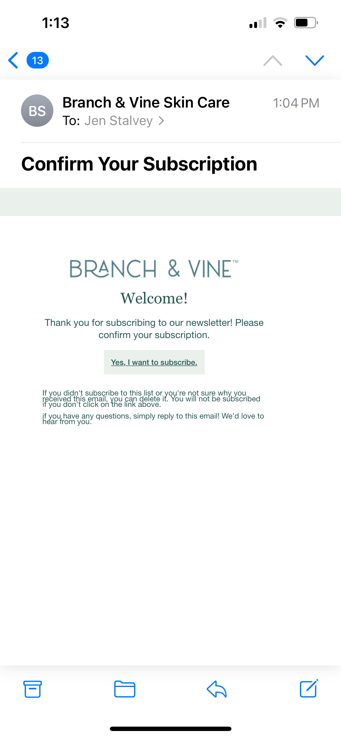
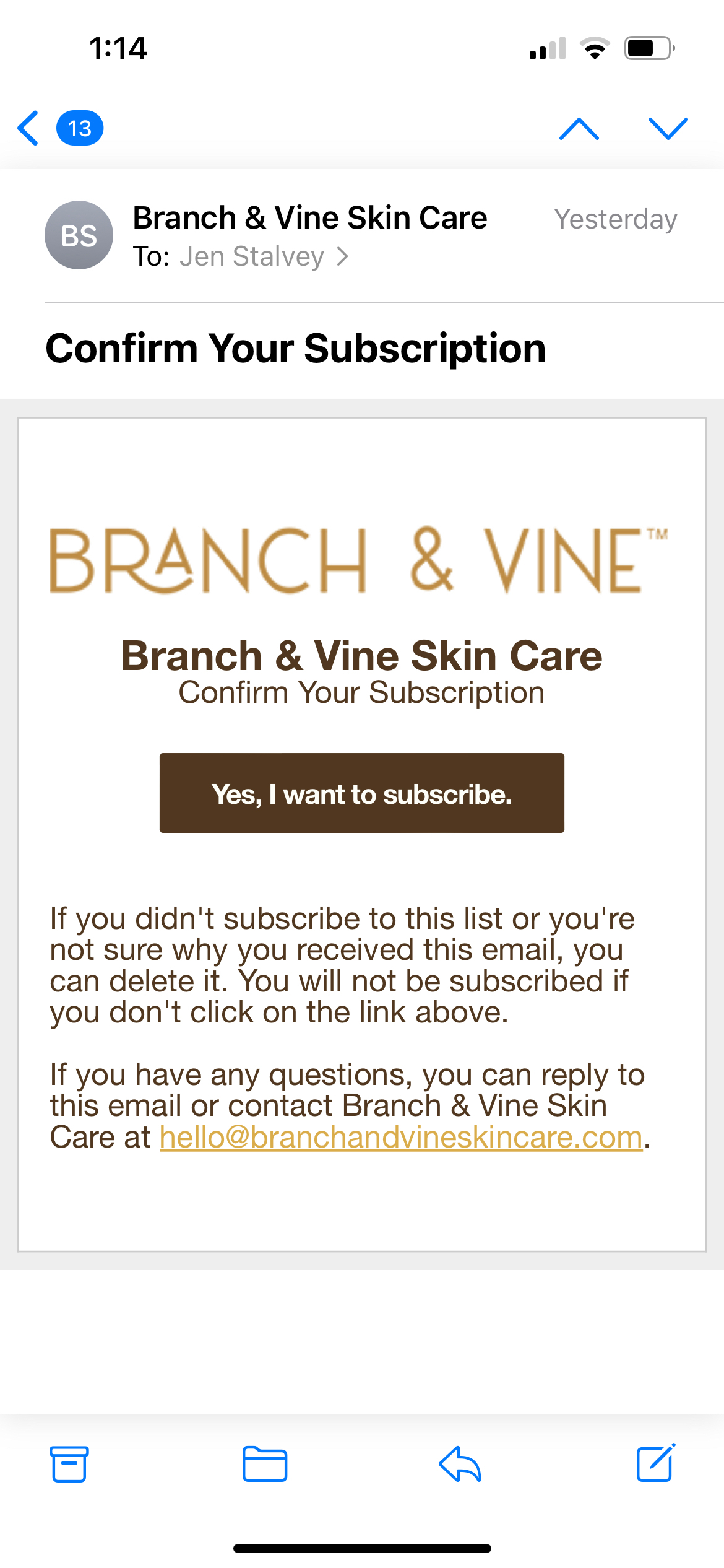
Hello! I updated the Email Preference and Subscription forms with new brand colors; however, the Opt-In email formatted so oddly! It doesn’t look good on mobile or desktop.

Below are two screenshots on mobile - the 1st is the default email when I first opened my Klaviyo account, and the second is how the email looks now after updating the colors. I didn’t add an underline to the button, and didn’t adjust the form padding.

What’s going on?
 

Hi @Jen S.,

Thanks for being a part of our community! I’m sorry for the change to formatting that you’re seeing. Can you confirm which inbox this email was received into? From Outlook 2007 onwards, Microsoft stopped using Internet Explorer to render emails and instead opted to use Microsoft Word as its rendering engine. This creates a less than ideal environment for email marketers and developers who use HTML. Unfortunately, this is not an issue within Klaviyo, but across the Email Service Provider industry. We outline the issue in more detail in the following Help Center Article: My Email Looks Different When Viewed in Microsoft Outlook

In order to optimize your emails for Outlook and other inboxes, we recommend using a tool like Litmus or Email on Acid to test your messages on various devices and inboxes. I hope this helps!

~Chloe


Hi @Jen S. Thanks for posting in the Klaviyo community! Wondering if, when you updated the brand colors, you accidentally reverted back to old formatting within the form?

You can adjust colors and formatting individually within each block, but also as a whole for the form. There are also different styling options for what shows on mobile vs desktop.  Here’s some more information from Klaviyo about styling forms: https://help.klaviyo.com/hc/en-us/articles/4413537049883-Understanding-styles-for-a-sign-up-form#color-and-spacing-options6


Hope this helps. 

Katherine


Hi @Jen S.,

Thanks for being a part of our community! I’m sorry for the change to formatting that you’re seeing. Can you confirm which inbox this email was received into? From Outlook 2007 onwards, Microsoft stopped using Internet Explorer to render emails and instead opted to use Microsoft Word as its rendering engine. This creates a less than ideal environment for email marketers and developers who use HTML. Unfortunately, this is not an issue within Klaviyo, but across the Email Service Provider industry. We outline the issue in more detail in the following Help Center Article: My Email Looks Different When Viewed in Microsoft Outlook

In order to optimize your emails for Outlook and other inboxes, we recommend using a tool like Litmus or Email on Acid to test your messages on various devices and inboxes. I hope this helps!

~Chloe


Hi Chloe,

Thank you for replying! I was using Apple Mail. I logged into my account in Safari browser and the formatting looked much better. Any issues with Apple Mail you’re aware of?

Also, any idea how to remove the underline of the button text? It doesn’t appear in any of the other forms or templates - just the opt-in email.

Thanks!


Hi @Jen S. Thanks for posting in the Klaviyo community! Wondering if, when you updated the brand colors, you accidentally reverted back to old formatting within the form?

You can adjust colors and formatting individually within each block, but also as a whole for the form. There are also different styling options for what shows on mobile vs desktop.  Here’s some more information from Klaviyo about styling forms: https://help.klaviyo.com/hc/en-us/articles/4413537049883-Understanding-styles-for-a-sign-up-form#color-and-spacing-options6


Hope this helps. 

Katherine

Hi Katherine, thank you for replying!

The first step I took was to update the brand colors/logo.

Then, when I realized the consent pages did not automatically update (like the email flow templates do) I understood that the brand colors would only appear in new forms and not existing ones in use. So, I deleted my two sign-up forms (one embedded, one flyout) and reset the consent pages to default. 

However, when I reopened the consent pages I saw they had not been updated and still used the old brand colors. So, I formatted each consent page/form manually with the new brand colors/logo. All of them look good now, except for the opt-in email (which I was viewing in Apple Mail).

Thanks!


Hi @Jen S.


Thanks for the additional info! 


Happy to hear the branding is now aligned with your rebrand! 


Do you mind clarifying if the odd underline you’re seeing with the subscribe button is only in the Apple mail app vs logging into apple mail via safari? I’m going to ask an expert on this for confirmation.


-Taylor


Reply