


Your email template looks beautiful in Canva. But once it lands in someone's inbox, will they actually know who you are, what you want, or what to do next?
These three questions, who, why, and what, are the foundation of emails that actually perform.
At Hazel Village, an ethically-made stuffed animal company based in Brooklyn, we've built our entire email program around answering these questions within the first second someone opens a message. The result: emails that represent our brand, communicate a clear message, and drive the clicks that convert subscribers into customers.
The 3 core questions every email must answer
Good emails all have a few things in common:
- They correctly represent the brand and the product being sold (Who is emailing me?)
- They have a clear message (Why are you emailing me?)
- They have a call-to-action (What do I do next?)
The good news? Klaviyo's drag-and-drop editor makes it easy to build these emails without needing separate design software. Visual hierarchy is key, someone should know what they're looking at within just a second or two.
Here's how our team at Hazel Village creates an email from top to bottom, plus the tips and tricks we've learned along the way.
Building your email: top to bottom
1. Logo: make it clear who's sending
At the top of every email is our logo. You should have a collection of logos to choose from, pick one that says your brand name and is long and skinny. This way it takes up less visual space while making sure customers immediately know who the email is from.
Pro tip: We use a black logo on all our emails so it doesn't distract from the body content.
2. Important links: give customers quick access
Always include 2-3 important links at the top of your email. The most frustrating thing for a customer is opening an email and not being able to quickly get to your site.
One of our favorite Klaviyo features is the ability to select if a link shows on mobile or desktop. For desktop, we have 3 links but for mobile only 1. We also use universal content blocks so you can edit the logo and links across all emails and templates with ease.
3. Headline: get to the point fast
Select 1-2 web-safe fonts that fit your brand's identity. Your brand likely already has set fonts, but many aren't visible across different email providers and can default to less appealing options.
The headline should be 1-5 words that succinctly describe the email. In Klaviyo's email builder, you can set colors for the template background and content background. At Hazel Village, we keep both white and manually set each block background color to ivory. This immediately differentiates the email content from other information and links.
4. Image: fit more above the fold
To fit the most content above the fold, use landscape or square images. Images don't need to be huge, 1000 pixels wide is more than enough for high-resolution email.
Add 10-20 pixels of vertical padding on the image for a cohesive email body. And always make sure your images have descriptive alt text for accessibility.
5. Short body text: respect your reader's time
Here's the reality: most customers won't read your email in its entirety. They want to get in and out quickly, but if they do want more information, it should be available.
Keep body text to 2-3 sentences. Since Hazel Village has an old-timey feel, we use Courier New for all our emails. All web-safe fonts are legible, so pick whichever fits your brand.
Helpful resource: How do I learn email design and email copy writing?
6. CTA button: make the next step obvious
Use Klaviyo's button content block to create a custom CTA that fits your brand look. The text should be easy to read, large, and ideally in all caps. You can adjust the rounded corners and padding to match other design choices throughout the email.
Make sure the CTA button content background is the same color as your body text, image, and header to create a cohesive email body.
7. Footer: links, brand info & unsubscribe language
At the bottom of your email, include extra links, information on how to subscribe to emails or SMS, and a link to unsubscribe and manage preferences. You can handle all of this using universal content blocks and tags.
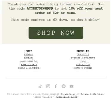
Make sure these are legible and can't be confused with the body of the email. Use the social links universal content block, there are customizable options for icon styles that fit your brand and make your email look professional.
The bottom line
Email design matters for high click rates, and Klaviyo makes it easy to create accessible and aesthetically pleasing emails without leaving the platform.
What design practices do you depend on? Have you found any tips and tricks for Klaviyo's drag-and-drop editor that take your emails to the next level?
