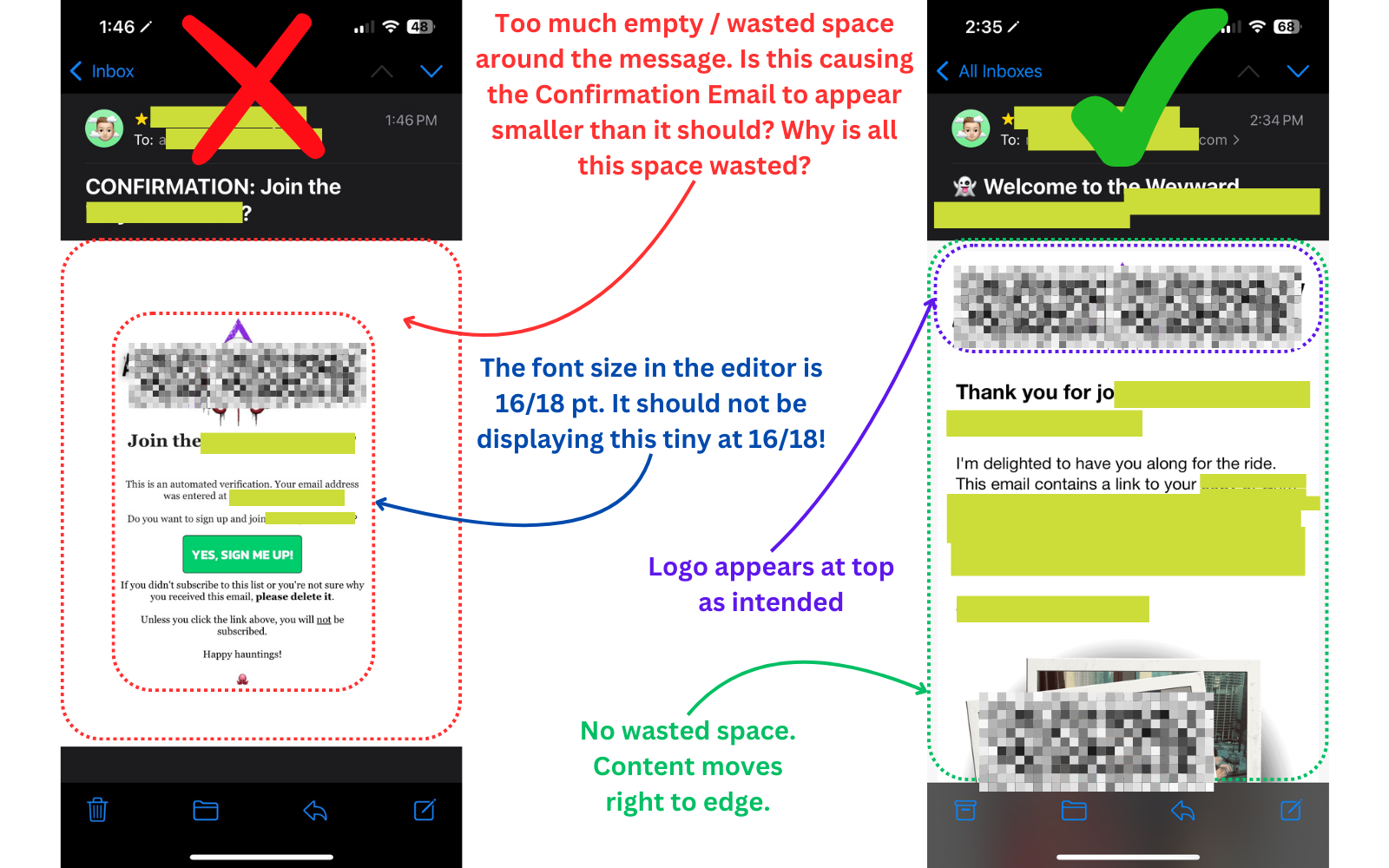
No matter what I change, my double opt-in appears way too small on mobile (iphone). This doesn’t happen when it’s seen in a desktop client, but on Apple Mail AND the gmail web interface, the text, image, and the confirm buttons are a good 40-50% smaller than they should be.
Is there something I’m doing wrong? Some sort of width or style I’m supposed to click? To be clear, it’s the Email Confirmation under the Settings > Other > Consent Page
As much as I want to ignore it, a huge chunk of my sign ups are going to come from an iPhone and this makes it just a bit too hard (and quite unprofessional) to confirm.
Bonus question: is there a way to reset the Consent Page > Email Confirmation back to the factory defaults? I’ve tried so many different variations of sizes and images to try and fix this I’d like to just start from scratch.
Thanks all!
Page 1 / 1
Hi, I do not think you are doing anything wrong here….but rather it is how the iphone is handling the media queries (or rather not able to handle the media queries) resulting in improper scaling of desktop versions for mobile viewing
Yes, I’ve just been reading some forum posts that say similar. However, I did not have this issue with MailerLite or Mailchimp. Since iPhones are a massive demographic, this is an issue that needs to be fixed.
UPDATE: After digging around and experimenting all day, I’m becoming more convinced that Klaviyo is somehow serving up the desktop version of their Confirmation Page to Apple iPhones when it should be serving up the Mobile version. This is causing the logo, text, etc. to be displayed much smaller than expected. I confirmed this with multiple email accounts, both @gmail and @icloud.
To be perfectly clear, I am migrating over from Mailerlite where this was NOT an issue, so it’s *not* something that can be blamed on Apple. If Mailerlite did not have this problem, Klaviyo should not either for twice the price.
In the first image, you’ll see the Confirmation Email on the left a standard email from my welcome sequence flow on the right. For the most part these fonts are the same / similar size, around 16-20, body. But the Confirmation email (left) is rendering the font much, much smaller. Furthermore, there is a tremendous amount of padding, even with it set to values like 6px or lower.
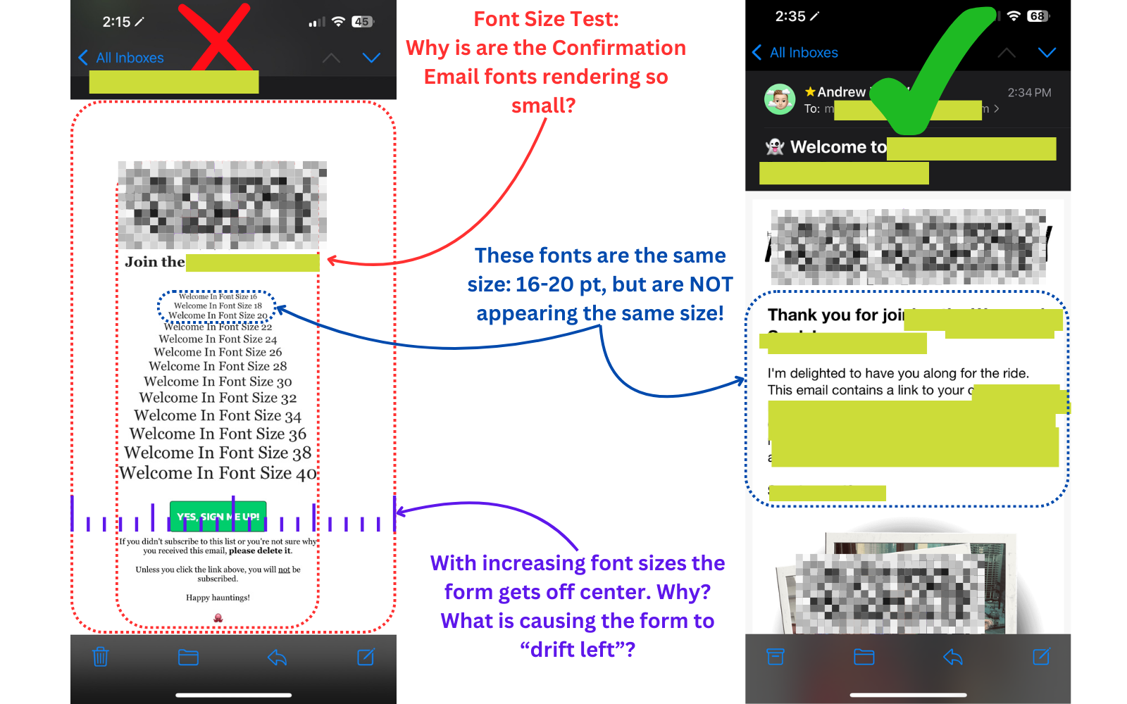
In the second image, you’ll see I tried a variety of font sizes in a Confirmation Email, from 16 - 40. Please note that the email on the right uses the fonts sized 16-20 and in the same body style but are significantly more readable.
This makes the Confirmation email objectively unreadable without pinching or zooming or blowing the font up into the 30s and higher. It’s too much friction and, frankly, unprofessional.
I also confirmed this behavior happens on other Confirmation emails by signing up for a buddy’s newsletter that is also hosted by Klaviyo. His Confirmation email arrived formatted similarly and he was surprised to learn of this. His regular newsletter emails look great.
I’m still waiting for support to escalate the issue or provide workarounds. Has anyone found an acceptable workaround that skirts this issue?
Hi @heydrew,
I wanted to provide an update to let you know this issue is being triaged with the engineering team and the support agent you have a ticket open with will follow up with updates there.