Ever since one of the recent updates, we’ve been having trouble viewing the Analytics Dashboard Overview properly. The sections go out horizontally farther than the computer screen, and there’s no sideways scroll bar, so we can’t actually see the numbers. There’s also a double vertical scroll bar, which is just annoying. Is there a way to fix this so that we can actually see our numbers?
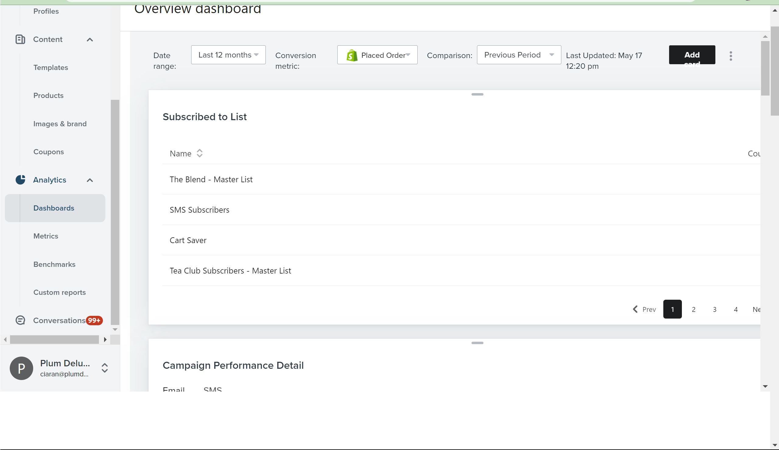
 

Hi @CKeast


Thanks for sharing this question with us, happy to help! 


Do you mind sharing what browser you’re using when you view the analytics dashboard like this? And whether or not you see it in other browsers? That will help us better investigate how far across this display issue spans and why this might be happening. 


Thanks for partipcating in the Community!

-Taylor 


@Taylor Tarpley It looks like this in both Google Chrome and Microsoft Edge. I’m using a ThinkPad with Windows 11 Pro, and everything is up to date. Let me know if there is anything else you need to know in order to diagnose the issue. Thank you much!


Hey @CKeast,

Just to gather more data to share with your product teams, do you happen to have your browser magnified and what is the screen resolution of the computer you’re working on? 

Despite Klaviyo being responsive, there are small instances where dependent on the screen resolution of the device, along with any additional settings in place, may cause the experience to be less than ideal.

David


@David To — My screen res is 2560 x 1600, and I do have the scale at 175% because I am visually impaired. I’m guessing, based on your response, that the scale is the reason I’m having issues?


@David To  I’ve also had the same problems that @CKeast describes, and I use a Macbook Pro with a 15” screen. Even with the window at full capacity, I have to scroll horizontally for Klaviyo’s reporting dashboards, and it often occurs on Flow email or Campaign email editors if my browser window isn’t taking up the full 15”, or if I’m on my smaller monitor. I use Chrome always since it seems to be the best browser for using Klaviyo without bugs. 


It’s been happening for me consistently since the new dashboards were released either in Q4 last year or Q1 this year, I can’t remember exactly. 


It would be great if this could be resolved so Klaviyo’s more elegantly usable across different browser window sizes. 


~ Gabrielle


Hey @CKeast and @ebusiness pros,

Thanks for sharing these additional details! 

I’ve routed these details back to our Product Team to explore further. They’ve already mentioned how helpful this feedback has been to helping them improve further.

You can always leave further dashboard feedback at the bottom of your Klaviyo Dashboard page by clicking on the “leave feedback” button. 

Thanks for being a part of our Klaviyo Community!

David


Sounds great, thanks @David To


Reply