Hello,


I’ve been sending call to action emails where I offer products for customers to buy, with one header banner and then products bellow it. Problem is because I use product block with 3 columns and it looks great on desktop, but on mobile it shows product in 1 column only. 

I’d like for mobile to make it 2 columns instead of 1. I know about unchecking “STACK ON MOBILE” but all that does is make it in 3 columns on mobile which becomes unreadable.

Is this doable in Klaviyo?

Hey @Xei5680 

Welcome to the Klaviyo community! Thanks for reaching out for help with this!

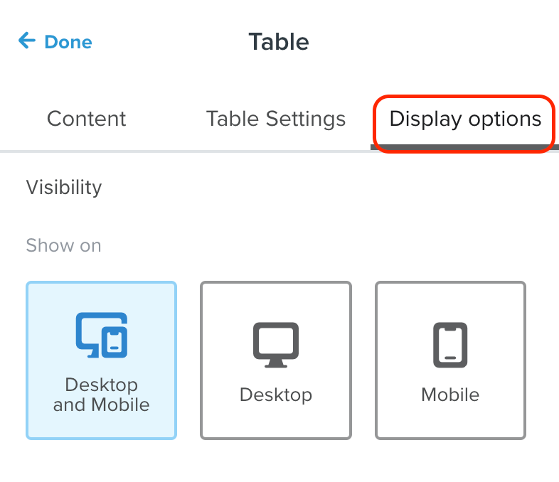
My suggestion would be to create two different product block, one for desktop display only (3 columns) and one for mobile display only (2 columns). You can change the display settings for each product block by clicking on the block > Display Settings > Change setting for the correct display method 

Hope this helps!


Hello Stephen and thank you for answering. 


Do I need to make my products in table block or I could do that in product block?


Because I tried your suggested method but on mobile, option for number of products per row disappears and it’s still only in one row.


Hey @Xei5680 

Yes, a table block definitely will give you more ability to customize how many columns there are.


I have the same problem but if I create two different product blocks, one for desktop and one for mobile, the email size gets high and at the risk of clipping. Isn’t there any other way to solve this problem than using two different blocks for mobile and desktop


Reply