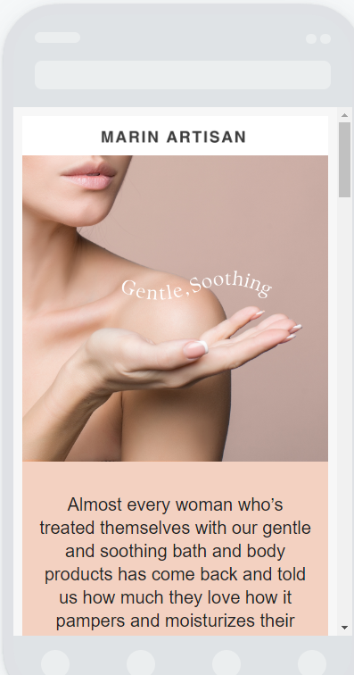
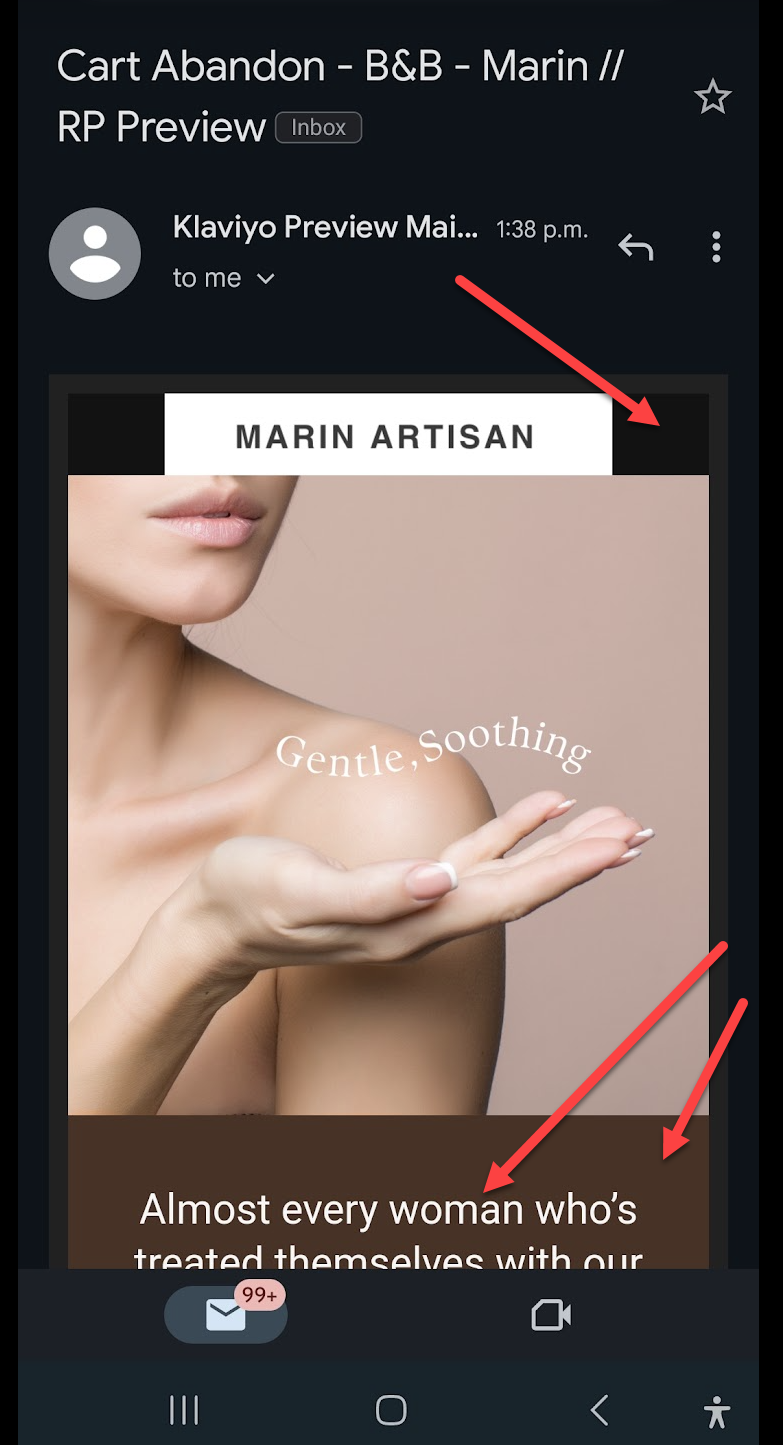
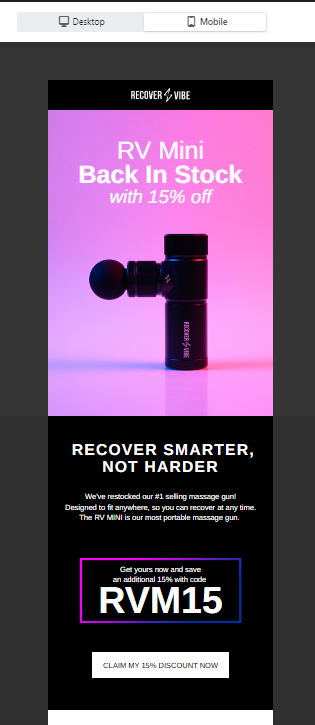
Hello! On mobile preview, it appears great, but once I send it as test email, it looks different on my iPhone, yet with the desktop view, it is all goods. Please see image for reference.

 +3
+3Hello! On mobile preview, it appears great, but once I send it as test email, it looks different on my iPhone, yet with the desktop view, it is all goods. Please see image for reference.
Best answer by stam_marko
Hi
I’m afraid that Klaviyo’s preview is only an approximate estimate of the ‘actual’ mobile view.
Each email provider's way of rendering emails might appear slightly (or significantly) different.
For this reason, I have three test emails (Gmail, Outlook and Yahoo). Most of the time, there are all similar, but there are cases where in Outlook or Yahoo, the email differs from Gmail.
Some tips from my small experience with this:
1. First, I adjust the email to fit my customers’ core email providers without using different blocks for desktop and mobile. That ensures that my email’s code size remains small and less complex.
2. Check your template by sending preview emails to different email providers (Gmail, Yahoo, Outlook) or use Litmus or Email on Acid (or any other tool)
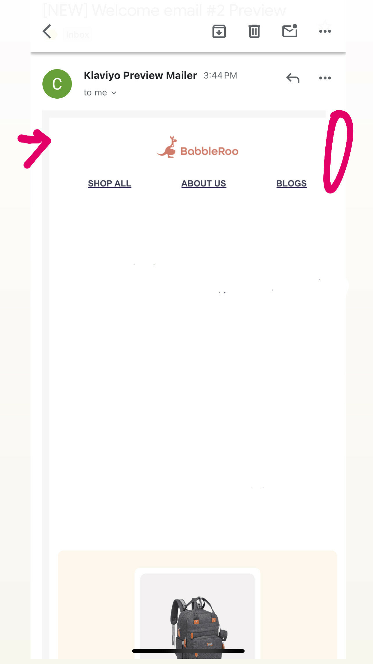
3. Your hero image could have the hero copy embedded in it instead of a background image and a text block. In this way, you can use your custom fonts without risking of them being changed to devices which do not have them downloaded.
4. Let us know what you’ve learned from that process. For example, I’ve noticed that padding reacts strangely (sometimes) in Outlook.
I hope that helps,
Enter your E-mail address. We'll send you an e-mail with instructions to reset your password.

