You’re designing your email, and all you want is to have two images side by side, but how do you do it? Well, there are 2 ways:
Use columns. In the Klaviyo email editor, choose Add Columns to Email and drag it to where you would like your images to be. It will populate with text blocks by default. Drag in your image blocks and delete the text blocks if you don’t plan to use them. This method will allow you to easily include 3-4 images in a row and can be used with any content type. using columns to add images
Use a Split. In the editor within the block options choose Split and drag the block to where you want your images to be. The Block Tab will show a column editor. Under Layout/Types > Content change the dropdown for both columns to “image”, then click into each column tab to upload your images. This method allows you to adjust the width of your images easily after adding the split if you want one to be wider than the other. using splits to add images
Have any other questions about how to create unique image layouts in your emails? Ask away below or share examples of layouts you love.
Page 1 / 1
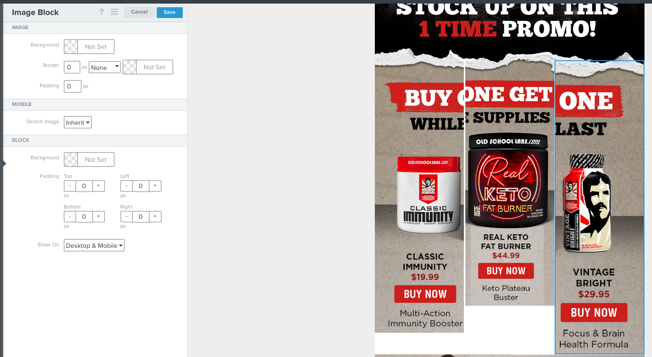
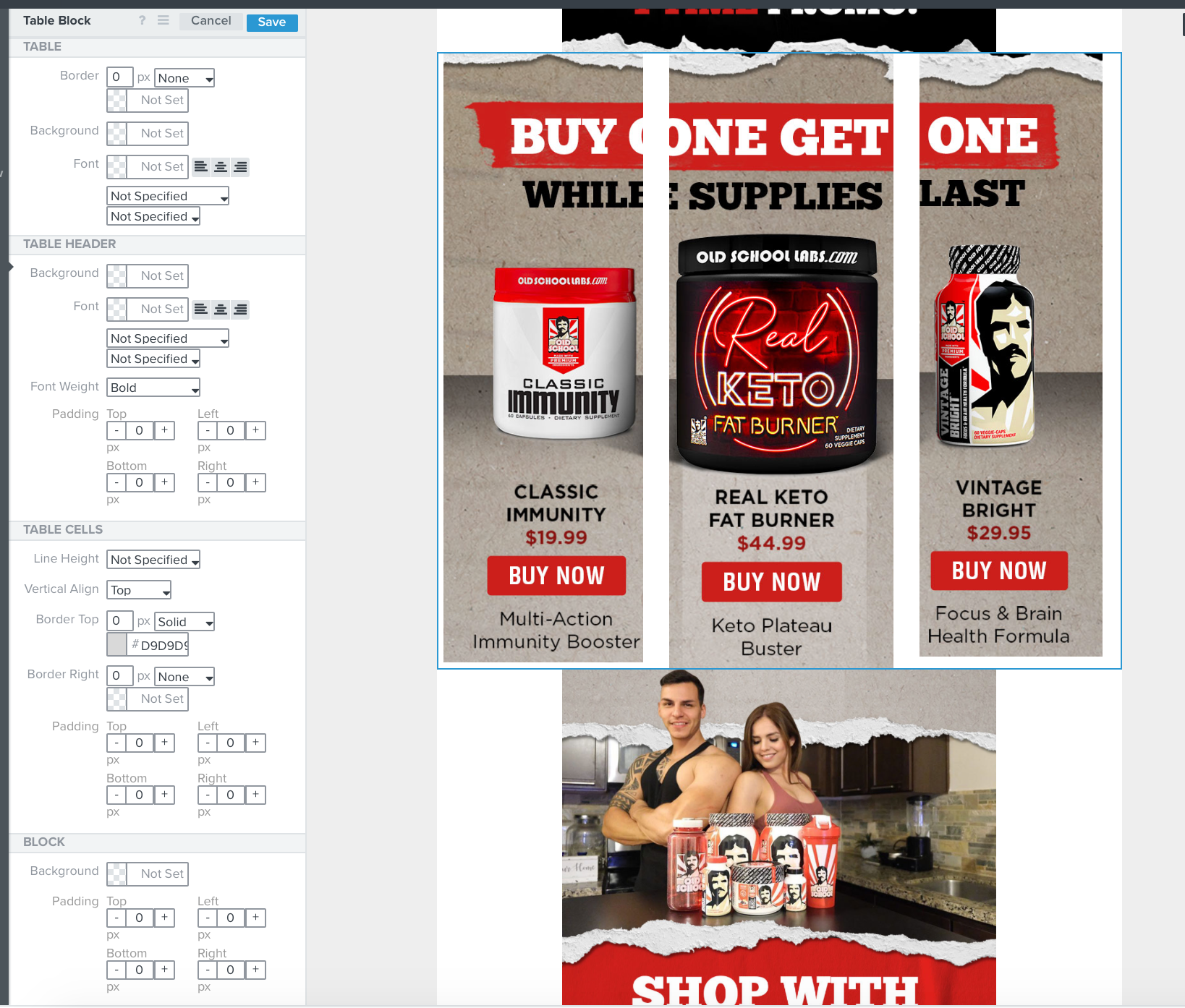
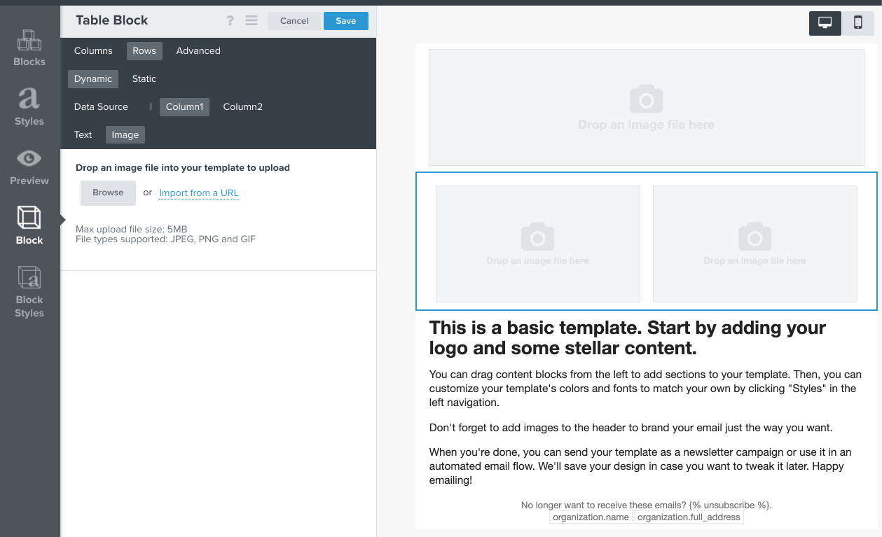
A third way to do this is to use a “Table Block” and have two (or more) columns of images. The nice thing about using Tables is you can have more than 2 column of images, add additional rows, or mix it with other content (text/html). Just note, table elements do not “stack” in mobile but you can choose to have certain any columns show/hide on Desktop or Mobile.
See example:
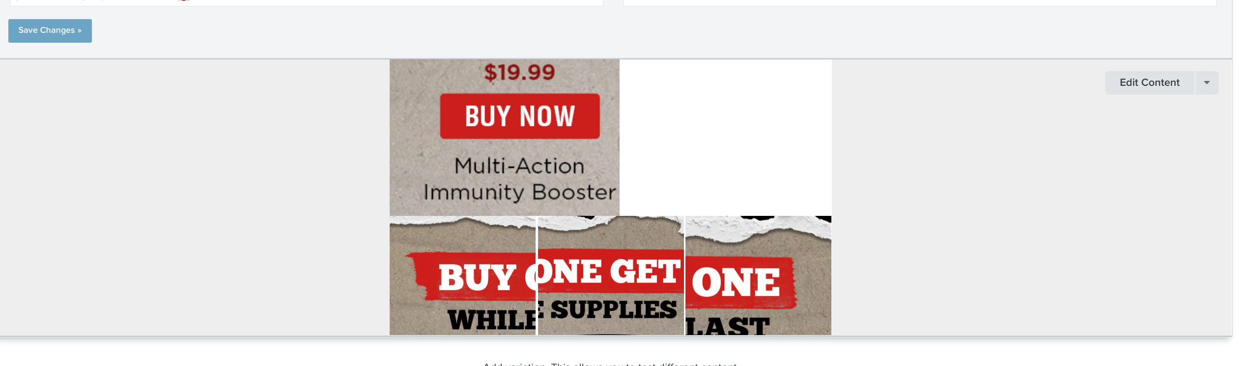
Additionally, if you just want a clean table with no borders and no heading text, you can do the following:
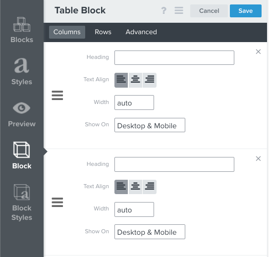
Remove the Text in the Columns → Heading
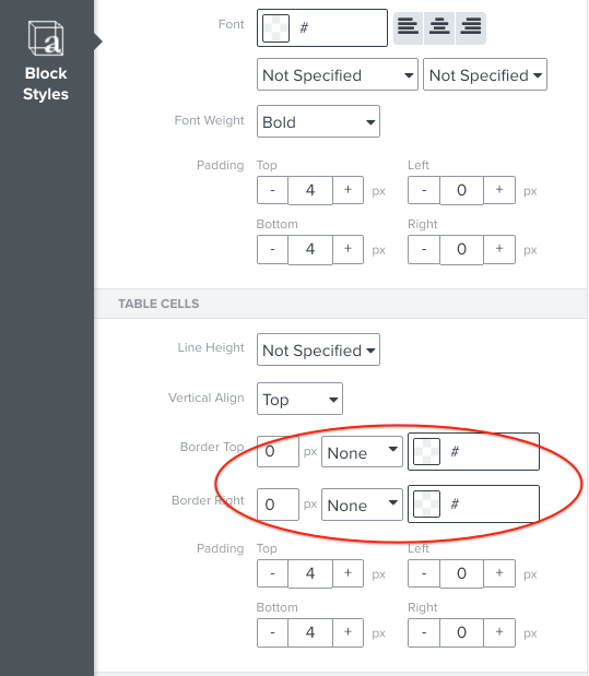
Set the Border Top/Right to “None”
@retention Using a Table Block is a great call out, Joe! I actually find that there’s a lot more flexibility in controlling the design with this type of block as well.
Additionally, while this isn’t necessarily adding images side by side, you can also use Add Columns to Email to include a CTA/button next to an image:
This article on Adding Columns to Emails is great for those that are looking to find more ideas/tips for email design!
Hey guys -- great stuff!
I just want to ask if there is a way I can vertically align the contents of the left column to the height of the photo on the right column? Just like the one in your example @cassy.lee ?
Is it just a matter of adding a spacer on top?
Hey guys -- great stuff!
I just want to ask if there is a way I can vertically align the contents of the left column to the height of the photo on the right column? Just like the one in your example @cassy.lee ?
Is it just a matter of adding a spacer on top?
I can’t speak to exactly how that example was made, but a spacer would be a great option. If you use a spacer you can adjust it so it looks great on desktop, and set it to be desktop only so that if your columns stack on mobile, you won’t have a large gap in content before your text.
I tried adding the GIF directly here but it wasn’t loading, so apologies for the inconvenience!
If you have any difficulties with this, or are looking for further design tips, feel free to share a screenshot with us of what your email looks like (with any private details like email address blurred out).
Thanks, -Cass.
Hey thank you @Julia.LiMarzi and @cassy.lee!
It was that gap on mobile that bothered me and made me ask about the spacer. I was really hoping there was a feature to vertically align the elements automatically. I was at a point where I was thinking of doing tables and add custom css but then realised that it would complicate things.
The spacer on desktop looks like the best option now. And thank you for the tip to create 2 different blocks for desktop and mobile. I forgot that we can do that!!!
Hi,
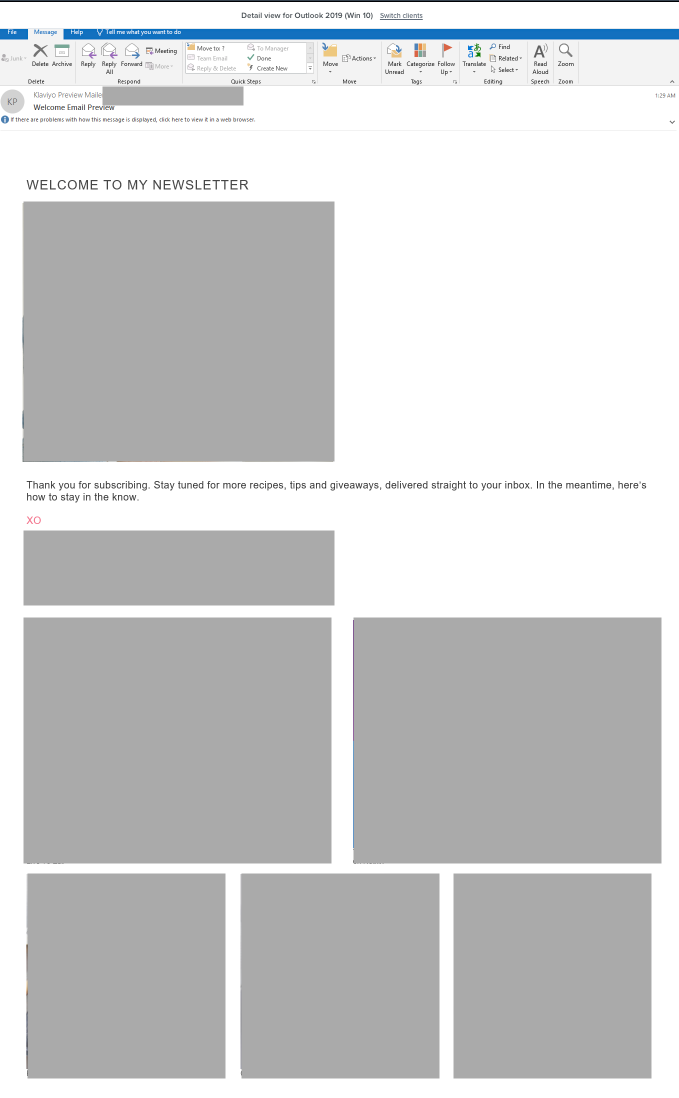
I’m wondering if any of you have noticed the stretching of an email due to use of these split/multi-columns in the klaviyo template when viewed in the Outlook app in Windows (e.g. Outlook 2019, Outlook Office 365). I’ve even tried to set max-width style properties on the image elements in these columns, but they still stretch the full width of the app. Here’s a preview from Litmus:
Email preview on Outlook 2019
Hi @slatlas!
This is a great question and call out. I can’t speak for Outlook 2019 necessarily, but it is a known issue for previous versions of Outlook (specifically 2007, 2010, and 2013). This article provides an overview from the Litmus blog on the Rendering Differences in Microsoft Outlook Clients (although it hasn’t been updated since 2014, so I’m not sure how that affects your 2019 version either).
Unfortunately, these are some issues identified with the following HTML Emails in Outlook 2007/2010/2013, which seem to match some of the design discrepancies you’re experiencing:
No support for background images in divs and table cells
I’m having some trouble getting my table images to line up properly. Everything is the same height and I’ve spliced multiple times to get the right height, but it just doesn’t want to line up. Any thoughts? error screenshot attached https://imgur.com/KnSd7Gg
@707street
Do you have a picture of your settings for the image block as well? It’s a little hard to determine exactly based on the photo, but it looks like one of the images is sized differently. I’m wondering if they are aligned at the top and, if one image is not sized the same as the others, it will make it so that there’s some added space between the bottom edge of the image and the rest of the block.
Alternatively, you could try it as a table block instead. Keep us posted on whether you were able to get the spacing fixed, or if you have another screenshot of the image/block settings. That’ll help other Community members provide some feedback on what else to try.
Thanks, -Cass.
Hello,
they are all the same height and width. I put the images on a table block so It can be side by side via mobile.
However, I do have another problem. I put these images in a table and link them accordingly. When I view the test email on gmail desktop and mobile, it asks me to save the image rather than linking me to the product page. Why is this?
I’ve been using tables and split blocks to create columns… and never even noticed the column button at the bottom! Super useful.
Any idea how I can remove spacing between them? i went to block style and removed all padding but there is still white space between the columns
Hey @ayay123,
There are a couple things that could be affecting the spacing between the columns.
One is Padding, which you’ve already adjusted. Some blocks such as the text block also have the option to adjust Margins. Padding will adjust the spacing within the block whereas margins will adjust the spacing around the block in relation to other blocks.
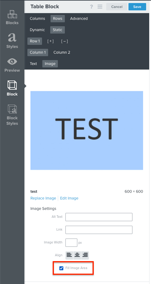
If you are using an image block, also be sure to check that you’ve set the image to Fill Image Area, which is found in the Block Settings below the alignment toggle.
Hope this helps!
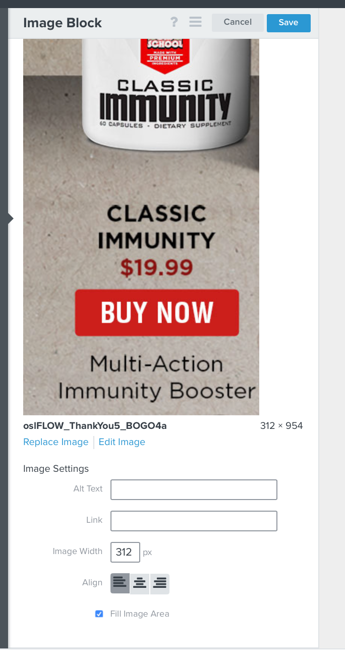
I am having a similar problem described above. I have 3 images, all the same height with varying widths that need to but up against each other with no spacing or padding at all. This is what I am looking at right now.
All image block settings are as follows–
Here are the settings for the left image block–
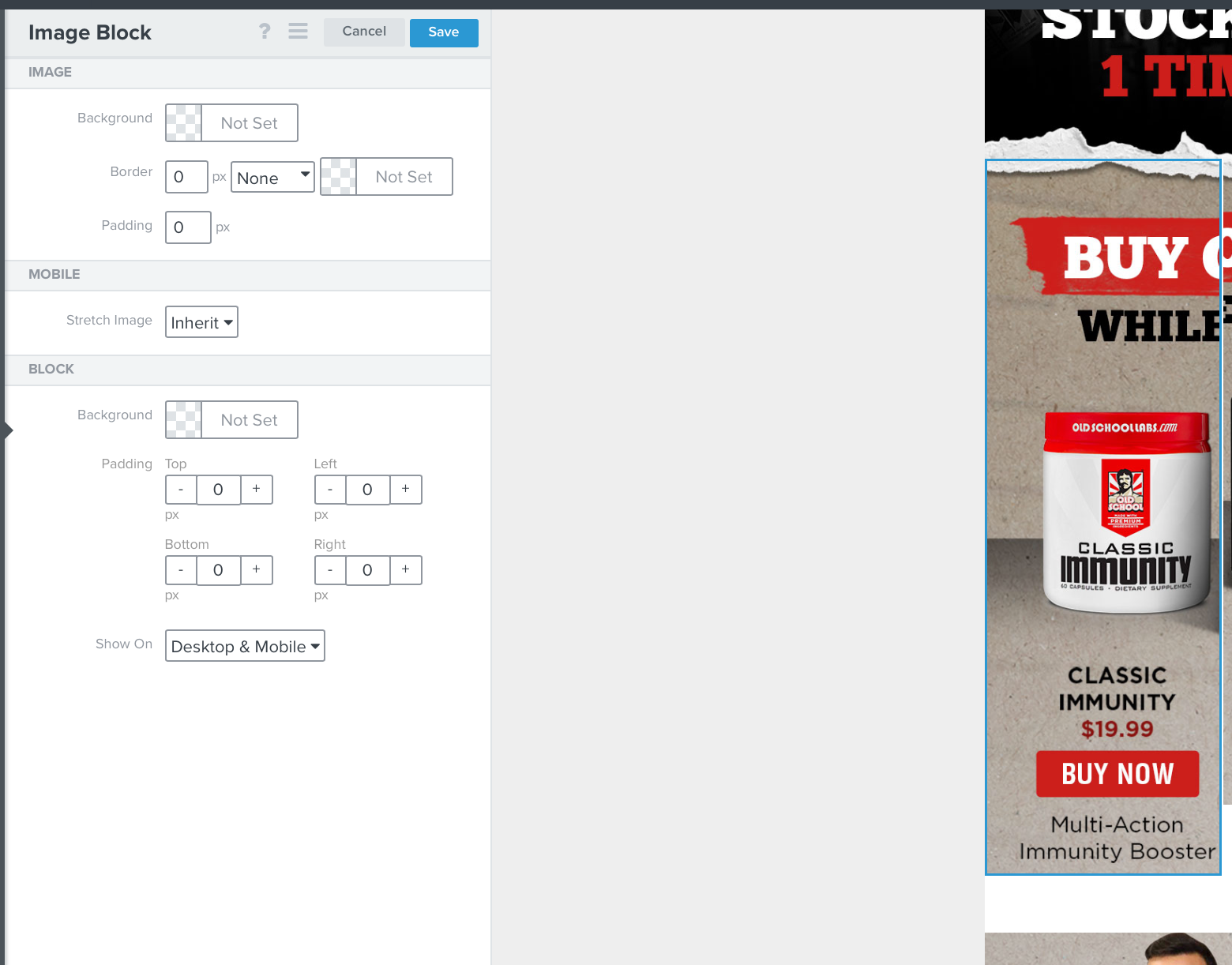
Here are the settings for the center image block–
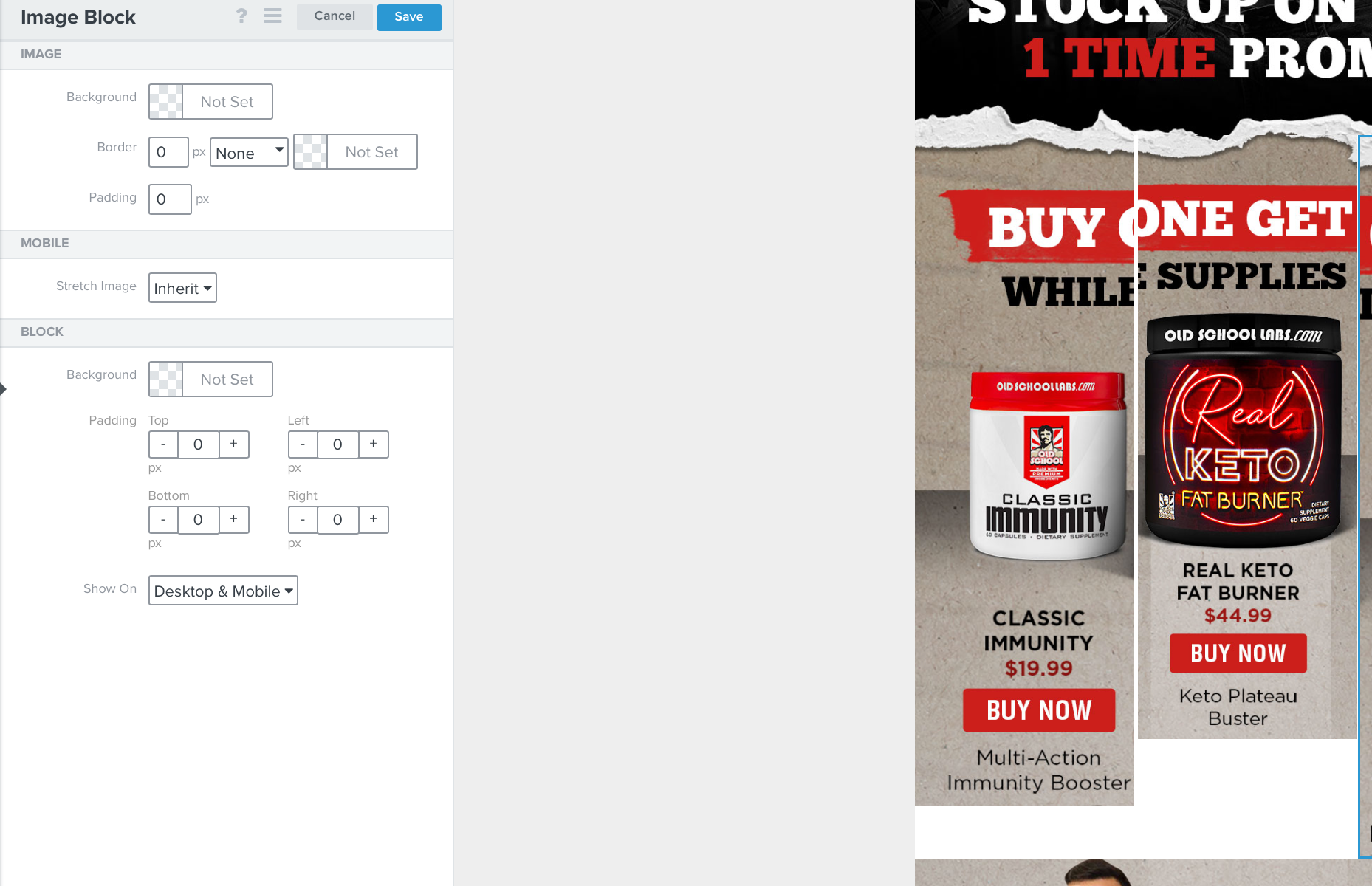
Here are the settings for the right image block–
Even worse yet in the PREVIEW another image appears above it that is not shown when I get into the Edit Content mode. So I cannot even remove it because it does not appear when I get into the edit mode. If I send a preview email, the other image above the block appears. I cant understand how this is possible. I saved the flow, got out of KLAVIYO and logged back in again. Same problem.
I am trying to understand why it seems so difficult to align 3 images that are the same height. My settings do not indicate any spacing or padding yet this is what I am left with–
I tried to build the 3 images butted up against each other in a Table Block and that does not work either.
There is no padding specified. All of the images are the same height, I confirmed in Photoshop at 954 pixels.
Hey @TeamWERQ,
I think the issue you are seeing of why despite these three images having the same height are not lining up directly next to each other has to do with the varying width of your images. For starters, the default email width of every template is 600px. While you can adjust this default setting, we don't recommend increasing the width of your template unless this is required for a more advanced layout as 600px is the recommended width to display appropriately on both Mobile and Desktop device. You can also learn more about optimal template and image sizes from the Optimal Email Template Width and How to Use Images in Emails Help Center Articles.
Since it appears from your screenshot you are applying 3 image blocks next to each while using columns, we can typically estimate that each column would be about 200px. Because these three images have varying widths, when applied inside each column, Klaviyo will automatically shrink and optimize these images to fit into the columns. Instead of stretching the content, Klaviyo will shrink them down which will result in the image heights being shrunken as well as opposed to be stretched.
To resolve this, I would suggest either importing and using a single image in your email of these three products side by side or alternative using a third party image editing tool such as Photoshop to cut these images into equal sizes (width and height).
In addition, when using a table block, you do have less control over the padding of each individual rows. However, if you were using an image in these table rows, I would suggest enabling the Fill Image Area setting to ensure your image fills up the entire area as much as possible. When using a table block to put these images side by side, I would still suggest ensuring you are using images that have the same width and height for these images to align properly. You can find this Fill Image Area under the image’s Align settings.
If you need further help optimizing and designing your emails, I would suggest working with an email design specialist or finding one from our extensive network of agency partners.
Thanks for being a Klaviyo Community member!
David
Now what if you are using lookup tags and you don’t know how many images you have. You just know you want two or three images per row?
When using the catalog lookup function, this would typically only display one product image unless you are looping and iterating over this variable. In which case, you should be able to apply conditional logic to check for the length of the list using a |length filter. This is also a bit reminiscent of how Klaviyo’s Recently Viewed Product function is set up where it uses a |length >= 3 to only highlight 3 products to display in the email. For further reading, I would also suggest taking a look at the Django Documentation to see what is possible using Klaviyo’s template editor.
I hope you have a great day!
David
Thanks for your reply, very helpful.
Hey @odp,
When using the catalog lookup function, this would typically only display one product image unless you are looping and iterating over this variable. In which case, you should be able to apply conditional logic to check for the length of the list using a |length filter. This is also a bit reminiscent of how Klaviyo’s Recently Viewed Product function is set up where it uses a |length >= 3 to only highlight 3 products to display in the email. For further reading, I would also suggest taking a look at the Django Documentation to see what is possible using Klaviyo’s template editor.
I hope you have a great day!
David
A simplified solution is posted below:
{% for item in person|lookup:'WishlistItemIDs' %}

    {% if forloop.counter0|divisibleby:2 %}
        <div class="controlsEachRow">
    {%  endif %}

    {% catalog item %}

        {{ catalog_item.featured_image.full.src }}

    {% endcatalog %}

    {%  if forloop.counter|divisibleby:2 or forloop.last %}
        </div>
    {%  endif %}

{% endfor %}
Table is a good solution (compared to using columns) for making sure background color works properly without white spaces. But it seems that table areas don’t allow for custom fonts, so while the background looks good, the module sticks out like a sore thumb due to font difference. So… ultimately I’ve got to choose which is lesser of two evils.
UPDATE: somehow when I left the template and came back, the font started appearing in the table! Yay! So table is an excellent solution.
Hey @JimmieaQuick,
Just for some clarification, custom fonts within an email template will work within any area using a text block. This includes the use of a text block within tables, splits, and columns!
David
why my columns and sections are only adding at the end of the template after the footer??

