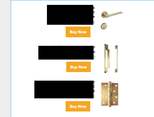
Hi folks,
I’m building a template (in the OLD builder) and I have a vertically aligned product block. If I align all the components right, the buttons don’t shift all the way across, and well… it looks bad. Is there any way to fix this?

Hi folks,
I’m building a template (in the OLD builder) and I have a vertically aligned product block. If I align all the components right, the buttons don’t shift all the way across, and well… it looks bad. Is there any way to fix this?

Best answer by David To
Hey
This sort of behavior is really going to be dependent on how the email is designed. For example, reviewing and understanding if the button was a stand-alone block or if it was an image added to a text block, are there additional stylings being applied, etc. would all have various different methods of causing and mitigating this behavior.
From an outside perspective though, I would suggest double checking to see if there were any padding being applied if the button was a stand-alone block. Similarly, if it was an image being pulled into a text block to mimic a button, I would suggest reviewing how the button/image was coded which may be overriding the padding styles applied to the text block.
There’s a lot to consider when designing your emails! If you were still having troubles with it, I may recommend reaching out to our Support colleagues to see if they can spot the issue or even reaching out to your own email designer to review more thoroughly.
David
Enter your E-mail address. We'll send you an e-mail with instructions to reset your password.