Hi!
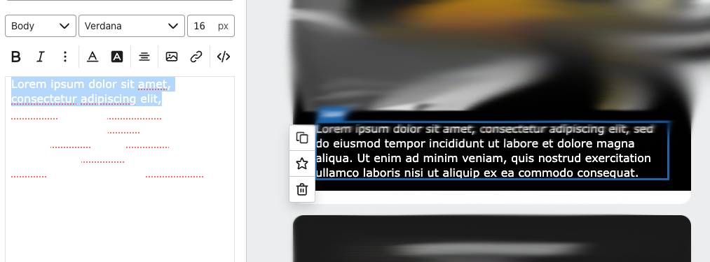
We have a suggestion to enhance usability: would you consider adding contrast to the cell block text when the text color is the same as the background?
Currently, we rely heavily on tables for most text components in our emails. One of our brands uses a black theme, which makes it challenging to work within the mail builder. To adjust text, we often have to temporarily change the text color back and forth just to make it visible.
Implementing this small adjustment could make the process much more seamless for users like us. Thank you!
Example:


![[Academy] Deliverability Certificate Forum|alt.badge.img](https://uploads-us-west-2.insided.com/klaviyo-en/attachment/505f2253-cde5-4365-98fd-9d894328b3e0_thumb.png)

