We’re unsure whether to let Klaviyo do line breaks on their own.

Or use a formatting tool like format-it.com to set each line length a certain number of characters.

Preview emails using this system look great in Outlook and Gmail read on a desktop.

Our system:

This 75 characters of text across the screen is our MAXIMUM for email copy.

Here's our 75-character text-ruler:
/-------------------------65------------------------------------]
/-------------------------70-----------------------------------------]
/-------------------------75----------------------------------------------]
Target most lines to be 65 or fewer characters-- with 75 maximum.

Useful, free online tool to use: Formatit (set to 65 target).

Replace body copy originally as written with FormatIt pasted
version, manually editing any lines as needed to be up to 75 but NO MORE.

….

That system was working for us (we thought). But the WYSIWYG editor and desktop email client review did not show us how bad this was looking on mobile devices. On mobile devices, everything looks wonky and awful with hard-carriage enter returns in strange places.

Here’s what we’re trying now by sending a test campaign to our internal preview list--

Hi {{ first_name }},

This is Danny typing all the way across in Klaviyo without stopping in the plain text editor. What does this look like? How far does it go? Where is the line break? I think if this looks good and natural in the email recipient's inbox then we should calculate at what character number Klaviyo naturally does the line break ("character number" were last two words in this text editor, but what about lines in actual email?) and model that for our email formatting plan.

1234567890 This is a real 65 characters across screen! 1234567890

This is what happens when we take 135 real characters across a screen and don't wrap it with any tool because we just let Klaviyo do it.

This is what happens when we take 135 real characters across
screen and wrap it using formatting to 65 character maximum for
each line.

1234567890 This is a real 70 characters across screen! 12345678901234567890

This is what happens when we take 135 real characters across screen
and wrap it using formatting to 70 character maximum for each line.

1234567890 This is a real 75 characters across screen! 12345678901234567890

This is what happens when we take 135 real characters across screen and
wrap it using formatting to 75 character maximum for each line.

Which of the "This is what happens" statement above renders best for you?

But frankly...with that above test we’re still just guessing what format will make Klaviyo happiest and render things in a way that gives our goal of shorter lines and better reading experience in the email recipient’s inbox-- while not causing any unintended consequences like we’re experiencing now for some readers.

Any best practices on this for line length / number of characters in Klaviyo?

We’re trying to get our system down.

Right now if we copy and paste from where we compose in Googledocs directly into Klaviyo-- it maintains most of our font formatting (font type, italics, bold, underline) but the relative distance between items, paragraphs, and indents is weird. So we’re trying to create an intermediary step that allows us to paste from Googledocs somewhere and get the line length right plus strip out any weird spacing stuff-- and then paste that into Klaviyo. It means we then need to go in and fix the font formatting, links, italics, bold, underline etc in Klaviyo directly but that seems inevitable.

If we could solve both things that would be amazing: maintain all text formatting / links when pasting from Googledocs, plus set our ideal length where each line is not going to go all the way across the screen of the reader in their email client. But that may be asking too much, who knows.


Thanks for your help Klaviyo community. You guys are 3 for 3 on questions asked and helpful kick-ass answers. Hopefully we can keep that going and one day you all can find me in here helping too.

Danny Welsh


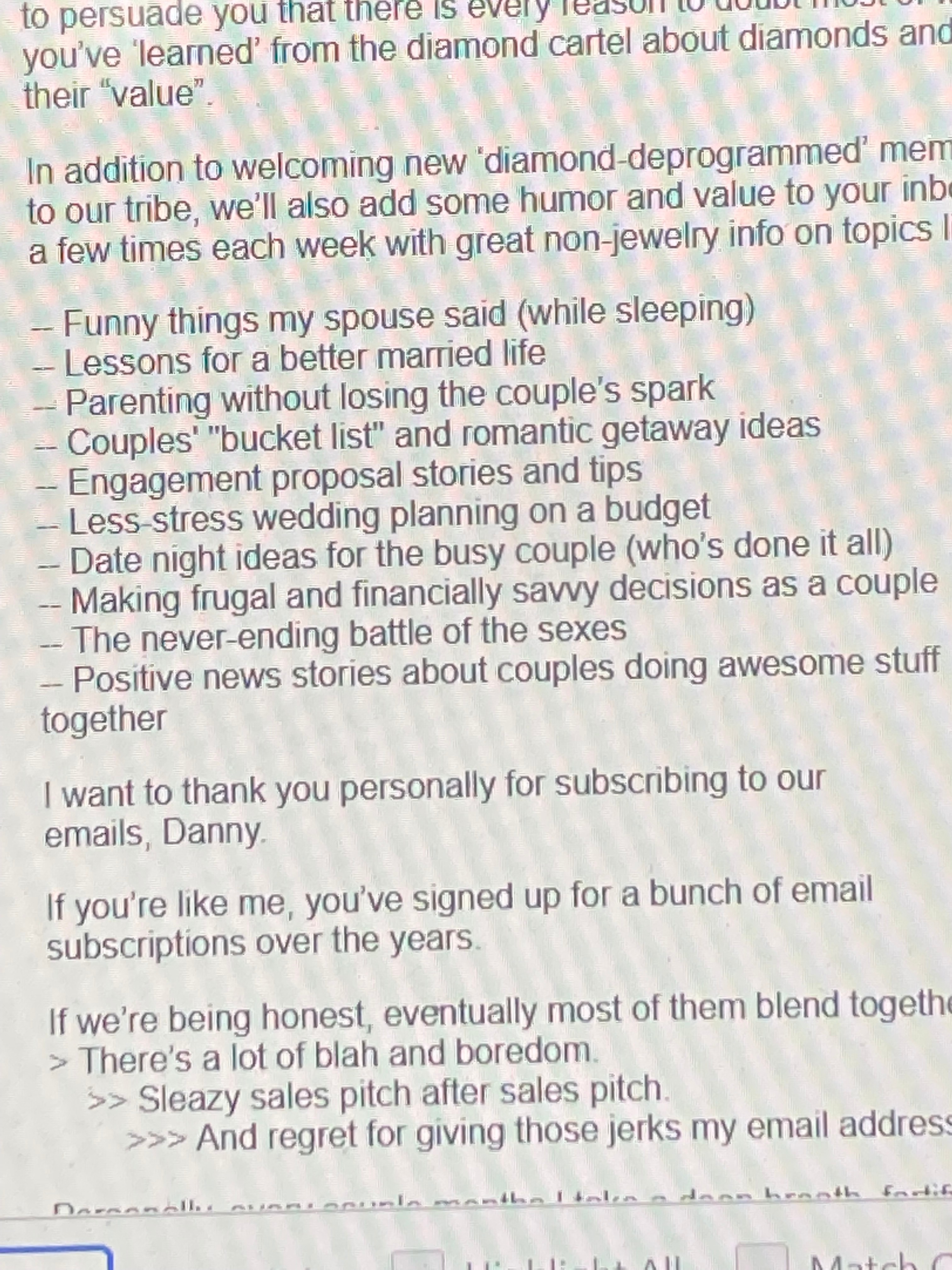
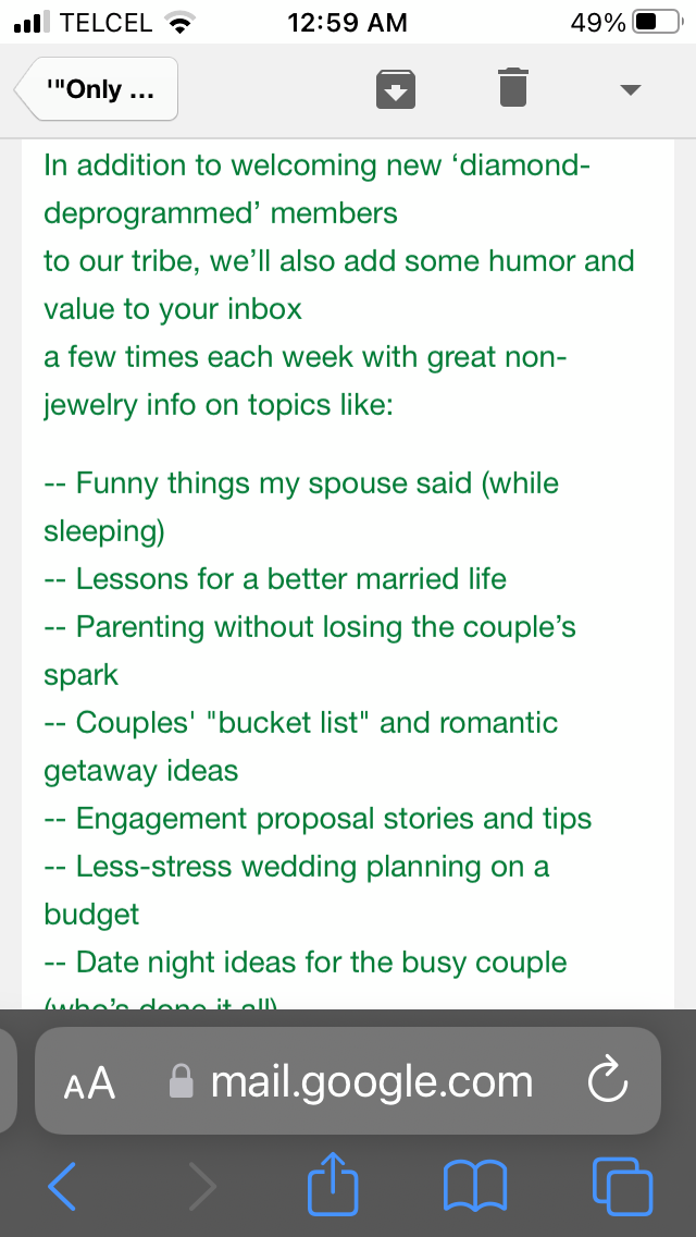
Here’s a picture of how an email looks in a desktop browser client (Yahoo and Gmail and Outlook, this is Yahoo) at top and bottom a screenshot from the same email read on an Apple iphone device with random end of line after “members” and after “inbox”. We’re seeing random line breaks just about every paragraph on a mobile device. Could use some help! I was thinking the images may help...


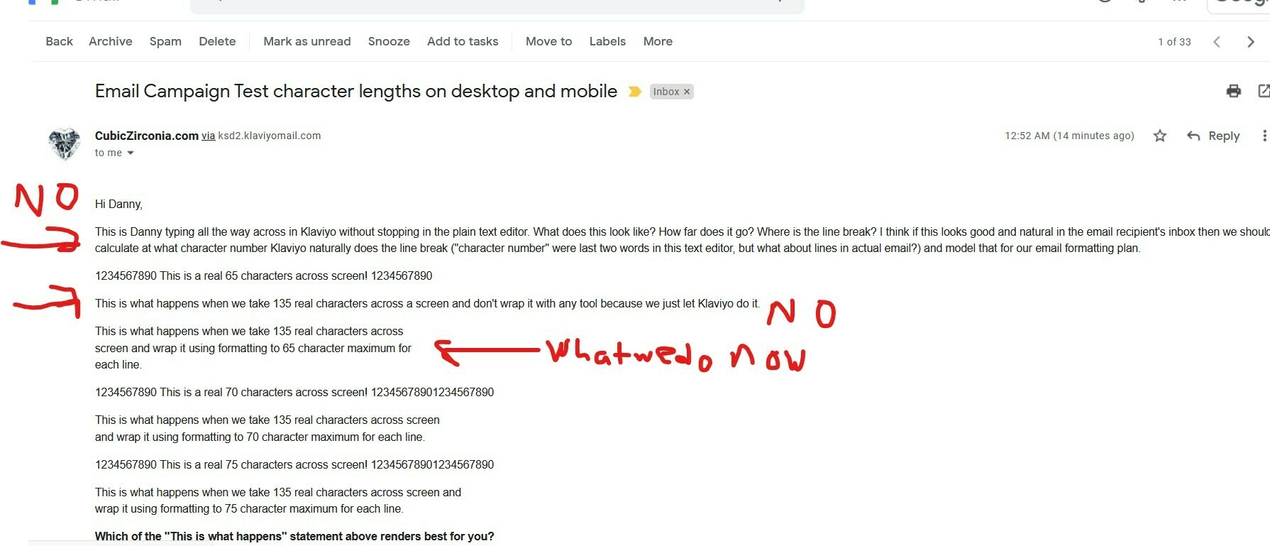
Our test email on desktop Gmail trying to solve this.

Wrapping characters at 65 across looks great-- though 75 looks pretty good too.

Allowing Klaviyo to go all the way across looks pretty awful on desktop gmail though.


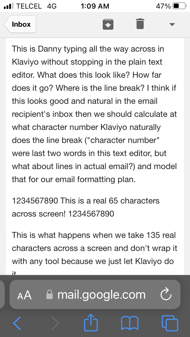
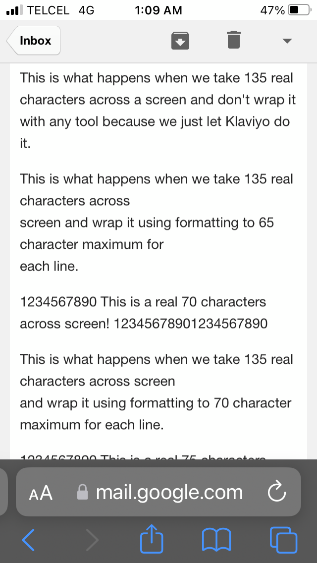
Our test email on gmail mobile apple iphone device trying to solve this.


Allowing Klaviyo to go all the way across looks pretty okay here (but the drawback is the same thing is waaaaaaaaaaaaaaaaaaaaaaaaaaaaaaaaaaaaaaaaaaaaaaaaaaaaaaaaaaaaaaaaayyyyyyyyyyyyyyyyyyyyyyyyyyyyyyyyyyyyyyyyyyyyyyyyyyyyyyyyyyyyyyyyyyy lengthier and a poorer reading experience on desktop gmail though.


Wrapping characters at 65 or 75 across, however, may looks great on desktop gmail-- but the same thing is rendering weirdly in Apple gmail mobile iphone reader.


Compare the 65 wrap here where there is a random line break in the middle after the word “across” and two lines down at the word “for”.

It seems there must be a way to wrap text that doesnt cause problems in mobile versus desktop view. (And this is just gmail Apple iphone versus Gmail web client...if the problem is happening here, no doubt other mobile vs desktop client situations are having similar or worse problems with rendering consistently).


OK 80 characters looks pretty good on desktop gmail and Apple gmail for a few small tests.
 
We'll try that as our new default for a few programmed emails in Klaviyo and see what happens. *crossing fingers*
 
I’d still really like to know WHY this is true (if it indeed is true) and whether this is congruent with any published best practices Klaviyo has on the subject!

Nevermind, spoke too soon. 80 character text wrapping is not the answer. :(

Hopefully we’ll look later today or tomorrow and someone more experienced with Klaviyo will jump in and make my day!


Hey there @ringscompany,

Thanks for your thought out post and testing results. 
I think I have some info regarding the spacing issues you might see or line breaks. It is a common thing to notice across most email platforms that formatting for mobile and desktop leads to tricky situations and weird spacing issues.

One thing I would check when you are inserting templates or text is to make sure not latent formatting is impacting it. You can avoid this by copy+paste w/out formatting. I also recommend using Litmus/Email On Acid for email preview tools as other Community members have found those to be better suited for our platform. 

Unfortunately, there is no way to control where the wording breaks - however, there are here are my two alternatives for you:

  • Use the Styles section to control the responsiveness of the text size for mobile view:?name=inline-1883451942.png
  • The other alternative would be to create 2 separate text blocks and display one for Mobile and one for Desktop. Then on the Mobile text block, you can control where the line breaks manually. 

?name=inline249786400.png

For buttons, unfortunately, the font size will need to be scaled down (or use to separate button blocks for different views.) That's the only workaround for that.


Hope this helped and would love to see what other Community members have to say on this as well,

Alex


Hi Alex,

Strangely enough, Email On Acid did not reveal these issues.


I’ll note the Styles section idea for later.

Right now we’re just doing simple text only versions of the robust visual emails we’d planned.

Not using the template editor or HTML stuff. Just picking texts that can be sent without any logistics or visuals needed (whether they’d improve the experience for readers and performance of campaigns is unknown at this time, though I expect they will when we figure that stuff out).

Something is better than nothing kind of thing. Honestly, I had to make that decision after 10 months with a Klaviyo account and a shop full of employees who’d yet to figure out even the basics of template design (and what we want to do is much bigger than basics)...text only seems like a small win to get us some momentum.


That said, once we get our visual templates designed I have no problem at all having the team put every paragraph in there twice-- one with sentences wrapped at a pre-set character limit that matches our style and will render well on desktop...and the other to show on mobile with text not wrapped at all, which allows Klaviyo to do it for best fit to the user’s screen (what appears to be happening with unwrapped run-on text in mobile that looks good but awful on desktop). That is great advice and not something I knew was possible.


It sounds like I’ll just have to live with this issue currently...because we’re not seeing any of this with EmailOnAcid previews.


One last thing, maybe we’re doing something simple that’s not smart.

What did you mean exactly by “ make sure not latent formatting is impacting it. You can avoid this by copy+paste w/out formatting. “ Can you walk me through that like I’m a 3rd grader?


Reply