Hi, when sending a preview email versus sending a live campaign we noticed that there is a white dot in dark mode Outlook in the upper left hand corner of the email- it is only noticed in the campaign- does anyone have any insights on this?
Dot in left corner of email
![[Academy] Deliverability Certificate Forum|alt.badge.img](https://uploads-us-west-2.insided.com/klaviyo-en/attachment/505f2253-cde5-4365-98fd-9d894328b3e0_thumb.png) +6
+6Best answer by stephen.trumble
Hey
Thank you so much for coming to the Klaviyo Community for help with your campaigns being viewed in Dark Mode.
We understand Dark Mode can be an issue with regards to how it affects your design and formatting of your email. There are multiple devices and email apps that handle Dark Theme on the HTML side differently. At this time, Klaviyo is still investigating the current solutions that have come across various resources. While we are eager to find a solution for everyone, we need to keep in mind which workaround is short term vs long term. In addition to that, Klaviyo will need to consider which client enforces Dark Theme up front and how they handle the HTML on the backend. We appreciate you being patient with us.
For more information, please see some related content below:
* Email on Acid - Dark Theme
* Apple’s Dark - Theme
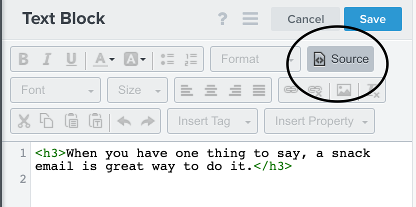
If it is only Outlook that appears to have the white dot it is likely the way the template CSS is being rendered in Outlook. That being said, if your team has any CSS you want to add, you can add this under Source in a text block:

Another item that may be the white dot in dark mode is possibly the Klaviyo tracking pixel. This pixel is used to cookie views of your email, and is located at the top or the bottom of your email based off your account settings. You can test this theory out by following the steps in the included Help Center article to move the pixel in your templates and see if it renders the white dot at the end of your emails, instead of the top left (the beginning of your email).

I hope this helps you figure out the white dot mystery! Thank you so much for being part of the Klaviyo Community!
Log in to the Community
Use your Klaviyo credentials
Log in with Klaviyo
Use your Klaviyo credentials
Log in with KlaviyoEnter your E-mail address. We'll send you an e-mail with instructions to reset your password.


