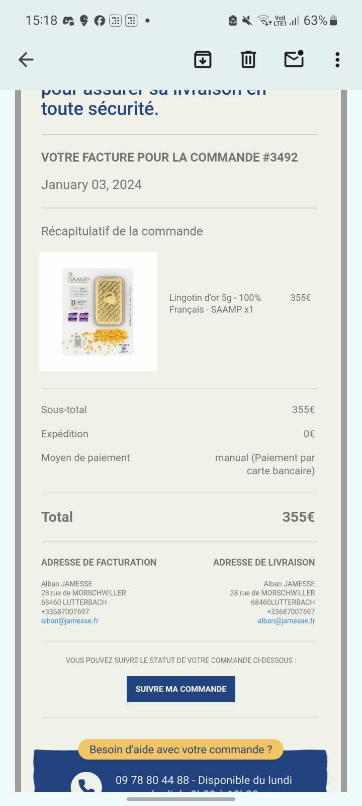
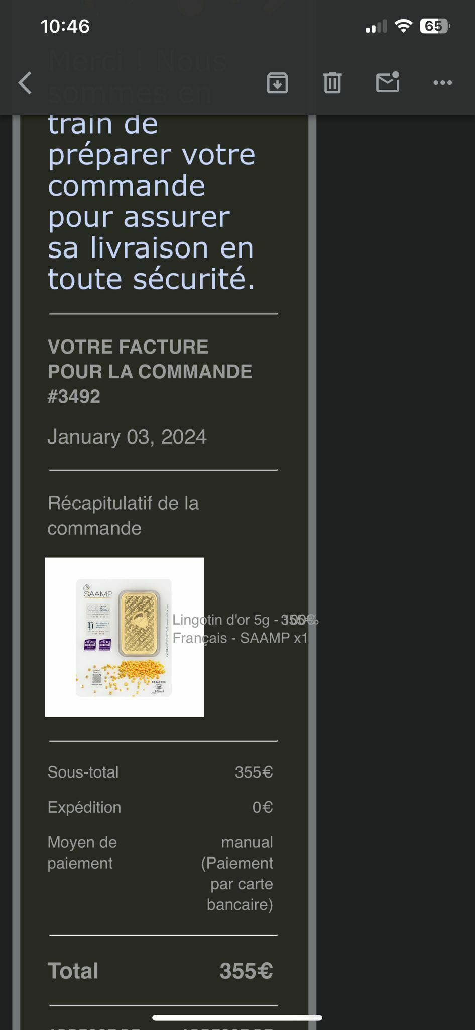
My email looks very different on android vs IOS


For information, I am using CSS media queries to control everything on the mobile side.
The preview in Klaviyo looks like the IOS one. What should I do?
My email looks very different on android vs IOS


For information, I am using CSS media queries to control everything on the mobile side.
The preview in Klaviyo looks like the IOS one. What should I do?
Best answer by Taylor Tarpley
Hi there
Unfortunately, templates are likely to look different on the following:
+ Android 6.0 as well as Gmail for Android
+ Google Inbox (Android) and Yahoo
Android will almost always render templates differently, because they do not respect media queries as this is a limitation of android itself. The best way to resolve this is to use email preview services like Litmus or Email on Acid to see what your emails would look like on different platforms. Unfortunately, there isn't anything Klaviyo or another ESP can do to change how Android respects media queries.
I do sincerely apologize for the inconveniences!
-Taylor
Enter your E-mail address. We'll send you an e-mail with instructions to reset your password.
