I’ve been using Klaviyo nearly every day for the past 2 years and find myself custom coding a lot of things to gain greater control over element styles (where I can).
I’m requesting these features for 3 reasons:
- Speed up the time it takes to create an email (minimal-no coding within text blocks)
- Provide greater control over styling, allowing for more unique designs
- Maintain client-friendly templates (no dealing with coded blocks)
These are the most common things I would LOVE to see:
Email Editor
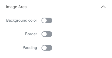
Add border-radius as a UI option for images. And add an option to control hover styling.
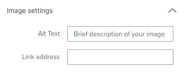
Add text-alignment UI option for images (alt text always shows up left-aligned and looks bad in center-aligned designs).
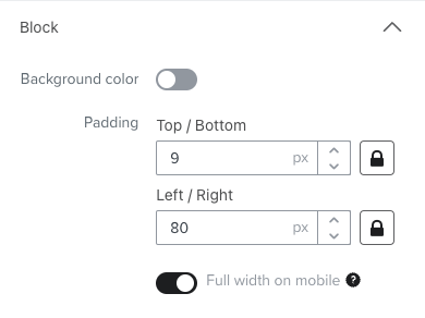

Leave 18px (default mobile padding) when full width on mobile is selected for buttons; or have an option to toggle the 18px on/off. And add an option to control hover styling.
Add valign=”middle” to split blocks.
Add ability to control individual column padding in split blocks and use class=”mob-no-spc” so it fills full width on mobile with default left/right padding of 18px.
*Provide a space to enter custom styles in the head code; could just be a toggle switch in the styles tab that inserts <style></style> right before the closing </head>. This would allow those who are into coding to create more unique inbox experiences, like using the checkbox hack +more, without risking the rest of the head code getting tinkered with.
Popup Editor
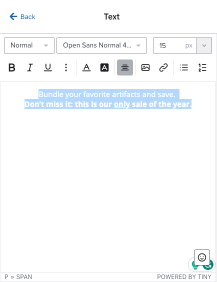
Change the background color of the text editor text to avoid white on white, black on black, etc. and provide access to the source code in text blocks (like it does in the email editor).
Thaaaaaanks!!!
