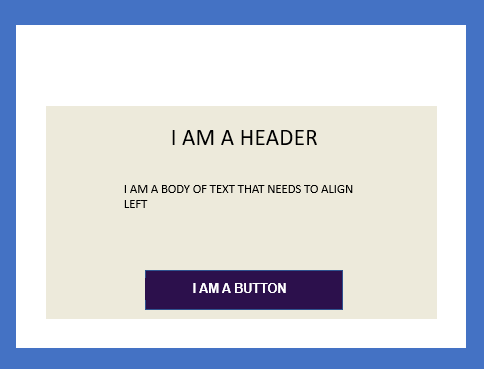
Hi i am currently transfering bits from Dot Digital into Klaviyo and trying to build a block that contains a button. The button needed is one colour the block is one colour but the block to have a margin which effectively is another colour. Needs to look like the below image. White part is the actual email width where I have an image at the top of the email which is size. Currently I can only get to look this. which is pretty pants! Any ideas would be appreciated.
Page 1 / 1
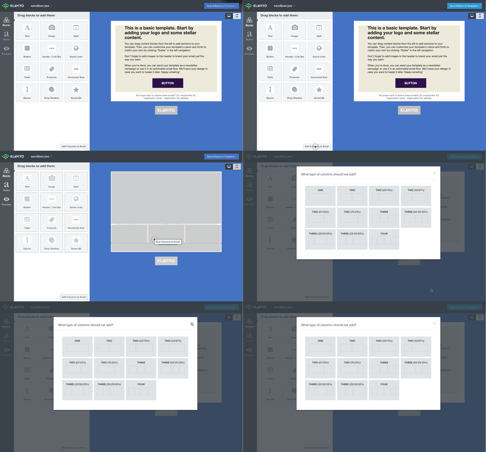
@davemanson - I tried to replicate what you’re trying to do, and I’ll admit it’s a bit hacky. What I did was insert a “3 Column” Section and put the Button Block in the middle, and two empty Text Blocks on either side (and made sure it only showed on Desktop view because columns stacks on Mobile).
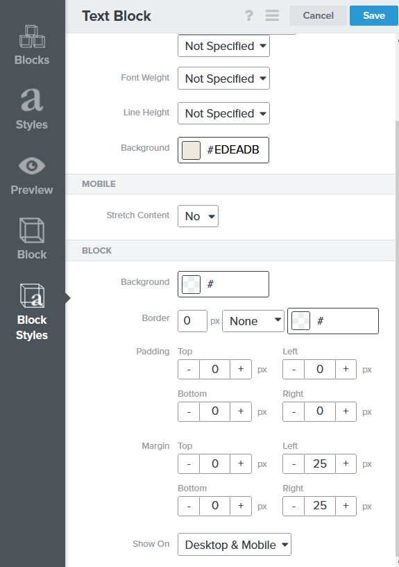
Then by adjusting the two Text Blocks’ inline Background color, and fiddling with the margins, it sort of works.
You can see that here:
However, as soon as you switch to Mobile, you will have the same problem unless you can represent it differently on mobile without the gutter. So this may not be fool proof either!
Another approach may be simply to insert a Table Block and build your own Button in HTML. It’s definitely not as elegant or simple as the native Button Block. Let us know how it works out!
Thanks it is very hacky! I did try that to be fair, the only issue is outlook renders buttons in a different way to the actual the preview so looks even worse in outlook!
I think HTML is the only way to go.
The whole email is going to have to be run done for mobile which is really annoying! Maybe I can persuade my client changes is good!
Thank you
@davemanson Here’s a quick HTML/CSS I’ve compiled for that button. Maybe you can try and see if this works for you. Just copy and paste this code into the Source of a Text Block.