Solved

How Can I Adding Multiple (4) Google Fonts to an Email Template?

  • 14 September 2021
  • 6 replies
  • 661 views

Hi there - I want to use our brand fonts in our email templates, and figured the best way to do that was to use Google fonts and assign each font to a h1, h2, h3, and h4 tag. I’ve read the https://help.klaviyo.com/hc/en-us/articles/115005256008-How-to-Add-Custom-Fonts-in-Email-Templates at east 15 times and have gone through quite some testing, and am now stuck at getting both these fonts to show in the appropriate tags I set for them. 


Here is what I want from a brand standard:

H1 = Exo 2 Semi-bold 600

H2 = Open Sans Semi-bold 600

H3 = Extra-light 200

H4 = Open Sans Regular 400


And here is the code I was copying and pasting into the text block in Klaviyo, per the instruction outlined in the help article:


<style type="text/css">@import url('https://fonts.googleapis.com/css2?family=Exo+2:wght@600;200&family=Open+Sans:wght@400;600&display=swap');


  p, ol, li, ul, h2, h4 { font-family: 'Open Sans', sans-serif;

  }


  h1, h3, { font-family: 'Exo 2', sans-serif;

  }

</style>


And it’s working, I am getting the different fonts in the different H tags, but is there a way to assign the specific weight of the font to each h tag such as the H1 being the boldest (exo 2 semi-bold 600)? It seems that by default the H1 tag is thinner, and the h2-h4 are more bold, which is confusing me and I am not sure why. 


Oe if there is a better way than Google Fonts to accomplish this, please let me know, thanks! 


Hi, welcome to the community!

Whenever someone is using custom fonts, I have to add mention that careful with the formatting on email clients that don’t support custom fonts in email (most of the popular ones), so test it out before sending!

Okay, a quick and easy way to make sure h1 and h3’s are bold is to add one more line in the css code:


h1, h3, { font-family: 'Exo 2', sans-serif;

font-weight: 600;

  }

Also, remove that comma after h3 or else it won’t work. 

Hope that helps!


Thanks! That still didn’t work though 😞 I can get it to work with one custom font, but not more than one


Hi @X-Chair Marketing


Thanks for sharing your custom font question with the Community! I’m sorry these custom fonts aren’t displaying the way you want them to at the moment.


As @Mailbox Manny astutely mentioned, creating custom fonts can be a bit tricky sometimes as some inbox providers support custom fonts displayed in their inboxes and other don’t. Correct coding in custom fonts is especially important, it seems that your code is correct, however I would suggest you investigate it again to potentially catch any additional punctuation or spaces, like the ‘ , ’ after h3, mentioned above. Our fellow user also gave a great suggestion of adding a line of css code to your h1 and h3 font to make it heavier than h2 and h4. Can you confirm whether or not the code ‘ font-weight: 600; ’operated successfully to increase the size of the font? 


Additionally, do you mind sharing more about what you mean when you said, the following? 


I can get it to work with one custom font, but not more than one


It seemed that your goal was to only make one custom font, that contained h1 heavier, do you mind giving a little more insight as to what you mean here?


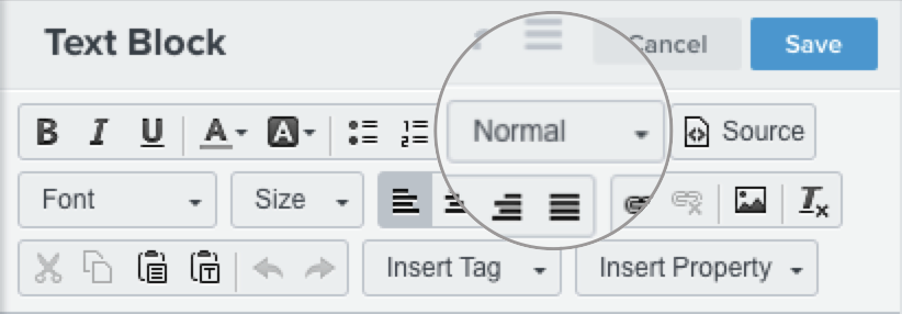
Finally, to ensure that there are no vital steps missed in this process, can you confirm that you have placed the custom font code in a text block at the very top of your campaign and that all your text that your want formatted with your various custom fonts has a default style applied ((Normal, Heading 1, Heading 2, etc.) as seen below? 


Thanks for being a part of the Community! 

-Taylor 


Hi guys,


In my case, I want to use different size of the same font, I don’t think this problem has been addressed yet.


I’m using the “Montserrat Alternates” font from Google.
The “Montserrat+Alternates” is for the regular font and the “Montserrat+Alternates:wght@400;600” is the bold version of the font.

I want to use the regular font for paragraphes and for the titles the bold font.

Then, is it correct to write it like that? Also, I am not sure when the font has space in its title, what should I write? Leave it with a space like ‘Montserrat Alternates’ or should I add the “+” symbol?


Here’s what I found:

<style type="text/css">@import url('https://fonts.googleapis.com/css2?

family=Montserrat+Alternates&Montserrat+Alternates:wght@400;600&display=swap');

  p, ol, li, ul { font-family: 'Montserrat Alternates', Arial, Roboto, sans-serif;

  }


  h1, h2, h3, h4 { font-family: 'Montserrat Alternates', Arial, Roboto, sans-serif;

  font-weight: 600;

}

</style>


Thanks for your help,

Best regards,

Arnaud.


Hi there - I have the same question as Arnaud. Can someone please help?


I’d like to use two different font weights for the Google font Poppins: Regular and Semi-Bold
This is the import URL.

https://fonts.googleapis.com/css2?family=Poppins:wght@400;600&display=swap

 I’d like to use Regular for my paragraph and Semi-Bold for my headings.


This is the source code I’m using per the instructions in previous posts. I included this source code as the first text box in my template. Unfortunately it is not working! :(


<style type="text/css">
@import url(‘https://fonts.googleapis.com/css2?family=Poppins:wght@400;600&display=swap');
  p, ol, li, ul { font-family: Poppins, New York, sans-serif;
font-weight: 400;
  }

  h1, h2, h3, h4 { font-family: Poppins, New York, sans-serif;
font-weight; 600;
  }
</style>


Thanks for your help!

-Diana


Hi there @ArnaudLaf and @Diana123 , 


Thanks for sharing your question with the Community, I’d be happy to help! 


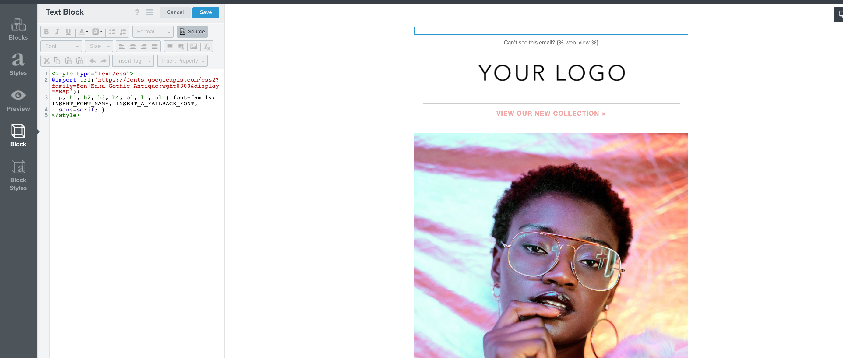
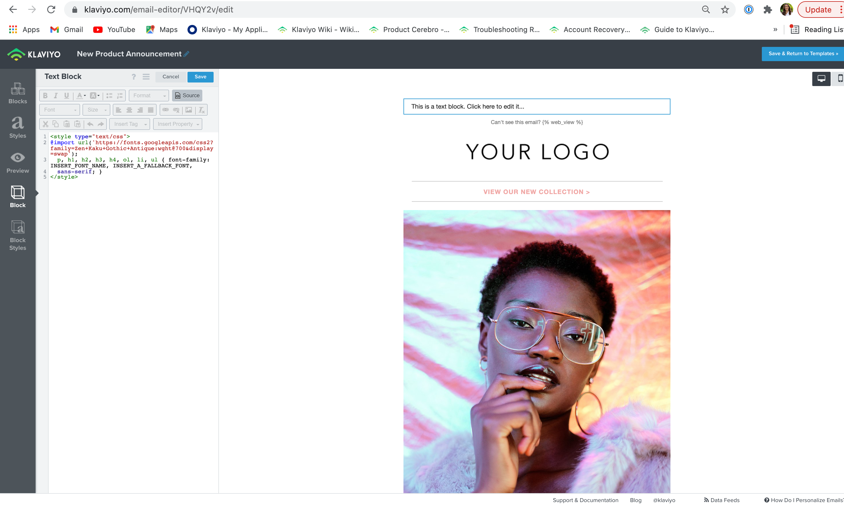
@ArnaudLaf, Yes the ‘+’ and spaces look correct in your code! To both of you, you can manually adjust the font to be heavier within the specific text block's HTML code or block settings if you are having trouble with the code. Additionally, to accomplish this, other users have found success by separating each font into two text blocks instead of including them both in one. The top image is one text block holding one coding for custom font and the second screenshot has the coding and text block for the second font. 


However, if you still are having issues with adjusting custom fonts in your account, I would reach out to support to see if they can help spot any common issues. Additionally, I’d recommend reaching out to a Klaviyo Partner who can better perform a deep dive into the issue! 


Thanks for being a part of the Community! 

-Taylor 


Reply