How Do I Add Responsive Page Margins in Email Builder?
Hi There,
How do we use your email builder to create nice spacing like we see in your own emails?
See attached, notice how on desktop the page margins are nice and wide but on mobile they’re smaller. How do we achieve this using your email builder?
And how do you set these sorts of block spacing styles template-wide (and override as needed)? That way, you don’t have to keep changing the spacing every time you add a block!
I hope that makes sense.
Cheers
Ben
Page 1 / 1
Hi @Ben
Thanks for being a part of our Community and contributing to your first post. We’re flattered that you think our email spacing is nice! Happy to help provide some thoughts on this:
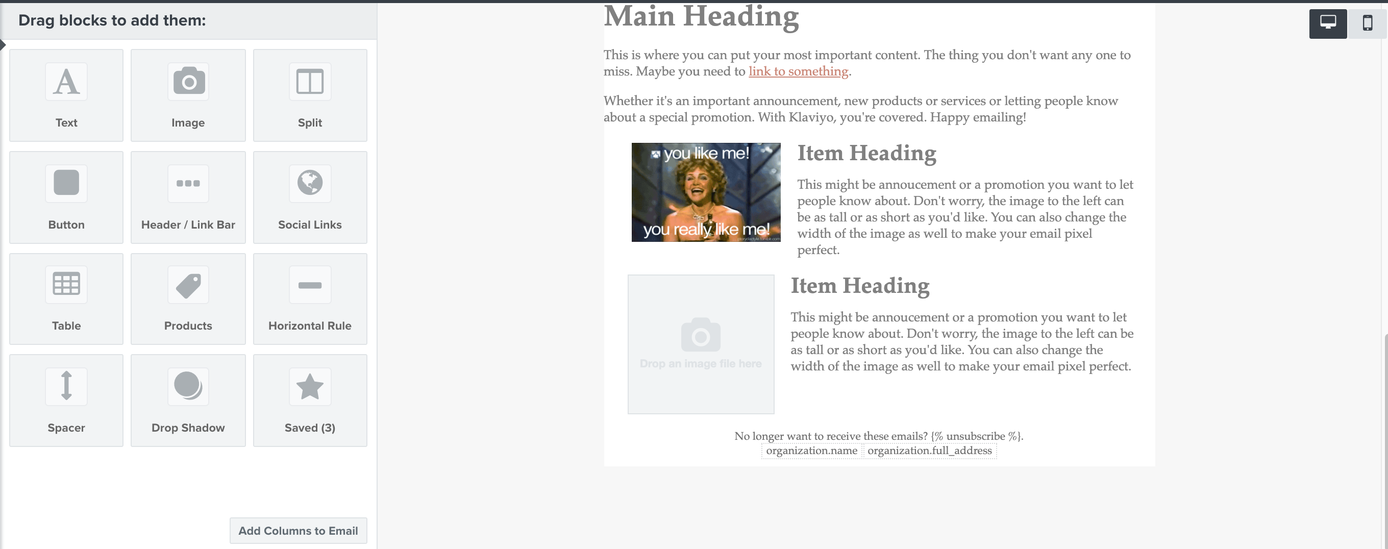
When editing your emails, you have the option to switch between Desktop and Mobile in the top right corner (image below):
When you click on a block, you have an the option on the bottom to show the Margin and Padding on Mobile, Desktop, or both (image below)
You can pick and choose what design and format you want to customize for Mobile or Desktop view! For your second question, you can save blocks so that you can always refer to a particular style. You also recommend creating a base template so that you can always keep the same styles and formats. You can view instructions on how to do this, in this Create a Base Template article.
Hope you found this helpful, Ben! -Cass.
@cassy.lee I think your response might be a little misleading here, because it sounds like the user can decide how much block margin/padding to display on mobile and desktop independently. Whereas all you can actually do is just show the block on desktop or mobile or both.
Thanks – O₂
Hi @Doubleo,
Thanks so much for keeping me honest! My apologies if my response was a little misleading, and you’re totally right that the block margin/padding displays are not necessarily independent. To help clarify how mobile margin and padding work:
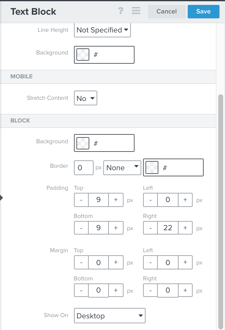
To add margin or padding that will only be visible on desktops, use left/right padding in the Block section of the Block Styles tab for your block. This left/right spacing will disappear on mobile.
To add margin or padding that's shown on both desktops and mobile devices, use the Margin options in the Block section of the Block Styles tab for your block.