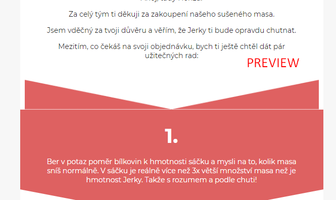
Hi, I would like to add section dividers to my emails, but for some reason there is always some small spacing that makes it look bad.

See pictures below:
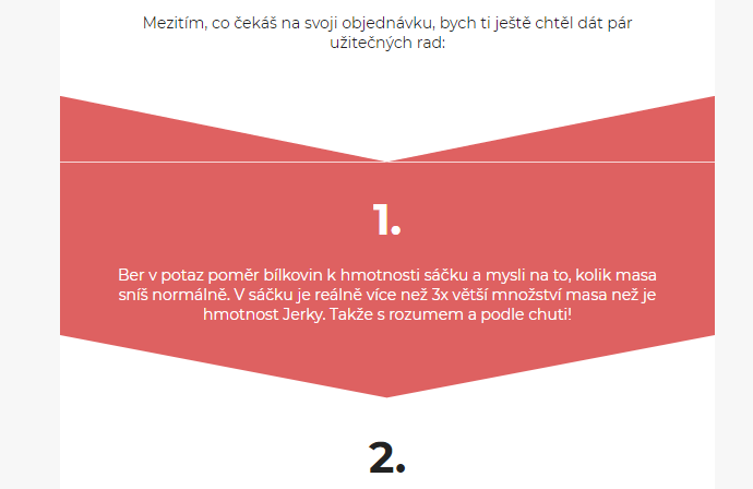
This is how it looks in editor
This is how it looks in preview mode
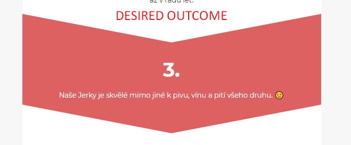
This is how I want it to look...

Can you please tell me how to achieve this effect? :)

Thanks!

Hello @petrlehuy,

Thanks for sharing your question with the Klaviyo Community.

First, I recommend removing all padding from the top and bottom of each block and also ensure there is no border.
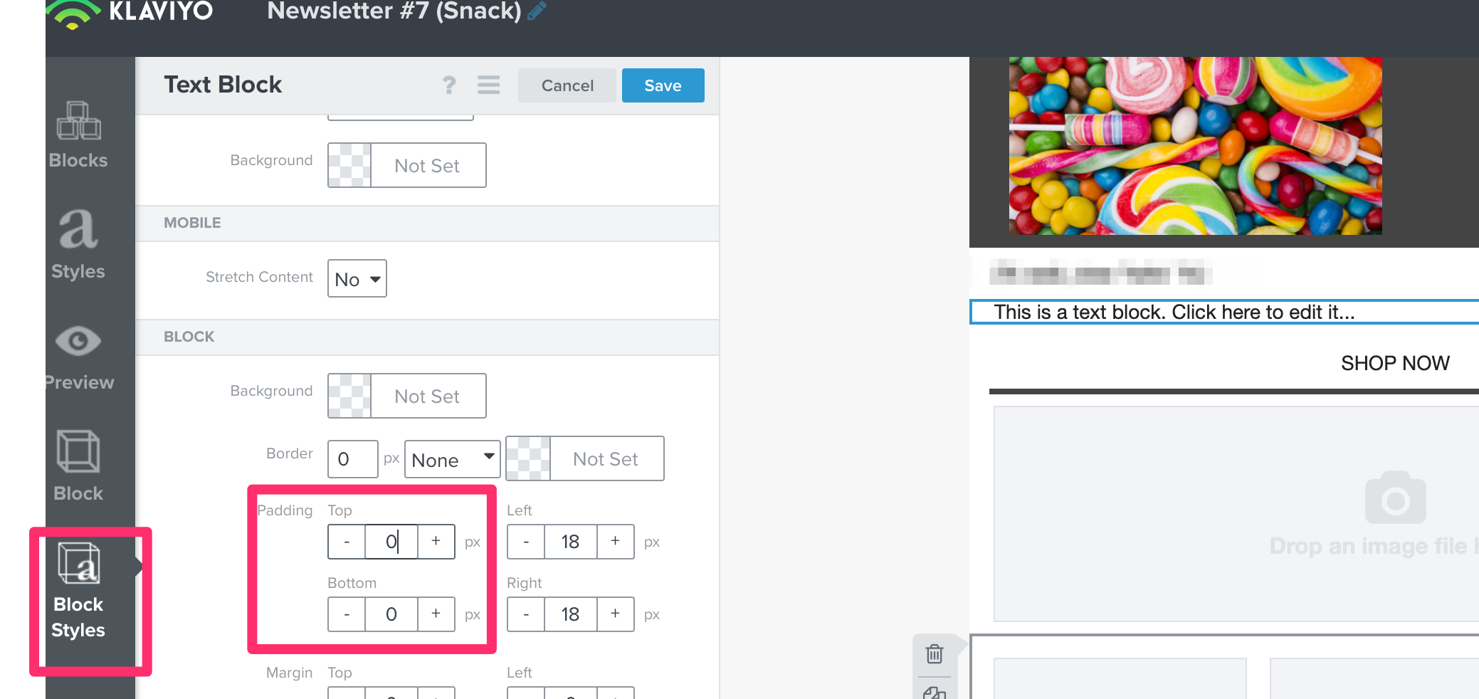
 

Additionally, if you are using images, I recommend using the “fill image area” option. Lastly, you can try adjusting the content background under the “Styles” tab to the same pink color you’re using in the background and then set any other blocks you’re using to white under “Block Styles”.

If you are still noticing an issue after making this adjustment, I believe this issue is a result of certain devices and email clients rendering improperly due to the different <td> tags separating the blocks. I recommend testing on a few separate browsers to confirm.


Hello @petrlehuy,

Thanks for sharing your question with the Klaviyo Community.

First, I recommend removing all padding from the top and bottom of each block and also ensure there is no border.

If you are still noticing an issue after making this adjustment, I believe this issue is a result of certain devices and email clients rendering improperly due to the different <td> tags separating the blocks. I recommend testing on a few separate browsers to confirm.


hey @dov.derin could you specify how to resolve the issue with different <td> tags separating the blocks? Because at times I get the same issue (using gmail app for test). And i noticed that the issue was gone after i deleted the previous test emails.


Hello @petrlehuy,

Thanks for sharing your question with the Klaviyo Community.

First, I recommend removing all padding from the top and bottom of each block and also ensure there is no border.


Additionally, if you are using images, I recommend using the “fill image area” option. Lastly, you can try adjusting the content background under the “Styles” tab to the same pink color you’re using in the background and then set any other blocks you’re using to white under “Block Styles”.

If you are still noticing an issue after making this adjustment, I believe this issue is a result of certain devices and email clients rendering improperly due to the different <td> tags separating the blocks. I recommend testing on a few separate browsers to confirm.


Hi, I already removed all the padding, but unfortunately it didn’t work. Could you please tell us how to resolve the issue with <td> tag? 🙂 Thanks


Hi @petrlehuy,

I did edit my initial reply since you last checked I recommend giving these solutions a try as well (reposting them below)

Additionally, if you are using images, I recommend using the “fill image area” option. Lastly, you can try adjusting the content background under the “Styles” tab to the same pink color you’re using in the background and then set any other blocks you’re using to white under “Block Styles”.

I’m afraid there isn’t a way for us to alter those tags if you’re using the drag and drop editor.


Reply