Hi @Jeff B,
Thanks for sharing this with us.
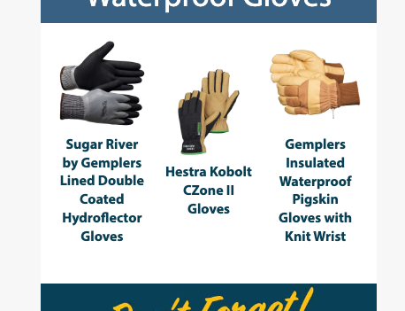
I understand that custom descriptions and lengthier product names can cause the product images in a product block to be misaligned. At this time, the simplest way to avoid this is to either not display the product name/description at all, or manually modify them to be the same length for each product. This will prevent the kind of image staggering you may be seeing.
With that said, I'd be more than happy to submit product feedback so our team may consider adding an option to align the product cells by the image. We greatly appreciate your feedback and I hope we can accommodate this functionality in the future as I can completely understand the manual editing is not ideal.
Thanks for being a community member.
I was having the same problem and found this post.
Thats an unfortunate response from Dov, seems like it should be something that has been addressed by now. I am beginning to build out more complex flows and utilizing dynamic product feeds but then that negates the ability to manually edit the names.
Would love to see the photos align at the top as a setting.
I’m having the same issue! And it would be such a simple fix I can’t understand why this hasn’t been implemented yet…. COME ON KLAVIYO
Hi there!
Thank you for sharing your feedback with us!
I want to affirm we do hear your feedback! The Community team do shares your feedback requests and features to the product team involved in the area. We know this is a pain point for our customers. We are working on improvments to our product block experience this half of the year and I will share in this thread when I have an update!
Thank you for sharing your voices in the Community and letting us know how we can make the experience better for you!
-Taylor

