Solved

Question about Layout split section on mobile view

  • 20 April 2023
  • 2 replies
  • 171 views

Badge +2

Hi,

I have a question regarding a split section.

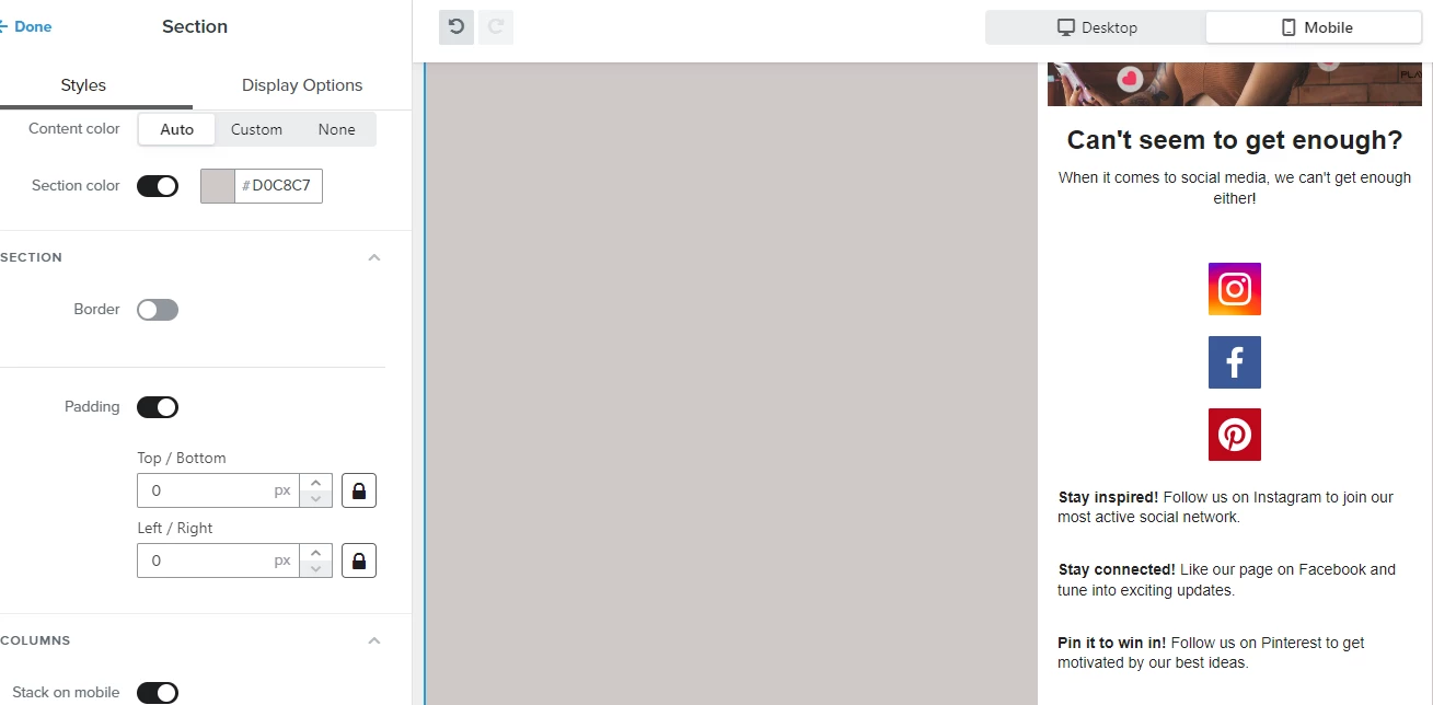
In my desktop view the social media icons are on the left of the text, since there is enough space.

In the mobile view looks it like below. Not really nice. Any chance to bring the text next to the icons? I played already around but couldnt find a suitable option.

Thank you


icon

Best answer by Spark Bridge Digital LLC 20 April 2023, 14:12

View original

2 replies

Userlevel 6
Badge +31

Hey @DaveSG!

In your screenshot, there is a toggle at the very bottom for ‘Stack on Mobile’ and you can swap that off to keep everything inline when viewed on mobile!

If you have other elements that you still want to stack on mobile, just not these social icons, you can move these icons & text into their own ‘Section’ where you can control the settings for stacking only for it.

If the formatting is still really different for that section when you do turn off stacking - you could control your icons and text in the ‘Display Options’ (One of the top tabs in your screenshot), and select Mobile Only (Just duplicate it to make sure you have a Desktop only version as well).

That way you can fully customize how Mobile looks without changing the desktop version on the email! Just depends on how stylized you’d like to get!

Here is a helpful article on the options you have as well: https://help.klaviyo.com/hc/en-us/articles/115005254428

Hope that helps!

Badge +2

Dear @Spark Bridge Digital LLC - thanks a lot for your detailed answer. But I couldnt make it, I tried what you wrote but it was still stacked. I have done it then finally with a table and 2 columns , this was working for me.

Reply