Hello everyone!
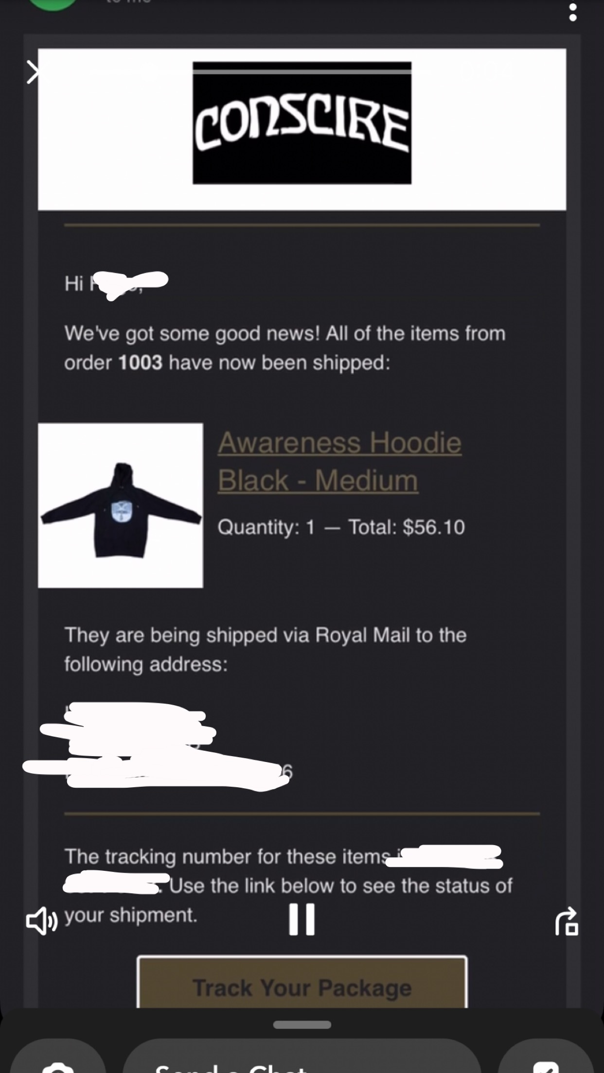
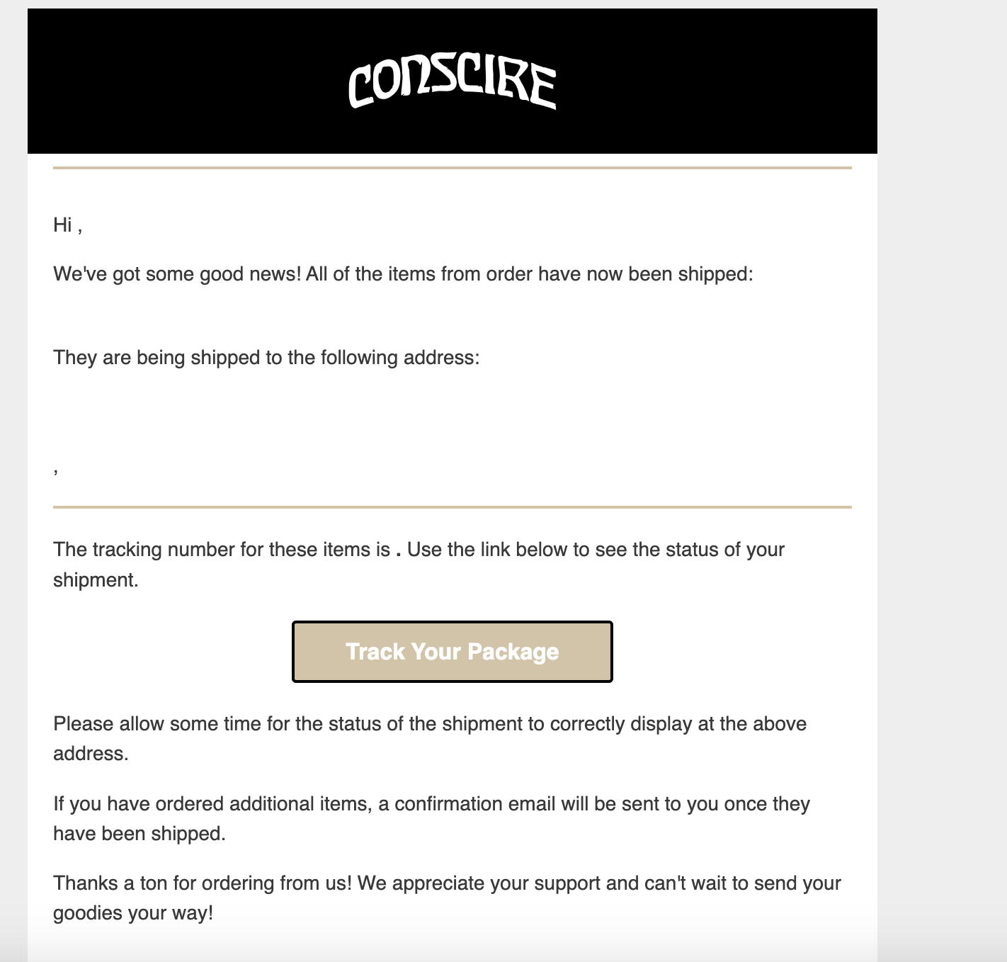
I have a few questions regarding Klaviyo confirmation emails that are sent to customers. I have attached screenshots of the email my friend received and my live template, and I noticed that the template looks different from what I had designed. Specifically, the logo appeared with a black rectangular box when the full background should appear black all the way, which may be due to his user interface being in dark mode. Is there a way to adjust this issue or should I redesign the template completely so that it is compatible with both dark mode and regular white mode? Furthermore, the color appears slightly different on his email, and I am not sure why.
I also wanted to ask for some advice on whether I should remove the standard "Thank you for your order" email sent from Shopify since I already have Klaviyo on all my confirmation emails. Any input on this would be greatly appreciated!


