Solved

Shopify order confirmation addresses lay out

  • 12 April 2021
  • 1 reply
  • 233 views

Badge +2

Hi all,

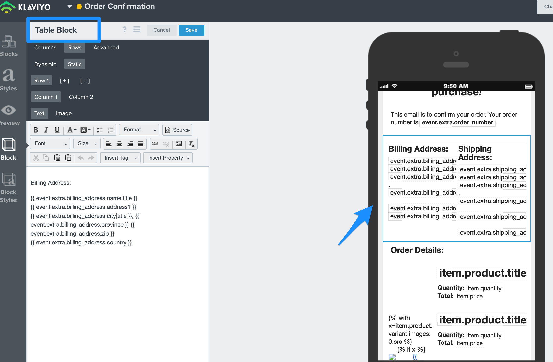
I am setting up my order confirmation e-mail using the Shopify template. I am using 2 columns to display the billing address and shipping address.

In desktop view the two columns are shown next to each other. However in mobile view they are displayed below each other.

I would like to display it next to each other in mobile view too. Tried to choose a smaller font fize and tried to decrease the column width, but this did not help.

Is there any known solution for this?

icon

Best answer by Dov 13 April 2021, 20:58

View original

1 reply

Userlevel 7
Badge +61

Hi @DopestJewelry,

Thank you for sharing your question and looking to the Klaviyo Community for some solutions.

Yes, the best solution is to use a table block instead of a text block. You can copy and paste the content from the text blocks into the table block directly by navigating to Rows > Column 1 (paste billing address tags) and then Rows > Column 2 (paste shipping address tags). Ensure you remove the default column headings (under the columns tab) or modify the column header names as you’d like.

Then, when previewing on a mobile device these columns will display side-by-side. I realize the in-app preview looks slightly off, but when you send an actual preview the text should align properly.

Thanks and have a great day.


Reply