


So, I’m very surprised that the Table element doesn’t have a function to allow stacking columns on mobile.
I’m trying to create a design where you have
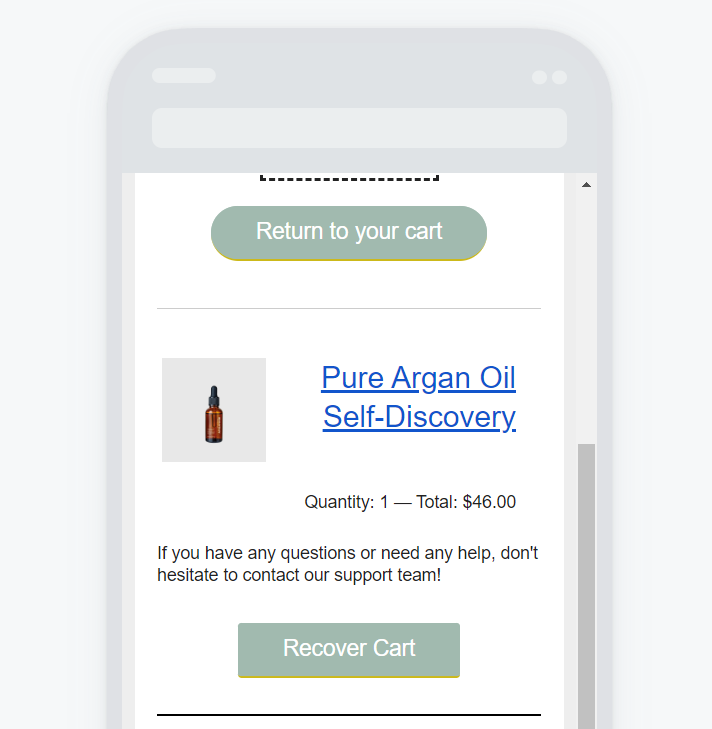
[image] [description]
[description] [image]
And I’d like the description to move under the image when I am on mobile.
Currently, it’s really not looking great.
And adding a “mobile only” version table increases the size of the email and it ends up being clipped on Gmail.
The Split option doesn’t work for me as it’s not possible to vertically align the description text
And the column layout just adds useless bits of code + I need to add single columns on top of each 2-column I want to create to give more space and to add titles and description to my design.
Overall, I’m stuck between trying to create a mobile-friendly version of my email and good design :/
Now I understand more and more why most ecom brands are going for the “image” only emails as it makes it much easier to do whatever you want without risking to have emails ending up too heavy because of too many bits of code!
Any help would be appreciated!
Thanks


