Hello everyone,
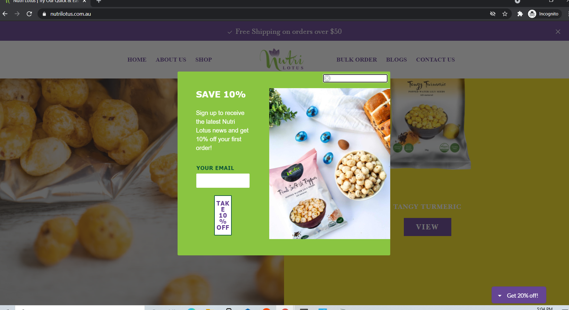
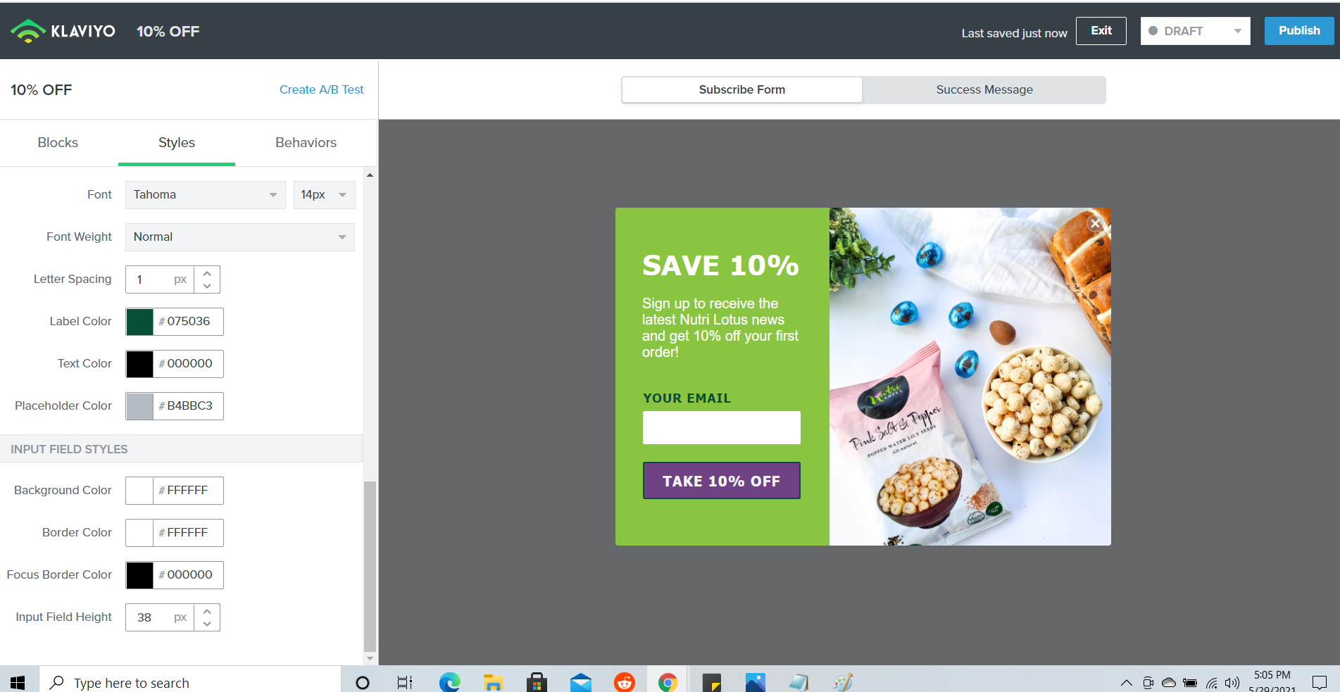
I designed a discount pop up for my site visitors but it’s appearing differently than the one I designed in Klaviyo. Can anyone help?
Please find the attached snapshots for both designs. Then one that I made


Thanks in advance.
Hello everyone,
I designed a discount pop up for my site visitors but it’s appearing differently than the one I designed in Klaviyo. Can anyone help?
Please find the attached snapshots for both designs. Then one that I made


Thanks in advance.
Hi
I hope you are having a nice weekend!
This formatting can happen when a website has CSS that impacts the style of a Klaviyo signup form. If you are familiar and comfortable with Google Chrome’s inspector tool, you identify the source CSS that is causing the issue and make the necessary adjustment to correct this.
If you are not quite sure how to do this, I would recommend working with a front end web developer to help identify the CSS that is causing the formatting issues with this form. If you do not have a front end web developer, please feel free to explore our agency partner directory to get connected with one.
Best,
Julie
Thank you Julie for the help  Much appreciated.
Enter your E-mail address. We'll send you an e-mail with instructions to reset your password.