I’m Setting up our email flows for our business, and i’m struggling with one very specific issue with product feeds:

When they appear on email, if the product title is bigger or smaller than the one next to it, the images appear wonky
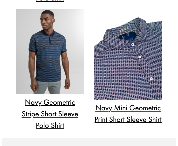
I’ve looked under every style editor and but I cannot figure out how to set these images straight, I’m hoping someone else has had this issue and fixed it and can let me know how.

Cheers,

Dave

Hi @DaveAndJelly 


Welcome to the Community! Thanks for sharing your question with us! 


Unfortunately, there isn’t any way to control alignment when using a dynamic product block and pulling this data in from your feed, you could manually select these products from the catalog and build these blocks as a static product block vs dynamic. A static product block would allow you to have more control and select where a specific product is placed so the products that have longer titles can be placed next to each other as to better align. The product team is aware of this pain point for our customers and are working on a solution for this!


In the meantime, I’d check out this additional thread for another workaround given by a Community member! 


Thanks for participating in the Community!

-Taylor 


Reply