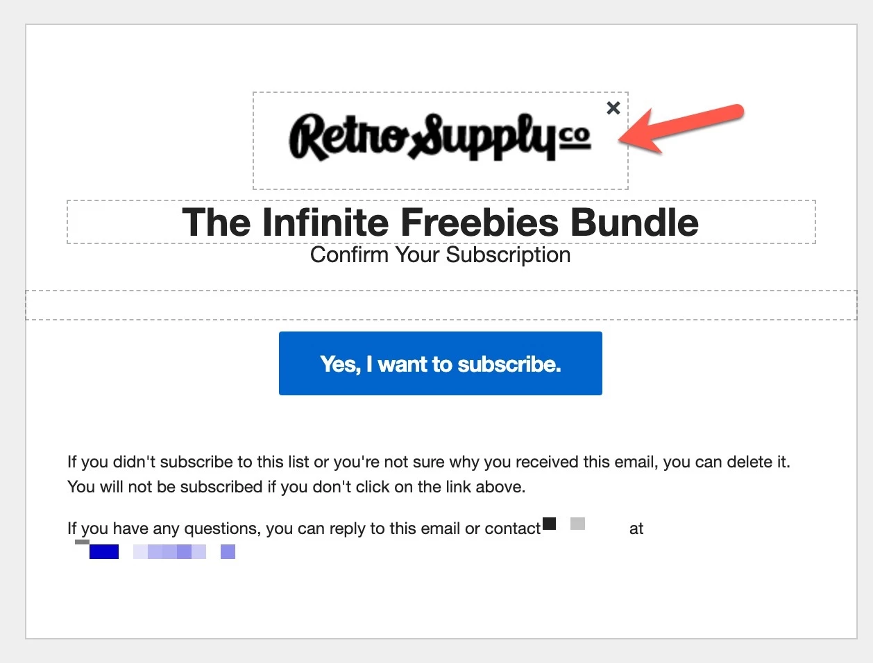
When I add my logo to the Subscriber and Preference Pages (for example, the Email Confirmation) my logo is always a little blurry.
If I use a larger images so it’s higher resolution it just makes the actual logo much bigger on the Email Confirmation.
Any idea how to make a logo crisp and sharp on these pages? See screenshot provided.

