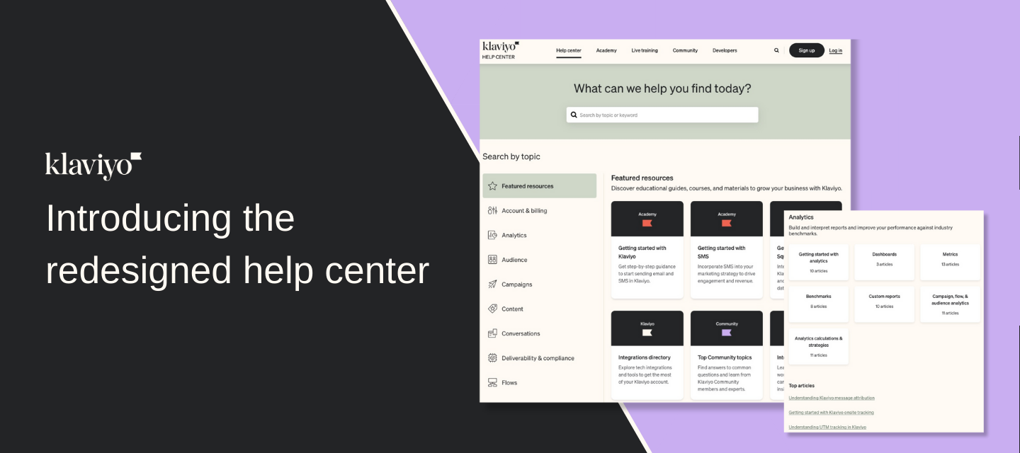
We’re excited to announce that the help center has gotten a new look! We’ve launched an updated design, featured resources, and more streamlined ways to find the answers to your questions. You can still find all the same articles you know and love, just in a more relevant and organized way. And don’t worry if you have any articles bookmarked–all links will still work as expected.
Read more about the changes below.
A refreshed overall design
We’ve upgraded the entire look of our help center. New colors and styles greet you on every page, and new product icons help orientate you.
A more streamlined homepage
One of the biggest areas that we focused on was the homepage. We wanted to provide a page that gets you to the resources you need quickly, but also highlights suggested and new resources.
Check out the “Featured resources” section for hand-picked resources that may be useful to you and your business. We will continually update this area with new content and other important information.
You also can easily dive into product topics right on the homepage. Instead of clicking in and out of different topics, simply scroll and find what area you want to focus on. Additionally, each product area contains the top articles that other Klaviyo users find helpful.
A more relevant content organization
We’ve heard your feedback that the old design was difficult and often overwhelming to navigate. In addition to making it easier to find the right product area on the homepage, we also completely redid how we organize content across the site.
A key part of this new organization was aligning content with how you experience the Klaviyo product. For example, we’re grouped our templates and coupons guides under the same “Content” umbrella that they’re organized into in Klaviyo..
Check out the new help center and let us know what you think below!


![[Academy] SMS Strategy Certificate Forum|alt.badge.img](https://uploads-us-west-2.insided.com/klaviyo-en/attachment/2f867798-26d9-45fd-ada7-3e4271dcb460_thumb.png)
