Solved

Images from 2-column show up out of order in mobile view

  • December 31, 2025
  • 1 reply
  • 22 views

Forum|alt.badge.img+2

Hello! I am having an issue with some images in my newsletter and was hoping someone could help.

I have two separate images that, when put together create one overall image. And I have two different sets of these. To create my layout, I added a two-column block from the layout section into the email for each of these two image sets, then added images, uploading and inserting my images into the two columns. In desktop view, everything looks great. In mobile view, I was expecting these to stack on top of one another in order. However, the images reorder themselves and they don’t make sense when viewed this way. 

In Desktop they look like this:

1 | 2
3 | 4
5

In mobile, they reorder like this:

1
3
5
2
4

But I want them like this:

1
2
3
4
5

Is there any way to achieve this?

Thanks for any help you can give!

Best answer by Byrne C

Hi ​@smags,

The quickest solution would involve cloning each image block, and setting the original image to desktop-only, and then the clone to mobile-only. After doing this, you can go to the mobile version of the template and re-order the mobile blocks as you see fit, so images appear in the correct order.

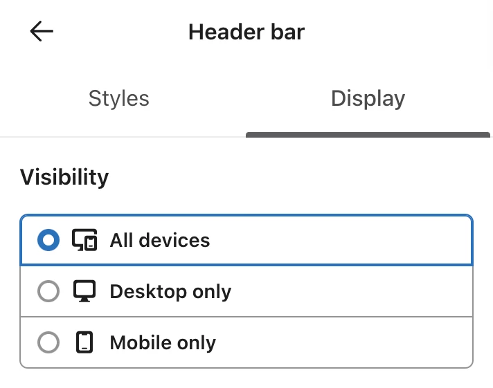
You can choose which devices a block displays on in the “Display” settings of a block. See image below.

Let me know if this helps out with the issue!

1 reply

Byrne C
Community Manager
Forum|alt.badge.img+28
  • Community Manager
  • Answer
  • January 5, 2026

Hi ​@smags,

The quickest solution would involve cloning each image block, and setting the original image to desktop-only, and then the clone to mobile-only. After doing this, you can go to the mobile version of the template and re-order the mobile blocks as you see fit, so images appear in the correct order.

You can choose which devices a block displays on in the “Display” settings of a block. See image below.

Let me know if this helps out with the issue!