Welcome back to another Community Showcase where we highlight successful email and SMS/MMS marketing, start a conversation and help develop ideas for your next campaign.  To help you start planting seeds for your Spring marketing, we have two great examples that truly flourished!


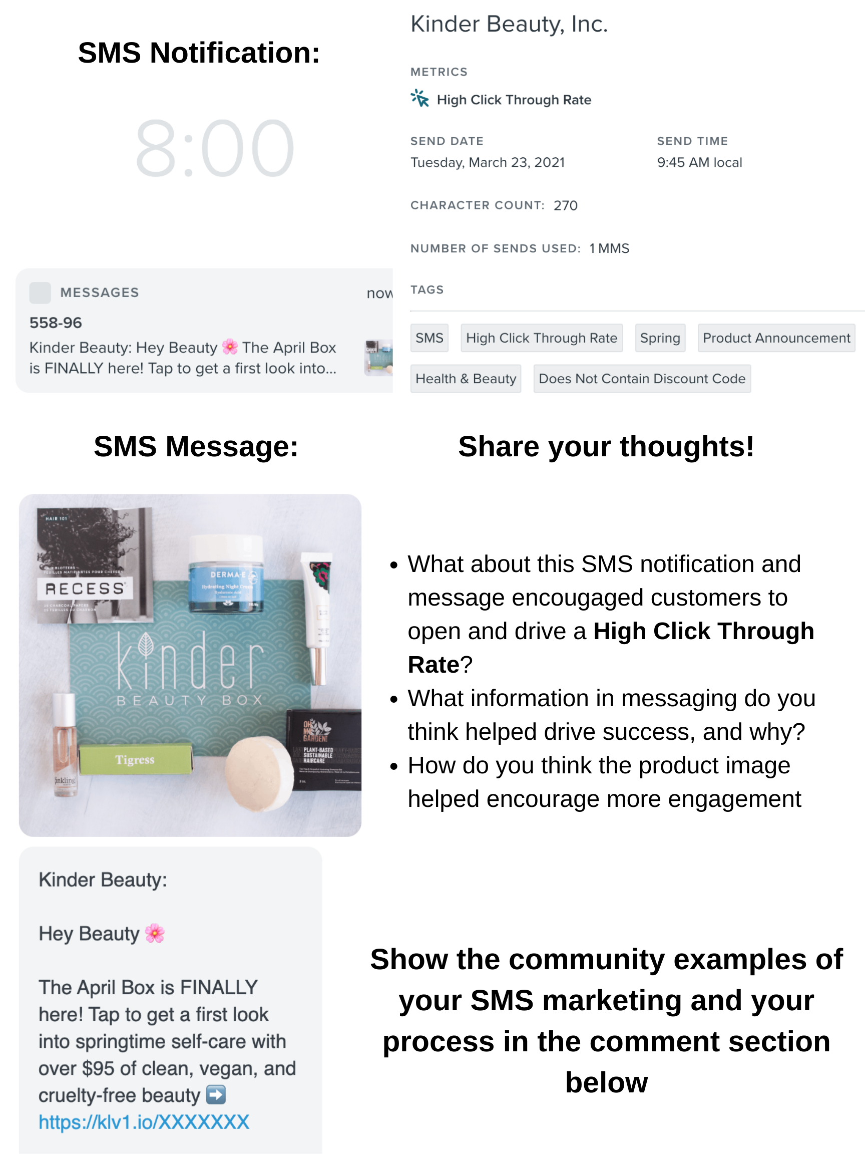
Our MMS marketing example comes to us from Kinder Beauty. From the messaging and product image to send time, this was a highly impactful campaign, even without a discount offered! Check it out!
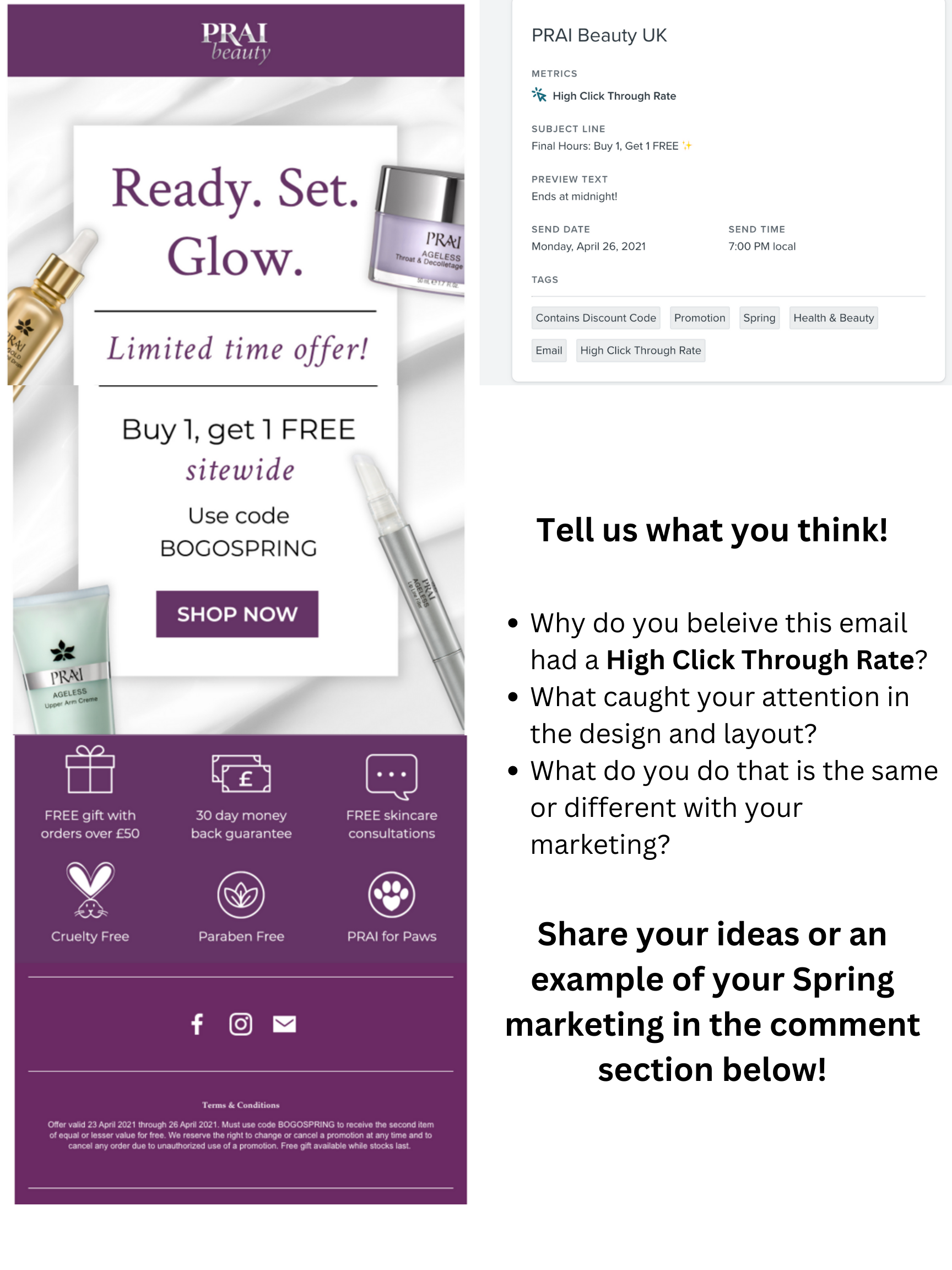
Our next example is an email campaign from Prai Beauty. With a beautiful design and layout, discount and product features, it’s no wonder why their customers were “smelling the roses” and engaging with this email!


Want to connect and collaborate with others in the Health & Beauty industry?

Join our Health & Beauty Industry User Group!

Hey @Brett_Gatsby, @inboxingmaestro, @Jakub, as out Champs your insights is incredibly valuable! What are your thoughts on this marketing?


Hey @stephen.trumble ,

Thanks for looping us in. Amazing campaigns with high CTRs. Wondering how it got translated into conversions & sale. Any idea?

Well, here are my thoughts to respective questions:

  1. Kinder Beauty:
    1. Clear messaging with emojis, element of curiosity and visual appeal of April Box - that’d have enticed users to open and click the SMS.
    2. Clear information about the product benefits - clean, vegan & cruelty-free beauty.
    3. Product image sets the right expectation and perceived value of the box that a user would get once purchased.
  2. PRAI Beauty:
    1. Messaging is short and enticing with a clear CTA - contains 3 major elements: Urgency, Incentive, and product benefit with no-brain money back guarantee.
    2. Clean design with FOMO/urgency (Limited Time Offer) and a site-wide coupon offer caught my attention.
    3. I’d also try to implement some gamification or animated GIFs that tells a story to make content more engaging and let readers spend time on the content.

Regards

Mohsin


Jumping in here to join the fun, here are my thoughts in addition to @inboxingmaestro great comments so far. 

  • Kinder Beauty:
    • Seeing an image of all the items from the box drives curiosity
    • Stated benefits/features that are important to their audience
    • The visual impact of the brand/product is helpful, especially for SMS since the phone number are typically unknown or unrecognized by recipients
    • Exclusivity of getting the first look is tantalizing!
    • My recommendation is try adding some space for the link to make it stand out from the paragraph to give it more room to stand out. Test it to see if it works for your audience.
  • Prai Beauty
    • Singular CTA - one email, one action.  It’s clear what to do here.
    • Supporting unique selling points (USP) helps reinforce positioning (cruelty free, paraben free) and pre-empting objections (30 day money back).
    • I’d recommend testing/trying the number of hours left (or date/time of when it expires), perhaps a countdown clock?
    • Also, A/B test different CTA like “Claim Offer” or “Save Now” or something to affirm the opportunity instead of the overused “Shop Now” - test it to see if it works better!


Reply