

Hey folks, just wanted to give some feedback and thoughts on the new customer profile UI that is rolling out next week.
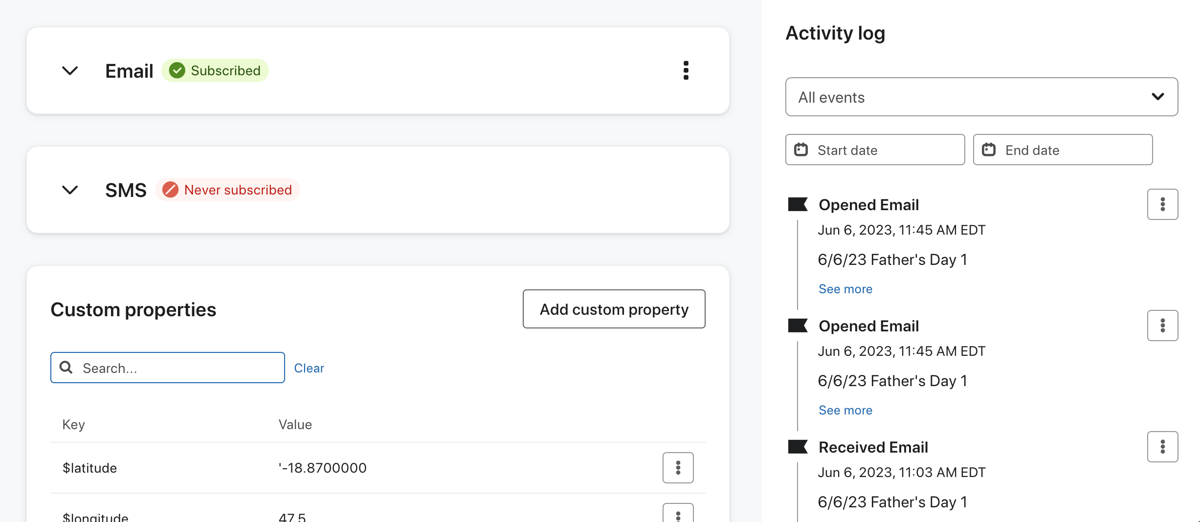
There seems to be a lot of dead space on the page that could be better used for conveying information. As it is now, there is a bunch of blank area around the main details and even within them, while the activity log is crammed over into the side:
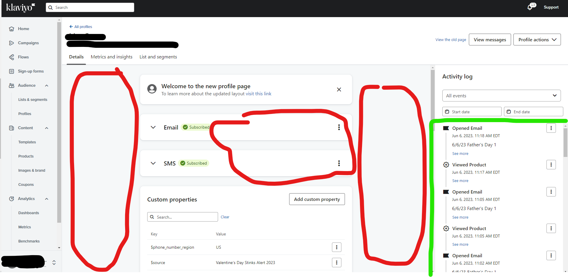
Activity log was very helpful for me to see what emails certain profiles were getting, but now there’s a lot more scrolling I’ll have to do than with the old UI. For my use, it was generally one of the most important parts of seeing a profile, though I know that might not be the case for everyone. Still, I’d like to see if have more space, perhaps by condensing some of those dead spaces on the page. (Side note, seeing emails with their headlines was wayyyy more convenient than seeing by internal title for me. Could we get an option to switch?)
The switch of metrics to another tab is fine, though that was generally the second most important thing for me to check and now it’s a click away.
I do appreciate lists and segments getting its own, searchable tab quite a bit. That’ll be helpful to check and make sure someone isn’t in the wrong group.
The current UI design just comes off as very odd too me: Why are Email and SMS subscription given such prime real-estate? (Big, centered, top of page) Activity log is off to the side and even on a big monitor you can only see about 5 actions at once before you need to scroll. Honestly, I think these two should be switched. Subscription status is something you can tell with a quick look, thanks to the color coding — activity log is not.
Does anyone else have any thoughts on the new UI change?