Hey folks, just wanted to give some feedback and thoughts on the new customer profile UI that is rolling out next week.

There seems to be a lot of dead space on the page that could be better used for conveying information. As it is now, there is a bunch of blank area around the main details and even within them, while the activity log is crammed over into the side:
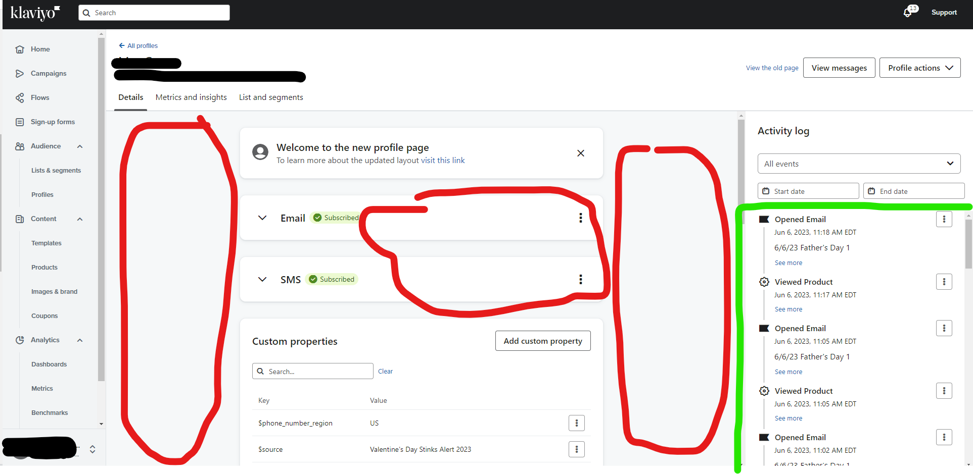
Activity log was very helpful for me to see what emails certain profiles were getting, but now there’s a lot more scrolling I’ll have to do than with the old UI. For my use, it was generally one of the most important parts of seeing a profile, though I know that might not be the case for everyone. Still, I’d like to see if have more space, perhaps by condensing some of those dead spaces on the page. (Side note, seeing emails with their headlines was wayyyy more convenient than seeing by internal title for me. Could we get an option to switch?)

The switch of metrics to another tab is fine, though that was generally the second most important thing for me to check and now it’s a click away.

I do appreciate lists and segments getting its own, searchable tab quite a bit. That’ll be helpful to check and make sure someone isn’t in the wrong group.

The current UI design just comes off as very odd too me: Why are Email and SMS subscription given such prime real-estate? (Big, centered, top of page) Activity log is off to the side and even on a big monitor you can only see about 5 actions at once before you need to scroll. Honestly, I think these two should be switched. Subscription status is something you can tell with a quick look, thanks to the color coding — activity log is not.

Does anyone else have any thoughts on the new UI change?

I am so glad I am not the only one noticing this.
I find it so frustrating every time I check a customer profile page, I can’t seem to find things that easy. 
More dead space, I have do scroll or click a few times to find out the information which previously was laid out in a very easy way access it. 

I honestly prefer the old version of the profile page or maybe you consider bringing some improvement soon to the new one. 

Alina


The new layout is certainly snazzier, but it contains a lot less useful information on it. Alina, what sort of information did you find to be more difficult to access? I’m curious if we had the same issues (for me it’s a profile’s activity and metrics.)


Thank you Max for this post! Isabel from the Klaviyo product team here. We’ve been monitoring feedback on the new page and connecting with users to get more insights. Part of the underlying reason to make the change was to move to a more modern front-end language that makes updates easier, so we’ll be making more improvements over time.

We’re working on a way to show more events on the Activity log, and give it more priority on the page. Stay tuned.

The wider spacing on the page is more visible on certain screen sizes than others (ex. on a 13” MacBook Pro at full size the Activity Log and Details are right next to each other), but we’re looking for ways to make the elements more evenly distributed for larger screens.

As for the ordering of the sections, as you may have guessed, different users have different priorities (ex. some care more about custom properties, metrics, coupons etc). Subscription/Consent data has its placement since “Is this user consented to email/SMS?” is the most common question people visit this page to troubleshoot. But we’re definitely going to continue keeping track of usage and feedback to determine priority order of sections.


Thanks for the response, Isabel. I’m looking at the profile on a smaller screen right now too. There is certainly less dead space, but I’m still perplexed on the real-estate choices here.

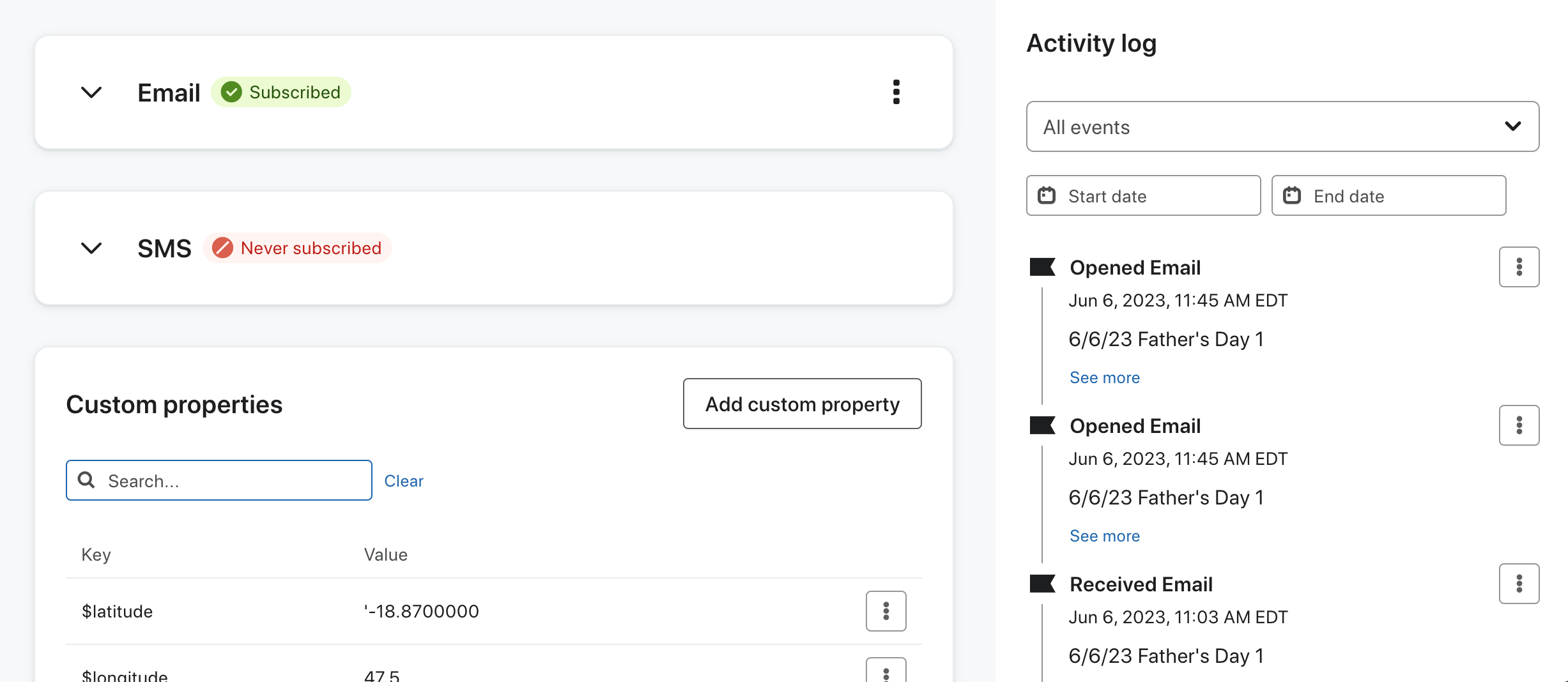
I know subscription status is important, but wow, it has really taken up a lot of space for something that is essentially “subscribed” or “not subscribed.” Just look at how much room it takes up for Email and SMS compared to the activity log:


I am happy to hear the log will get more attention though. I’m hoping to see that sooner than later. Good to know this makes updates easier as well.​​​​​


Just wanted to hop back in here and say that the new wider layout for activity is appreciated. This has made it a bit easier to read activity and to have more events on screen at once.


Max, I agree with you 100%. As much as I love Klaviyo and want to encourage and support innovation, I have to admit I really (really really) dislike the new UI and am dreading when access to the old profile UI disappears, because I find myself switching back to it every single time I look at a subscriber profile just to be able to see what I need to see.

The new one feels like it’s too zoomed in, like I’m looking at it through a telescope so my field of vision is tiny and everything is way too big. I find myself hitting Cntl- about 3 times literally every time I use the new UI, just so I can see enough information on the page.

For instance, in the activity log of the old UI, I can see about 12 customer actions on the screen at once including important details like which link they clicked. In the new UI, I can see only 4 customer actions before I have to start scrolling, and all the details are hidden behind a “see more” link. And when I open that “see more” link, I have scroll to read the details and even have to scroll just to get to the “see less” button and close it back up again. It’s sooooooo frustrating!

And Max, you’re right that there’s so much wasted space. My screen measures 10” top to bottom, and out of that real estate:

  • The profile’s header takes up 1.75” (most of it white, wasted space)
  • The section’s header (ie, Activity log plus its dropdown/search) takes up 2”
  • Meaning the actual activity log information gets a window only 3.75” high, squished at the bottom of the screen (hence allllll the scrolling to see anything). The information that is the whole point of the page gets less than 40% of the screen’s real estate.

There’s no way the headers should be so big. The main Klaviyo header at the very top of the page is less than an inch…  That’s how all the other headers should be too: absolutely minimal.

I also really really dislike that the new UI now identifies emails by the campaign name instead of the subject line. It makes sense, of course, except that I have all my flows structured with the subject line being much more descriptive and relevant than the campaign name, because that’s how Klaviyo had their UI set up. My campaign names are things like “Teaching Email 1”, “Sales Email 4”…  They’re not very descriptive because Klaviyo didn’t make them prominent in the old UI. So for Klaviyo to suddenly switch it up now in the new UI means I can no longer easily identify which email a subscriber has just received/opened/clicked and I have to now go in and rename all my campaigns just so the activity log is readable in the new UI. Again, really frustrating.

I know there will be a team at Klaviyo who worked really hard on this new UI and are proud of the work they did. And I truly hate to rain on their parade. But the new UI is so hard to use and so frustrating. And I am absolutely dreading the day they turn the old one off for good.


I also really really dislike that the new UI now identifies emails by the campaign name instead of the subject line. It makes sense, of course, except that I have all my flows structured with the subject line being much more descriptive and relevant than the campaign name, because that’s how Klaviyo had their UI set up. My campaign names are things like “Teaching Email 1”, “Sales Email 4”…  They’re not very descriptive because Klaviyo didn’t make them prominent in the old UI. So for Klaviyo to suddenly switch it up now in the new UI means I can no longer easily identify which email a subscriber has just received/opened/clicked and I have to now go in and rename all my campaigns just so the activity log is readable in the new UI. Again, really frustrating.

Yeah, this was a real pain point for me as well. Especially if I’m sending multiple campaigns with the same subject line for segmentation purposes.


Hi Steph and Max,
Thank you very much for the feedback here! Part of the goal of the redesign was to move to a more standardized system of visuals within the app (you may have noticed other pages getting updated too), but the profile page is a unique challenge because no other page has the same density of information.

We’re continuing to monitor the feedback and iterate. Specifically, we’re planning additional updates to the activity log to try to show more details at once. We’re also looking to return access to the clicked link via the action menu. You might have seen some changes already—it looks a bit different than what Max posted in the first comment—but the additional changes will take some time, so we appreciate the patience! We look forward to providing more usability updates.


Reply