Changing button background colour for out of stock notifications
Hi all,
I’m currently trying to alter the background colour of the ‘Notify me when available’ button. From looking through the code, I can alter the modal button which is simple enough, but for changing the button on the actual product page I can’t see any immediate way to change this.
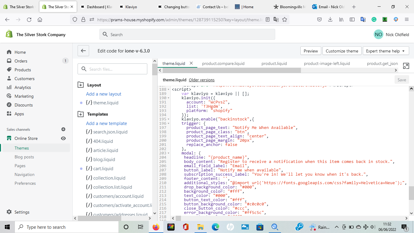
klaviyo.enable('backinstock',{ trigger: { product_page_text: 'Notify Me When Available', product_page_class: 'btn', product_page_text_align: 'center', product_page_margin: '0px', replace_sold_out: true },
There doesn’t appear to be any way to change this in Shopify’s visual editor when changing colours, and after reading through the documentation on Klaviyos Back in Stock styling, I can’t see anything on there either.
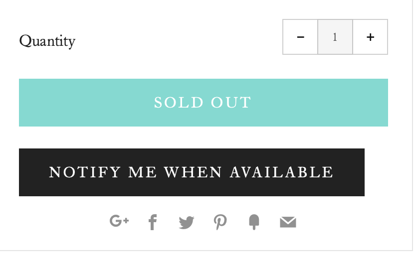
Currently the button looks like this -
But I have been able to alter the modal so it appears like so -
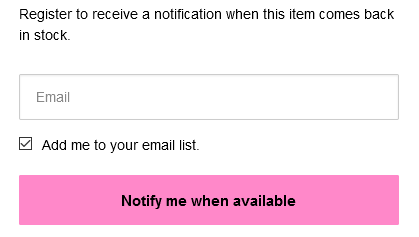
Unfortunately I’ve followed this guide, but it only details editing the button on the modal rather than the button that is located on the site.
Hi there,
By the “button that is located on the site,” are you referring to the “Notify Me When Available” button?
Thanks,
Caroline
Hi there,
By the “button that is located on the site,” are you referring to the “Notify Me When Available” button?
Thanks,
Caroline
Hi Caroline,
That’s correct, the “Notify Me When Available” button located on the product page.
I’m looking for exactly this issue too. The ‘Notify Me When Available’ button is difficult to format. My button seems to be default black and I can’t figure out how to change it.
Plus it sits on the left, isn’t centred, or the same size as the button above. It also doesn’t behave well when shrinking the screen down for mobile. If I could change the colour and make central that would be enough to make it bearable. I’m using Venue as a theme. Any help very much appreciated!
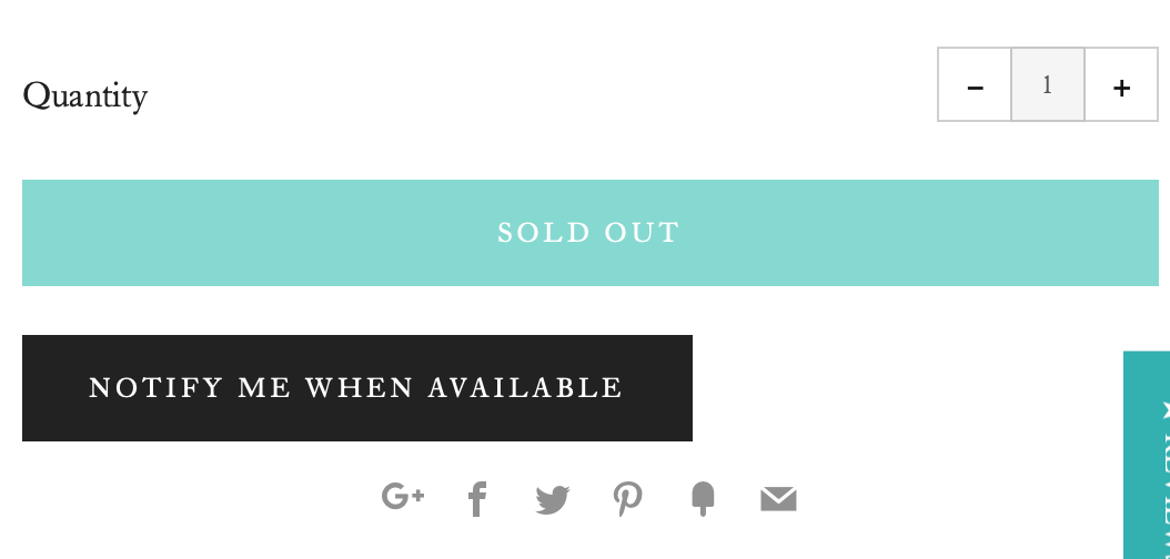
On desktop:
On Mobile:
Hi there,
The linked guide includes the following snippet:
trigger: { product_page_text: 'Notify Me When Available', product_page_class: 'btn', product_page_text_align: 'center', product_page_margin: '0px', replace_sold_out: false },
To adjust the CSS of the “Notify Me When Available” button, change the “product_page_class” value to the CSS class that you want to use to style the button. In other words, if you add CSS for the class ‘btn’, it will style the “Notify Me When Available” button.
Best,
Caroline
Thanks Caroline, that worked. For anyone who comes across the topic in future, the ‘.btn’ class already existed within my ‘styles.css.liquid’ under ‘Assets’ in Shopify’s code editor. I searched for it, and found this:
Which then resulted in the button showing as I had imagined, like below:
Hi @syst0,
Thanks for following up in this thread and sharing what worked for you! As we continue to grow the Klaviyo Community forum, it’s incredibly beneficial when our customers are able to share their own experiences and solutions so that it helps others succeed as well.
Thanks for being a part of our Community, -Cass.
I’m looking for exactly this issue too. The ‘Notify Me When Available’ button is difficult to format. My button seems to be default black and I can’t figure out how to change it.
Plus it sits on the left, isn’t centred, or the same size as the button above. It also doesn’t behave well when shrinking the screen down for mobile. If I could change the colour and make central that would be enough to make it bearable. I’m using Venue as a theme. Any help very much appreciated!
On desktop:
On Mobile:
I have the exact same problem. The Notify me button is not lining up with the Sold Out button above it.
Hi there @rachitbahri,
Have you tried to follow the steps previously laid out in this thread? What did or did not work for you?
Let us know,
Alex
Hi. I’m also struggling with this issue. My ‘Notify Me when Available’ button is white and sits to the left.
I’d like the button to be black, writing to be white and the button to be central. I don’t understand the above instructions.
Hi @alex.hong, yes I’ve checked that article and others mentioned in this thread but it makes no sense to me. There aren’t any pictures or videos explaining any of it. I added code from the ‘black & white’ section to the ‘btn’ but the button just disappeared altogether.
What am I supposed to do?
Hi @alex.hong, yes I’ve checked that article and others mentioned in this thread but it makes no sense to me. There aren’t any pictures or videos explaining any of it. I added code from the ‘black & white’ section to the ‘btn’ but the button just disappeared altogether.
What am I supposed to do?
I don’t have a free theme so none of the options in the article would work for me.
Hi there @Coinick,
Since it is a paid theme, we are limited in the assistance we can offer as all themes have variations and are not as uniformed as the free themes we offer guidance on. Unfortunately, Klaviyo's back-in-stock feature does not work as expected for custom (AKA, not free) Shopify themes. You will need to make some tweaks to your code in order to use Klaviyo BIS. Unfortunately, we're unable to advise specifically what changes will need to be made as each custom theme is different.
It is usually the work of a developer to get the Back-In-Stock code to work for your custom theme. Referring to the following article - Shopify Back in Stock for Developers - should assist with building the API call.
I have some general guidance I can offer.
The appearance of the back-in-stock button is handled through the Trigger settings in our back-in-stock code. You can find that mentioned here.
You will want to try different values for "product_page_class" based on your store's theme. I would recommend removing the extra piece of code while testing this as it can impact the general performance. Many themes will use "btn" or "button" for standard classes, but these are not required for theme developers.
Theme developers are not required to follow some basic guidelines that allow our back-in-stock feature to function. Therefore we are not able to offer custom solutions for custom themes. Sometimes the theme developer will be able to help with this implementation or you can reach out to one of our approved partners here.
If you end up working with a developer, you also have the option to build a fully customized solution. Our Back In Stock feature works by sending an event metric into Klaviyo which triggers a flow. You just need to send the Variant ID, Product ID, and email address. All of this can be custom-built using our open API to work with your website. Here is the necessary documentation for that.
Otherwise, there are other back-in-stock solutions supported through Shopify that you can find through their apps section. Here is a link to their site.
Just from looking at the preview of your code, I can see options listed for button, text, and background color.
Hello,
Is there a way to add css for mobile? Or adjust it?
The modal appears stuck on top on mobile devices. I want this to be displayed at the middle of the screen.