Hi @maxwellB ,
Great question about how to format forms differently for Mobile vs Desktop only!
When it comes to formatting sign up forms for mobile devices, it’s great to take into consideration the user experience as condensing a desktop form could change to form to an unintended design. In this case, it would be best to create a separate sign up form specifically designed for mobile only.
The Desktop & Mobile option you may see in your signup form editor does not create a new mobile form. Instead, it is utilized so that you can choose what blocks appear based on the customer’s viewing device. For this reason, you would want to go into your signup form creation page and create a new form that is designed for mobile. You can either make your own from scratch, or use one of our prebuilt signup forms from the form library!
Below are some links to helpful documentation regarding signup forms:
How to Create and Manage Signup Forms
Understanding Signup Form Input Blocks
Optimizing Your Signup Form Experience
Hope this was helpful and thanks for being a part of the Community!
Alex
@alex.hong
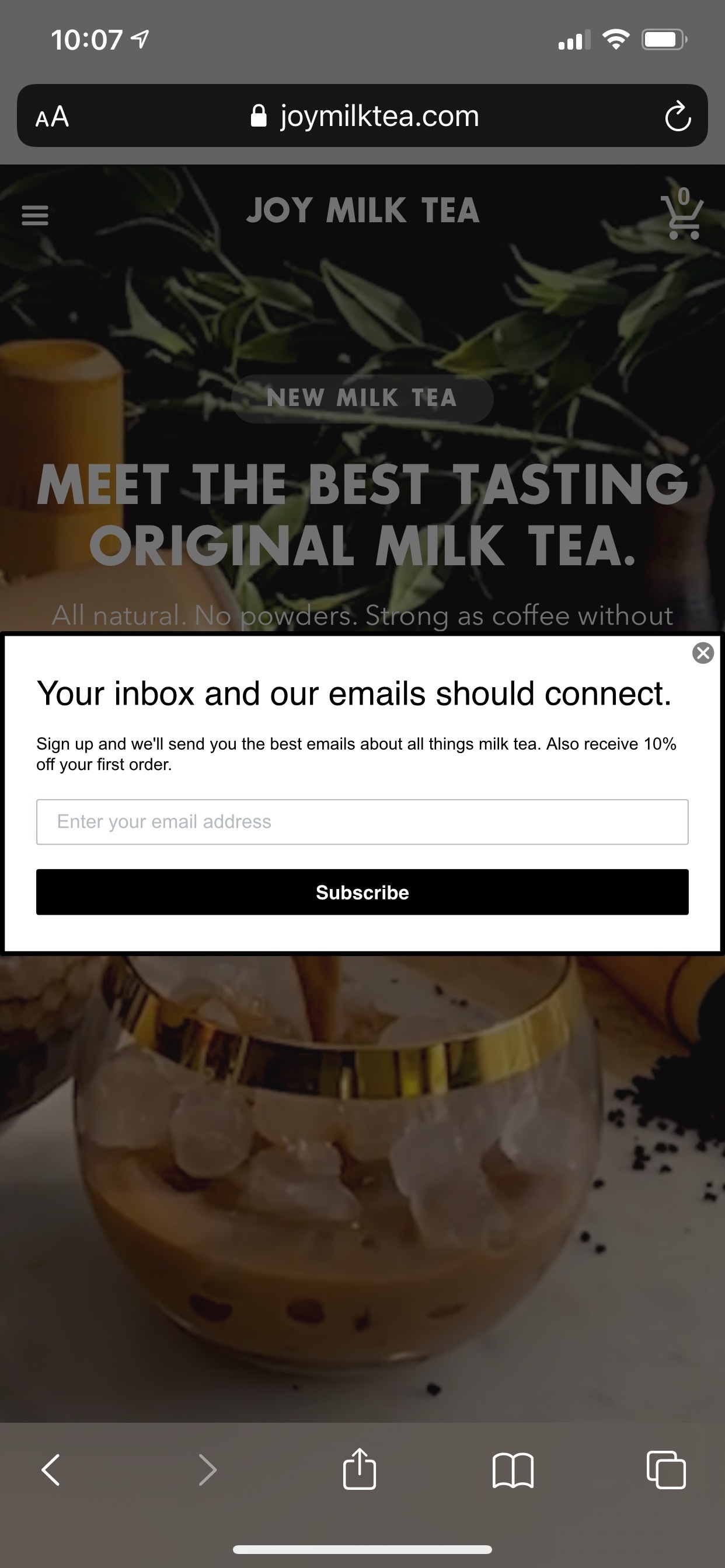
I do have a seperate form. The problem is that the mobile one looks just like a squished desktop form. I cannot edit it to fit mobile correctly. For example the text is not taking the styling, and the input bar is very short.
Hi @maxwellB ,
Great to hear you took into account mobile formatting and already created a separate form!
If you create a mobile-only form, then we would recommend setting your original form to "desktop-only". You'd essentially have two separate forms that subscribe profiles to the same list but one shows only on desktop and the other on mobile.
An alternative you can use for this would be to create a Klaviyo embedded signup form and embed the form on specific page on your website that only contains this form as the body of the page. Therefore, instead of sharing the Klaviyo subscribe page URL, you can share to your users this specific webpage where the form is hosted on. Since this would also be an embedded signup form, it would also be responsive on Mobile devices.
Hope this helped and please keep the Community updated on your progress!
Alex
@alex.hong
Ok I seem to have figured it out.
It looks like if the user clicks outside the popup modal it closes it. Any way to disable this? Does not seem intuitive? Seems like it results in unwanted closures.
Hi @maxwellB ,
Nice work figuring it out! Do you mind sharing with the Community how you came about finding your solution and what worked for you?
If you are using the Klaviyo form builder, your can choose an embedded form. Alternatively, you can use a Flyout form instead of a pop-up form. Flyouts will only disappear if the user takes an action (click on the X button to close it, or submit it) it will not close when the user clicks outside of the fly-out. You could also look into using a custom pop-up form and adjust the behavior of the form to not close when clicked outside of the modal, however that is not something Klaviyo can achieve by default at this time.
Here are some supporting documentations:
Redirect Existing Signup Forms to Klaviyo
Where to Paste a Form's Embed Code
How to Add and Customize a Legacy Popup
Pop up forms disappear the moment you click out of the form, even if you didn't click on the X button. If you want the form to appear again, you can change the form behavior settings and reduce the time it would take for the form to appear again:
Hope this helped!
Alex