Getting creative with close form button verbiage

  • 21 September 2023
  • 3 replies
  • 57 views

Userlevel 6
Badge +34

Hi Community! 

I am always on the look out for creative and on-brand verbiage to add to my sign-up forms. One of the lesser known CTA’s I see utilized in Forms is a button which dismisses or closes the form should the website visitor not wish to complete it. This is often a missed opportunity to win a new subscriber with clever wording that causes them to rethink their decision to dismiss a pop-up form.

Here’s an example of what I mean (see the text under the blue button):


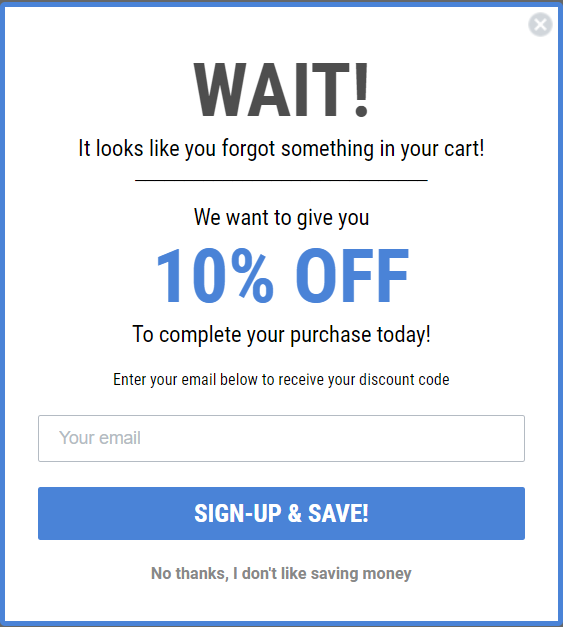
Does anyone not like saving money? Not really! So the button we have included below the main CTA causes users to take a moment to reflect and really consider the incentive they might be missing out on.

We’ve found that including a playful message like this can improve the form submission rate by 1-2% on average! 

I’d love to hear from some Community members on your favorite verbiage to use for the close form button in your Klaviyo sign-up forms - share them below!

--

Maybe some of our Klaviyo Champions can kick off the discussion? @Bobi N. @In the Inbox @chelsgrove @Akers Digital @Spark Bridge Digital LLC @retention @Omar @ebusiness pros @KatherineB @inboxingmaestro @Brett_Gatsby @Kylie W 


3 replies

Userlevel 6
Badge +21

@Ashley I. yes I love this! I’ve seen forms with this type of language but have never tested directly, so appreciate you including results! 


I’ve also seen similar themes like “I’d rather pay full price” or related to brand values (ie. brand all about organic food might say “I don’t like shopping organic” or something to that effect)


Userlevel 5
Badge +28

Hi @Ashley I. 
Wow this is a great topic for communication and I love this! I feel this is a very overlooked opportunity, including myself included. Even reading your post it made me think!

I have in the past focused on the button text itself and the question posed to the customer, with a more yes or no answer, but I love the play on words and use of psychology here with what would normally be a simple exit.

*me running off to implement and test now…

Thanks for sharing! 😁

Userlevel 6
Badge +24

The effect of playful copywriting is one of my favorite things to nerd out about, so thank you for sharing this example @Ashley I.!  I’ve seen brands do this before, but haven’t yet had an opportunity to test this kind of reverse psychology around closing an optin form. Definitely itching to test this now like @Kylie W :D 


From my own shopping experiences, it seems like this approach is especially well-suited to food brands, or more irreverent clothing brands. (bird dogs comes to mind)


This isn’t precisely tied to optin forms, but I’ve found that the brands who take little opportunities to bring humor into their copywriting are the ones that are most likely to stay top of mind while I’m shopping. Whether it’s an optin form, or product packaging, even the way they say “thank you” on the order confirmation page, the little touches can add up to a thoughtful customer experience.


One of my favorite examples is this funny story on the back of a Justin’s nut butter cups package. 


~ Gabrielle 

Reply