Hi, new to Klaviyo but can’t seem to find what I’m looking for.

My text input fields in my embedded signup form are full width. 
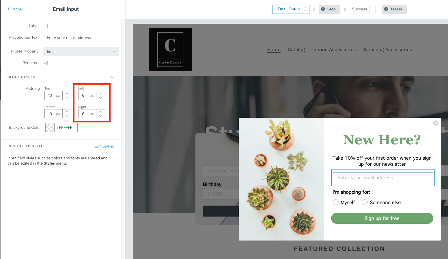
I would like to shorten the width of these input fields.

For example, “first name”, “last name” input fields do not need to be full width, and stacked.
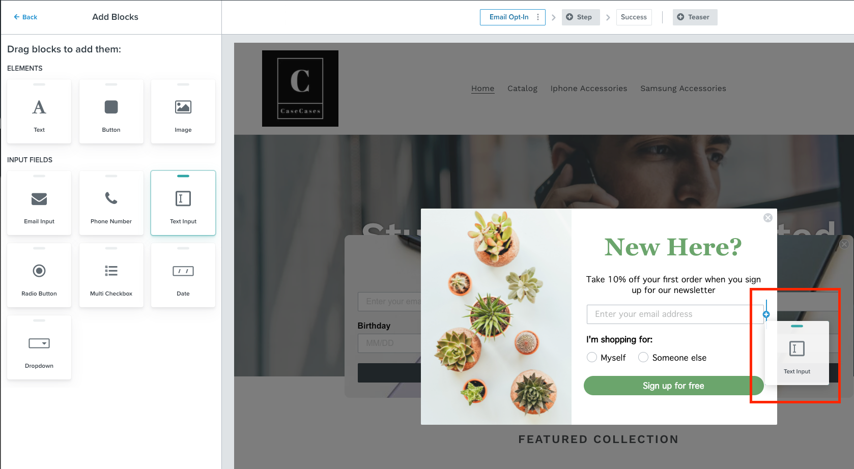
Additional question - Can first and last name be in two columns? I can’t find anything to assist with column in the designing stage within Klaviyo.

The submit button is also full width within the embedded form, can I constrain that to the button text?


Website Info:

I’m using Elementor on a wordpress site, with woocommerce.
I’m using the Astra Pro theme.


Thanks so much.

Hello @fandf,

Welcome to the Klaviyo Community!

You can shorten the width of your input fields in your signup form by increasing the left and right padding. The same can be said for any block elements in either your signup forms or your email templates! 

In addition, if you wanted elements in a signup form to be next to each other, you can drag those blocks to be next to each other. When dragging elements next to or above one another, you’ll see a blue line with a plus sign to indicate placement of the element. 

If you haven’t already, I would suggest taking a look at our Guide to Creating a Signup Form and Understanding Signup Form Input Blocks Help Center articles which dives into understanding signup forms and the various blocks available. In addition, our Academy team also offers a really great course on signup which i’ve linked here: rnew] Creating an Effective Acquisition Strategy Using Signup Forms

I hope this helps!

David


Hey David, thanks so much for your reply. 

I must have missed the blue alert when I tried to drag it next to an existing field. I'll have another look.

Much appreciated.

Thanks again. 


Reply