Solved

How to customize the close button in signup forms


Userlevel 2
Badge +5

Is there a way to customize the close button graphic in the signup forms? It’s a very small (low-res) light gray PNG (not ADA compliant). It should really an SVG with customizable colors. I just hope I’m missing something.

Thanks, -oo

icon

Best answer by Dov 3 August 2021, 14:53

View original

10 replies

Userlevel 7
Badge +61

Hello @Doubleo,

Thanks for sharing this information with the Klaviyo Community.

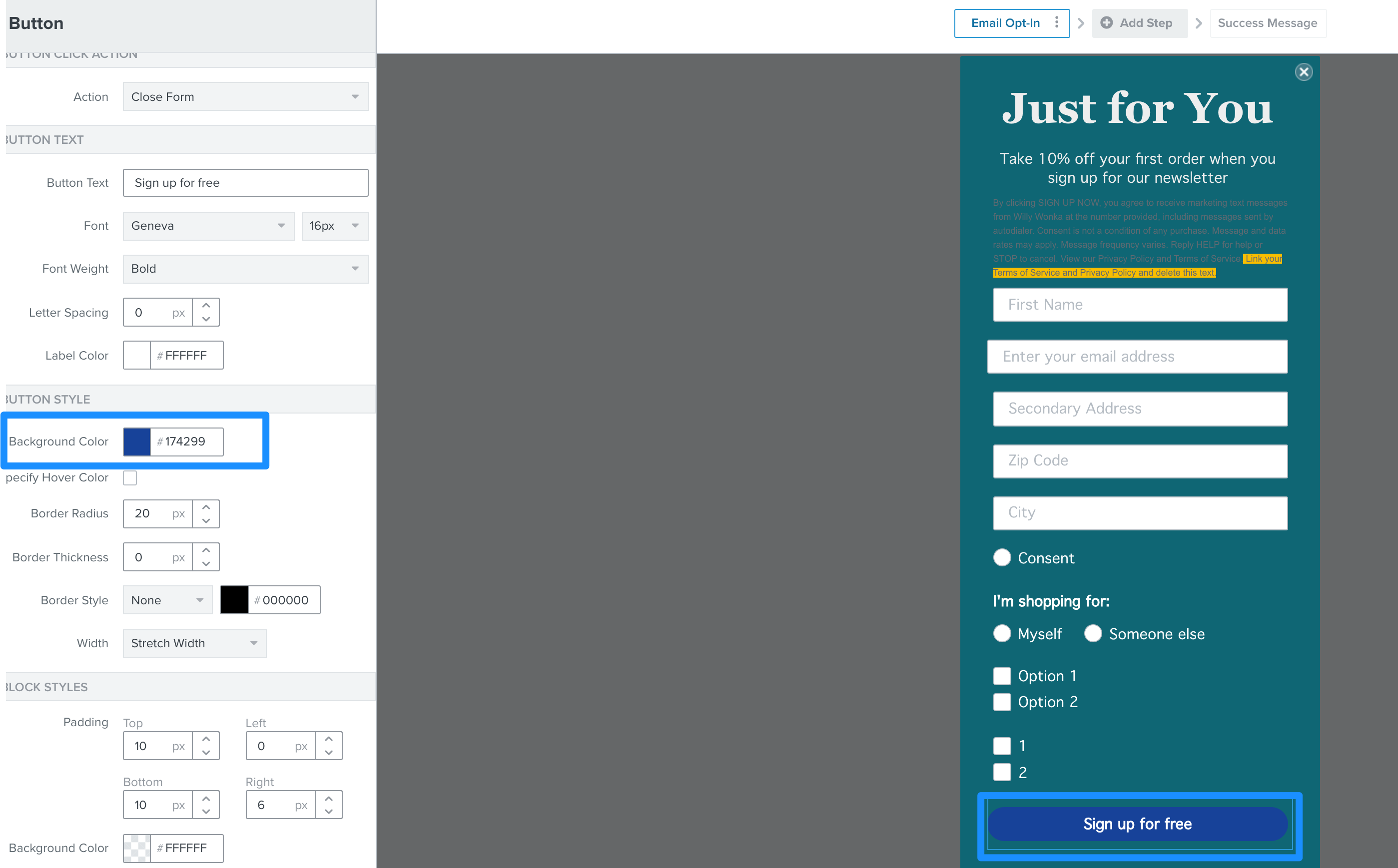
If you click on the button on your Klaviyo sign-up form, you will be able to customize several characteristics of the button. You can change the button color by clicking on the button > Background Color. For more information on editing sign-up forms, I recommend reading our article Overview of the Signup Form Builder.

I hope that helps!
 

Userlevel 2
Badge +5

Hi @Dov.

Maybe I wasn’t clear; I am talking about the close button in the upper right corner. There’s no way to customize that, is there? Again, it’s a very small (low-res) light gray PNG (not ADA compliant). It should really an SVG with customizable colors. I just hope I’m missing something.

Thanks, -oo

Userlevel 7
Badge +61

Hello @Doubleo,

Thank you for clarifying your question. Apologies for the initial confusion.

That is correct, there is currently no way to customize that button at this time, but it is a great suggestion. I will file a feature proposal on your behalf and the product team will look into potentially developing this feature within the form builder in the future.

Alternatively, you can create a secondary button on the form and use the "close form" action (as opposed to the submit form action) and use the same customization options provided in my previous post to customize that button. Or, for more creative control over the form, you can use a custom coded legacy form. More information on setting up this type of form can be found here.

Thanks for being a member of our Community.

Userlevel 2
Badge +5

Hi @Dov 

Thanks for filing a feature proposal for this. However, while a “customizable close button” is a feature that may or may not be addressed at some point, the fact that the close icon is blurry (1x) and non-ADA gray is a defect, and needs to be reported as an actual bug/issue ticket. That way I’m hoping it would get fixed sooner than a feature. Make sense?

Thanks,

-oo

Userlevel 7
Badge +61

Hello @Doubleo,

Thank you for your reply.

I understand the reasons for you feeling that it is a defect, but this was the way Klaviyo default sign-ups forms were initially developed and so it’s not a bug with the product per se. With that said, adjusting the exit button design is currently a limitation of the sign-up form builder that we’ll look into improving. For the time being, I recommend following one of the solutions mentioned in my previous reply.

Thank you for your understanding.

Userlevel 2
Badge +2

@Doubleo hey there! Your feedback is heard loud and clear. Stay tuned for some news on this front:

  1. We will be replacing the “x” button with an SVG because nobody likes a blurry icon. 
  2. We will also be adding ways you can customize the “x” button, including size, colors, and whether you want to keep the circle or just go with a clean “x”. 

Thank you for sharing your feedback and pushing us to make a better product. And @Dov @cassy.lee thanks for bringing this to our attention.  

Userlevel 2
Badge +5

@hansen that is great news indeed. You guys rock!

Thanks for the update! -oo

Userlevel 2
Badge +5

@hansen just following up on this. The new SVG icon looks nice and crisp. But still the pale, non-ADA colors. And I haven’t seen any options to customize it. It would be great to have a specific class on that close button so that we can at least override the styles in CSS. Though maybe I’m missing something. LMK.

Thanks, -oo

Userlevel 2
Badge +2

@Doubleo hello again! You are right that the default “x” icons retained its original color, as we did not want to change everyone’s form appearance without notice or choice. 


We just rolled out an update that allows you to click on the “x” icon in the editor and change a few key aspects:

  • size 
  • color of the x, of the circle, and of the outline 
    • you can set the colors to be transparent so you can get rid of the circle / outline altogether if you’d like to style it that way!

You’re not missing anything -- the changes just took a little time. Thank you for your patience. Give it a try!

Userlevel 2
Badge +5

@hansen that makes sense, thanks. I just saw the updated options in the editor. Looks awesome.

Thank you very much!

-oo

Reply