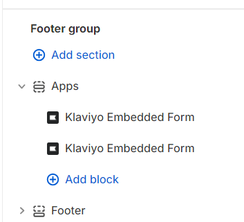
Hey @jossd
I think you will have to add or edit the css file to add queries to control the visibility of the forms based on the device screen size.
For the desktop form, wrap the embed code in a <div> with a class
For the Mobile form, wrap the embed code in a <div> with a different class
something like below
<!-- Desktop Form Embed Code -->
<div class="klaviyo-form klaviyo-form-desktop">
<!-- Your desktop Klaviyo embed code goes here -->
</div>
<!-- Mobile Form Embed Code -->
<div class="klaviyo-form klaviyo-form-mobile">
<!-- Your mobile Klaviyo embed code goes here -->
</div>
In your theme's CSS file (e.g., theme.css
or styles.css
), add the following CSS:
/* Hide mobile form by default */
.klaviyo-form-mobile {
display: none;
}
/* Show desktop form by default */
.klaviyo-form-desktop {
display: block;
}
/* Media query for mobile devices */
@media (max-width: 767px) {
/* Show mobile form on mobile devices */
.klaviyo-form-mobile {
display: block;
}
/* Hide desktop form on mobile devices */
.klaviyo-form-desktop {
display: none;
}
}
Now test this on different devices. let me know if it works
Cheers and thank you for being part of this community
Arpit