Hi

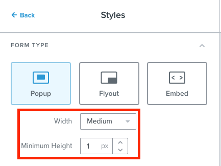
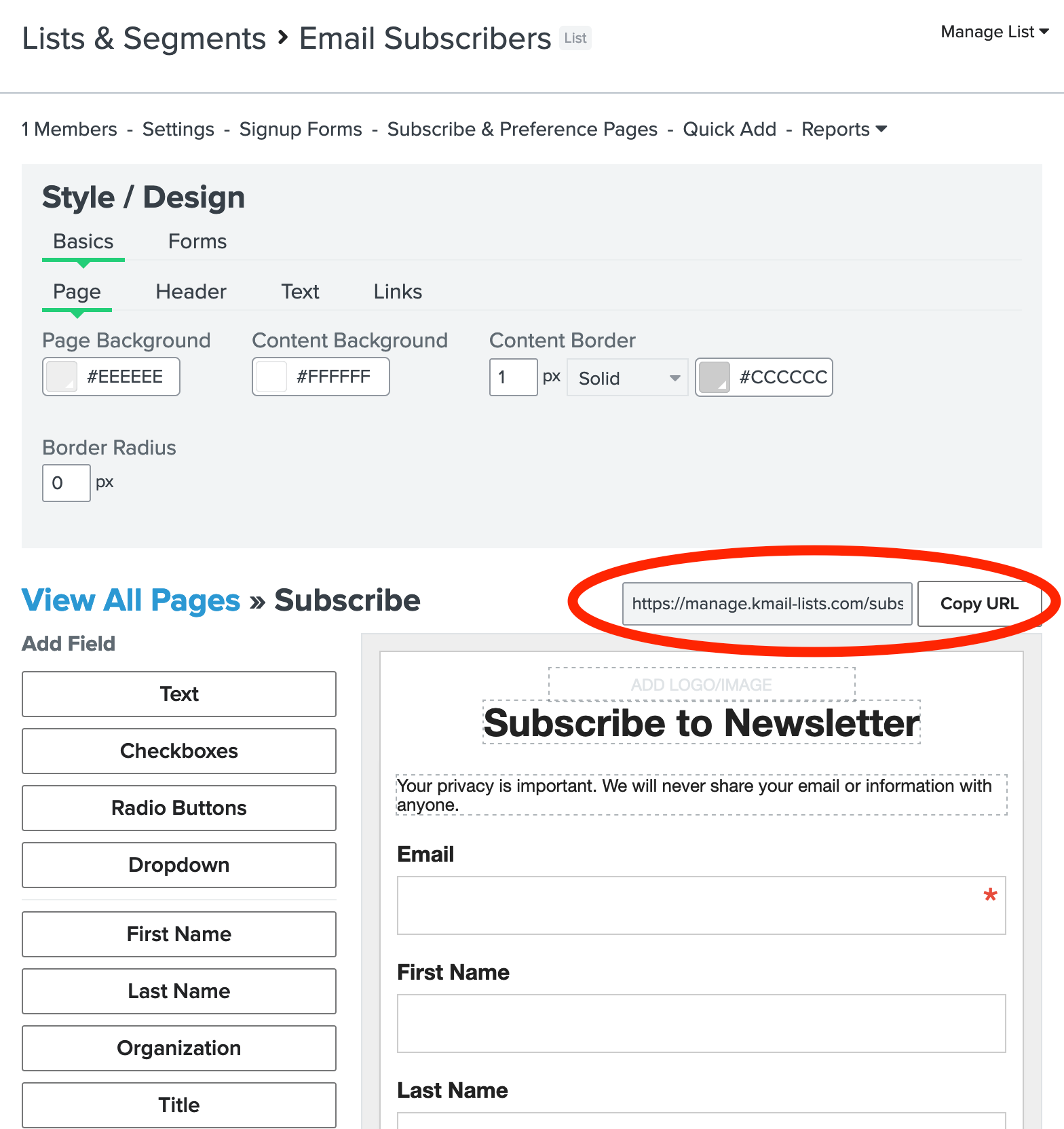
I’m trying to avoid having to embed a form on our own site, and instead just use the hosted Klaviyo form (see screenshot).

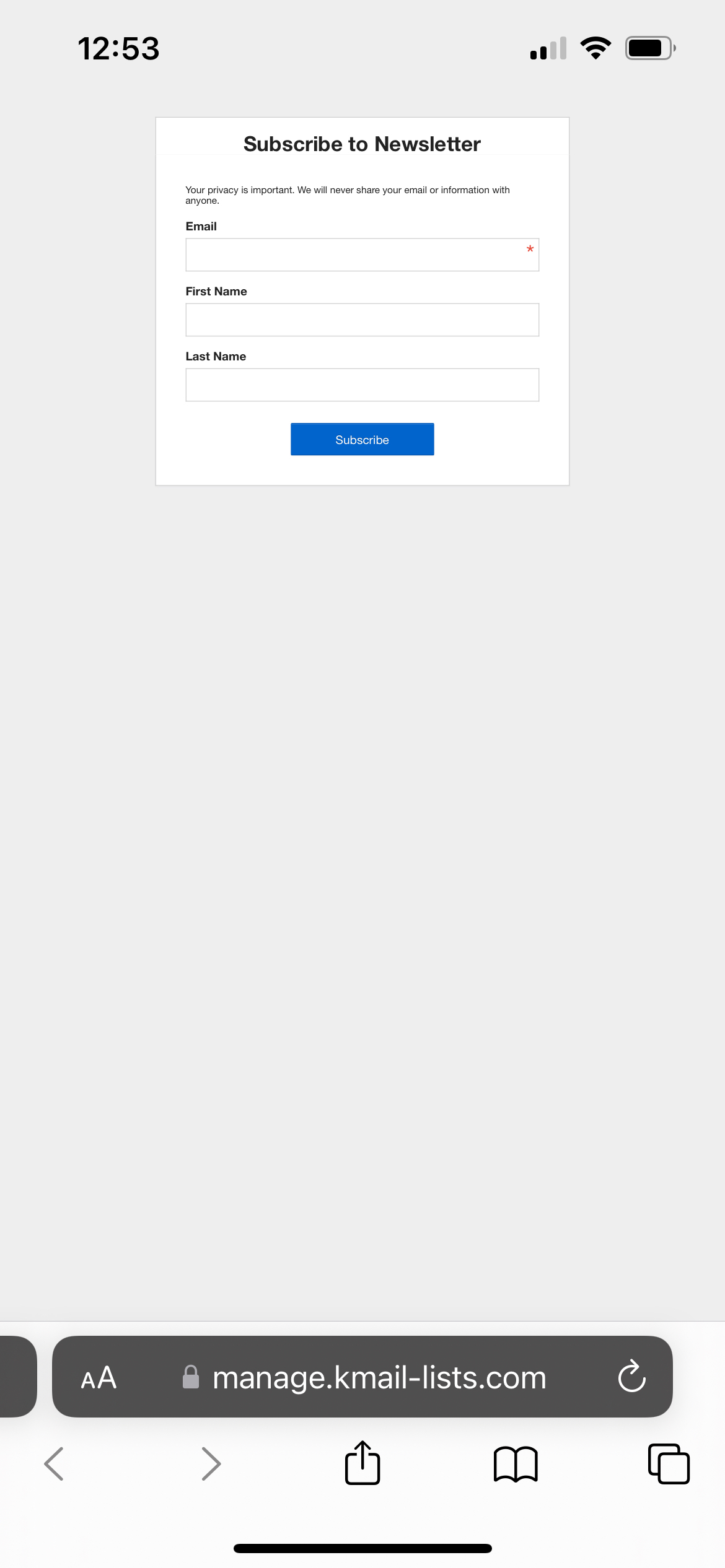
However, the form is much too small on mobile (see screenshot).

There’s no immediate remedy to this that I can find, no Desktop nor Mobile views where I can change the layout.

Am I missing something?


Here’s the form URL I’m trying to use, via Subscribe & Preference pages within the List options:


Here’s what it looks like on mobile:
 

Hey @eggplanted!

Thanks for reaching out to the Klaviyo Community for help about your full subscribe page on your website. Happy to help!

The subscribe page under your list's Subscribe and Preference pages is useful if you want to embed a full subscribe page to your website, but it has a lot of limitations when it comes to style and design, including sizing. Unfortunately there is no way to customize the sizing of how these pages appear. However, you can create a signup form for your Email Subscribers list in the Signup Forms tab on your Klaviyo dashboard. In the Style section of the signup form editor, you will have more control over the sizing. 

Hope this helps answer your question. Thanks again for being part of the Klaviyo Community for over 1 year now!! Thank you!


Hey @eggplanted - Stephen is correct with the design/formatting option here. I would also recommend looking into which fields/data you want to collect. Outside of email/sms. What data point of interest will have the biggest impact on your marketing efforts (name, bday, etc?). This info should be made optional on submission. I would also recommend sticking to 3-5 fields at most (submission rates decrease a ton with multiple fields). 


Thanks @stephen.trumble 

Yeah, that’s a bit of a bummer. For my particular use-case, it would have been useful if Klaviyo had the hosted signup form a bit more fleshed out in terms of being mobile-friendly. I’d been hoping to use this option for our clients, because it means I can create forms independent of needing login access to my clients’ domains.

Even for our own needs, sometimes it’s nice to just be able to throw up a signup form and send traffic to it, without having to create a page inside (for us) Shopify and then having to embed the code. It’s a bit of a faff.

Can I tentatively suggest that this is something the Dev team look at? I can’t imagine I’m an edge-case in terms of finding this sort of thing useful.


I just ran into this same thing creating my first custom page in Klaviyo. Here’s a tip, add this to the custom page to fix the scaling on mobile.

Hopefully this helps.

Nick

<meta name="viewport" content="width=device-width, initial-scale=1.0">

Reply