Hi Ovi,
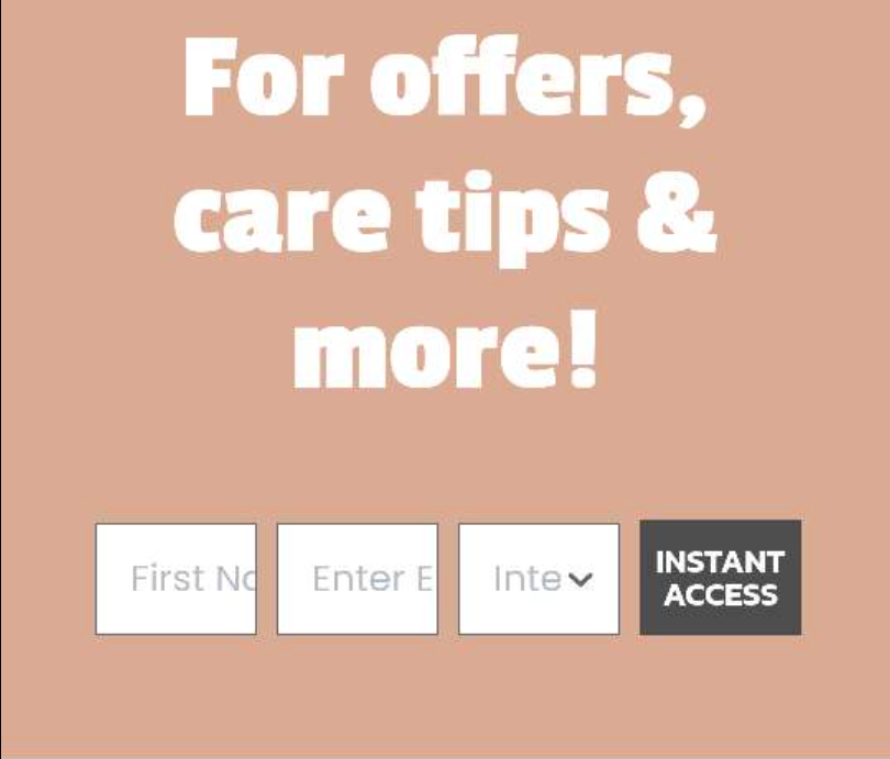
You’re on the right track to create a separate one for mobile and desktop. However, I wouldn’t worry about the placeholder text on your mobile version. I’d focus on the user experience. Have the input boxes side by side on mobile like that would be very hard for the user to fill out. I’d recommend stacking everything.
That will also fix the placeholder text not showing.
If you’re interest drop down is 3 or less choices, I’d consider doing a radio box (but dropdown works too)
Also, I’m not sure what you’re selling on the site, but I think this pop-up could use a better hook/offer for people to give up their email.
Thanks for the reply Manny, you’re right, the design isn’t suited to mobile anyway, I have no idea why I didn’t think of this.
As for the dropdown choices, yes there are only 3, but I prefer a dropdown over a radio box as it looks more consistent.
What might you suggest as a good offer for luxury handbags? The client doesn’t want to give out offers.
Good question @eCommetry.
If the client doesn’t want to give out offers, why does the copy say “Offers, Care Tips and More”. Subscribers might sign up specifically for the offers and be disappointed afterwards (quality > quantity subscribers any day).
I had a look around at other big players in the luxury handbag space. Most already have great brand recognition and didn’t push their email list hard at the outset. However, the trend I did see was to get first access to new products and exclusive events.
However, best way to see what works is to test, test, test :)
I would recommend changing the call to action button from “Instant Access” as well (but I may be wrong, what works for a few brands doesn’t work for all).
Share what your revised sign up form looks like, would love to see it!