Hi everyone,

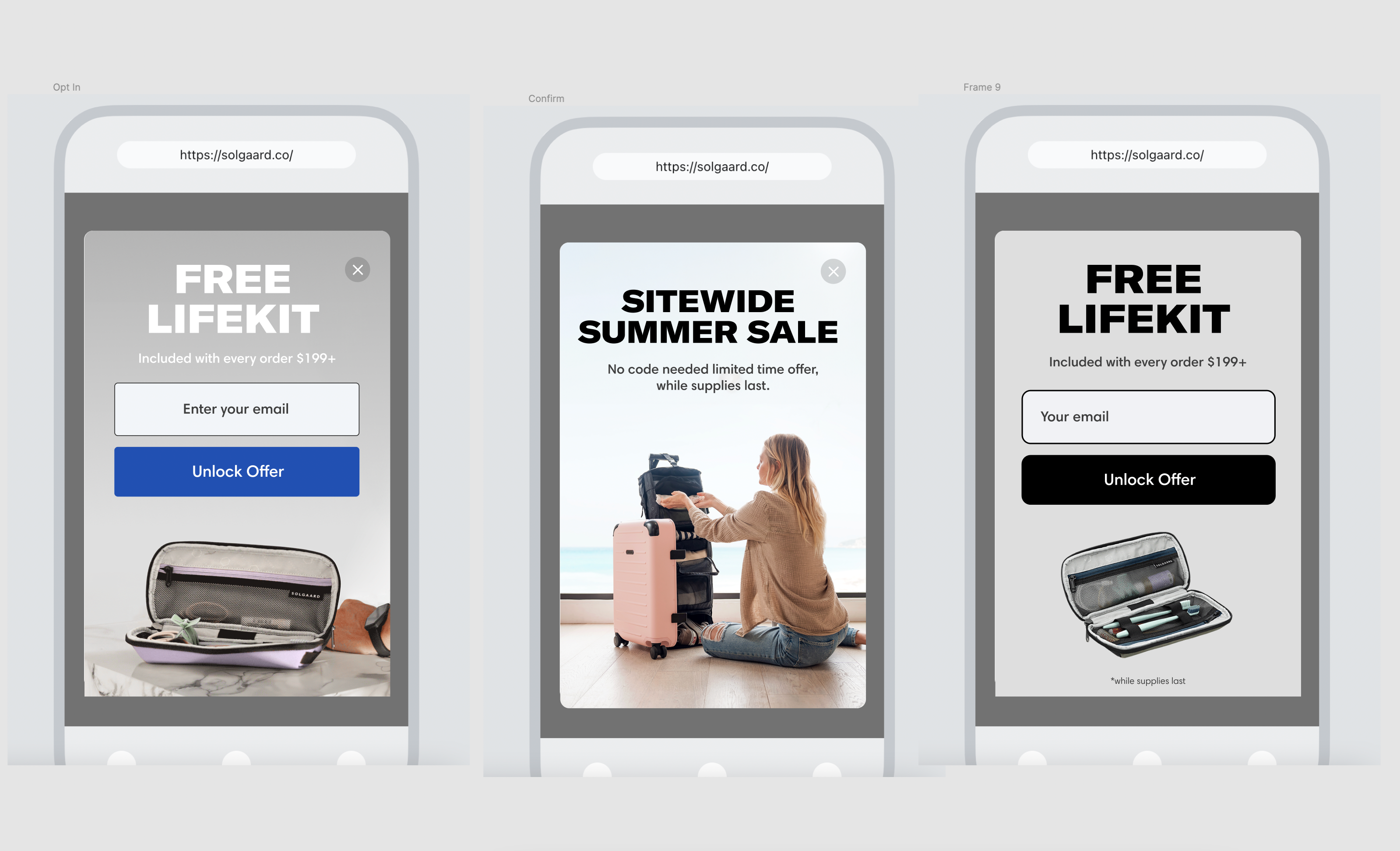
I'm seeking assistance with customizing the popup on our site for an A/B test.

I've attached visuals of our goal, but it seems Klaviyo might not support background images. The only options I'm seeing are Image Left/Right. Am I overlooking something?

Ideally, we'd like the form content and text to appear above the image. Before resorting to our dev team, I wanted to get an opinion from a Klaviyo specialist to potentially save some time.

Thanks!


Hi,

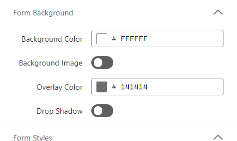
You can add a background image under the ‘styles’ menu when building your signup form:


You just need to toggle it on and then you can upload it.
You may need to play around with padding and transparency to get it to look exactly how you envision, but it’s definitely doable.

L


Hey WildMustardNZ

thanks for the fast reply!

Its working out nicely!

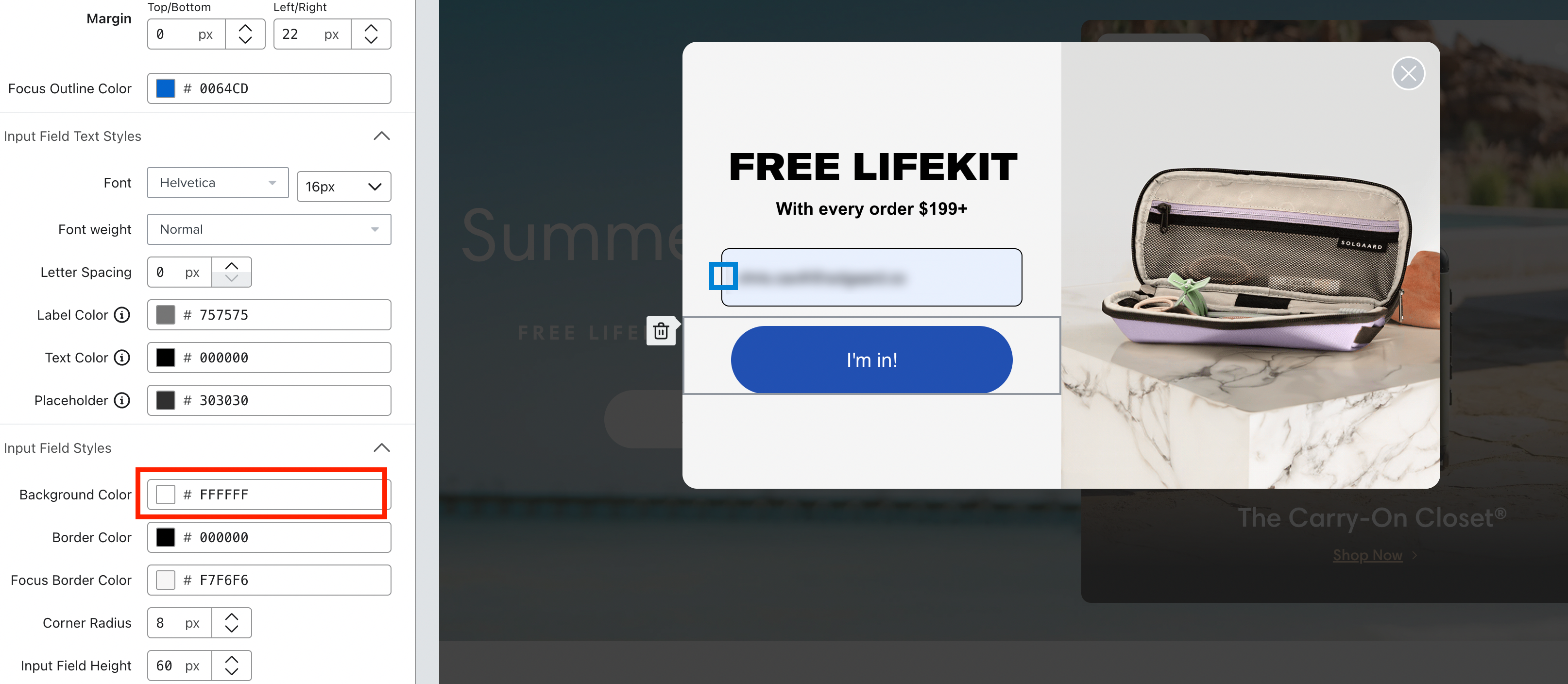
Do you know if we have control of the Input Border Stroke Thickness (highlighted in Blue box)

And For some reason the input field background isnt showing White. Any idea why that is occuring?

Thanks again!


Hey @chriscavill 

I don’t think there is a way to change border thickness here (maybe some custom coding?) and I believe if you publish the form, the input field background colour will be white when blank - it’s just got the blue-ish gray because there is dummy text. Use preview mode to be sure.

Might need a dev to fact check me on this one though!

L


what would be the best size for background images? 


Reply