I’m struggling with styling my embedded form a bit.


I’m looking to achieve a responsive email input field and submit button combination like so:


On desktop:


On mobile:
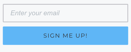
 

It seems that out of the box all form templates are static. So if the template has the email input field and button laid out on one row, they’ll stay on one row disregarding the width of the screen (which results in the e-mail address and/or the placeholder text not fitting the input field on smaller screens). 

Can I achieve the desired effect with the form editor somehow or will this require manual styling?

Hello @Cashimir,

Great question!

At this time Klaviyo signup forms are not dynamic. This means that the way you have it designated within Klaviyo will be the way they appear when published on your site. 

You can certainly achieve the desired effect of having the form rendered differently on both Desktop and Mobile devices by either using CSS on your website or alternatively making two seperate Klaviyo sign up forms; one targeting Desktop devices and one targeting Mobile devices. Using the two form method would allow you better control in how your forms are designed. You can find the device targeting setting from within your form’s Behavior settings under the Devices options.

I’ve also elaborated on this sort of targeting strategy with more resources in a similar Community post which I’ve included below:

Thanks for being a Klaviyo Community Member!

David


Reply