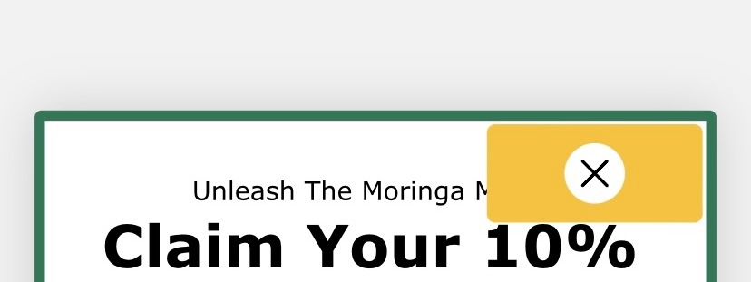
I recently created a signup form and the cross sign at the top right is getting a unneccessary background of yellow color which when I cross checked was not setup while creating the form.
How to remove it?
SS attached!

I recently created a signup form and the cross sign at the top right is getting a unneccessary background of yellow color which when I cross checked was not setup while creating the form.
How to remove it?
SS attached!

Hi
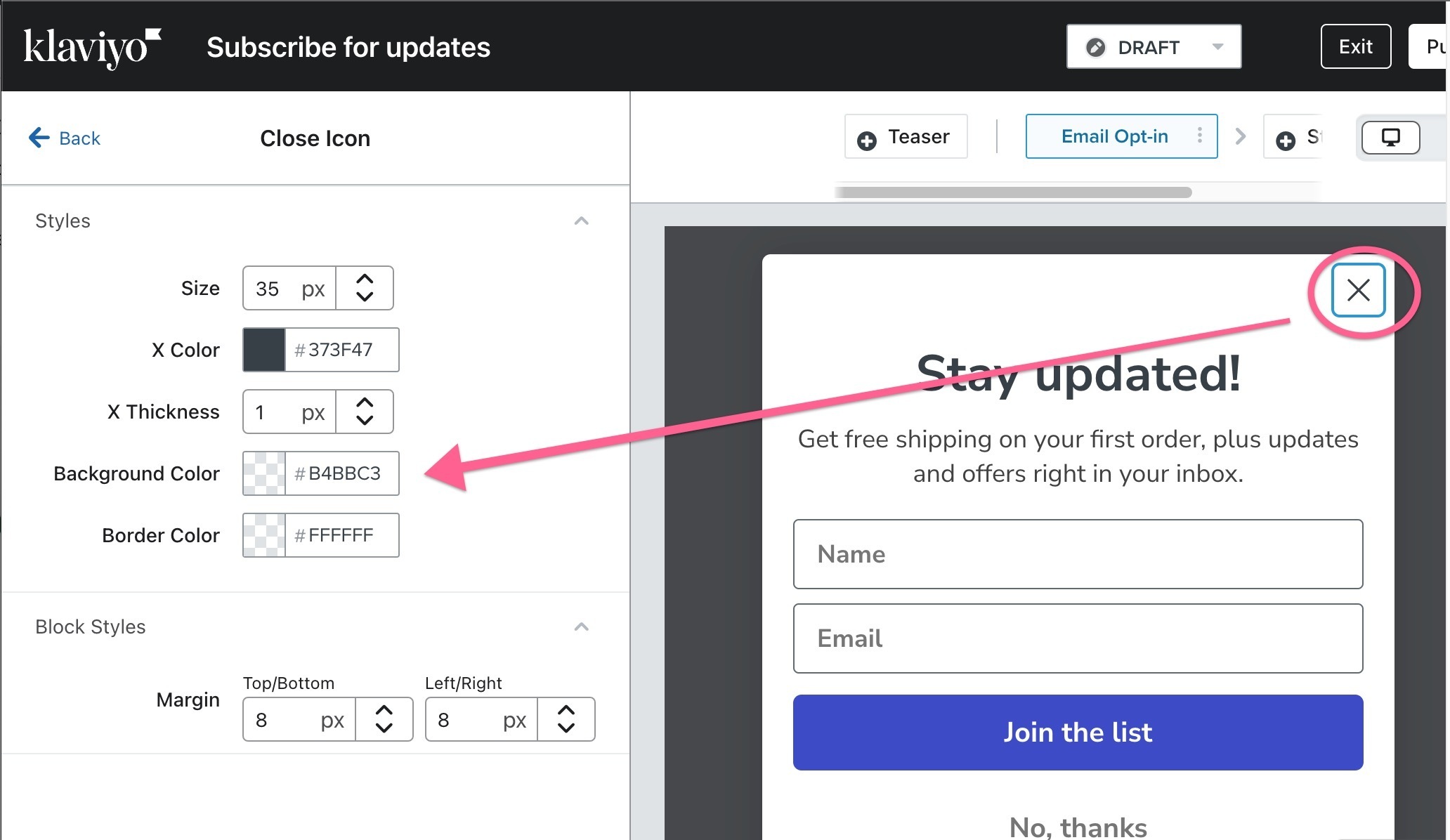
If you click on the “X” in the Signup Form, it will reveal the specific settings and styles for the close “X” button.
It looks like this:

See if you change the “yellow” background or border color to white or another color so it doesn’t show like it does now.
Let me know if that worked.
Hey, thanks for your response!
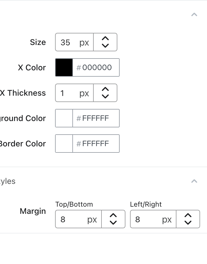
As I mentioned, I already cross-checked this and the background was not set to yellow.
Attaching SS of the same -

Hi
Thanks for your question!
Sorry you’re experiencing this issue!
Whenever your form looks different on your website then in your Klaviyo form builder, this issue could be conflicting CSS styling on your website. I would ask your developer to investigate the backend of your site to see if this is the issue and look for !important tags in your CSS and remove these to rectify the issue.
Thanks for participating in the Community!
-Taylor
Hey
Thank you for your response!
That’s exactly what I was thinking!
You’re right, I’ll convey this message to the website developers to look at it from their end.
Enter your E-mail address. We'll send you an e-mail with instructions to reset your password.