
Why does the signup form display with close button in a focus state?


Forum|alt.badge.img+1
  • Contributor IV
  • 7 replies

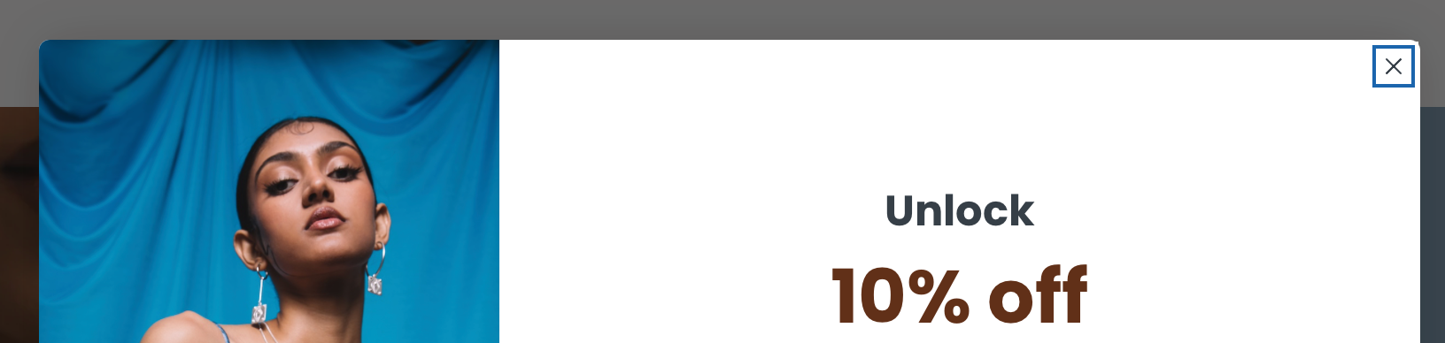
I don’t understand why Klaviyo would do this, since what we want is the user to submit the form and this completely distracts from the primary objective. I’ve looked through settings and tried all sorts of things but have not been able to find a solution.

Have others faced a similar issue? Is it the design template I’m using? Or is this the case with all the templates?

I saw someone else ask the same thing just a few days ago but there were no responses. So I’m thinking maybe it’s just me. What am I doing wrong?


Did this topic or the replies in the thread help you find an answer to your question?

14 replies

liz.hayes
Problem Solver III
Forum|alt.badge.img+5
  • 2025 Champion
  • 9 replies
  • August 14, 2024

Hi @deep, thanks for engaging with the Community! When you’re creating your forms, if you click on the ‘x’ close button it’ll open this design panel on the left that’ll allow you to remove any outline on the button by color matching it to the same hex code background as your form. I’ve included a screenshot below for reference. 

This should make the close button less obvious/noticeable for your customers onsite, but let me know if you have any further questions or you find the above solution doesn’t work for you!


Forum|alt.badge.img+8
  • Problem Solver III
  • 25 replies
  • August 14, 2024

You could do what @liz.hayes proposed and you will get what you were searching for. But this not good UX. If the user wants to close the pop up, this should be easily done. He should not have to search for it. And that small X distracts someone from your message and your main bold CTA, then the problem for sure is not the X button. I suggest you leave the X close button as it is and A/B test your incentives and CTAs.


Forum|alt.badge.img+1
  • Author
  • Contributor IV
  • 7 replies
  • August 14, 2024

Hey @liz.hayes thanks for the directions. I tried matching the color and I tried transparency at 100. Didn’t work.

As I mentioned there was another post a few days ago with the same issue and I can still see this issue on their website https://buysmart.ai

Here’s a screenshot of my current settings and I still see the close button in focus.

My website is https://batoki.art/


Forum|alt.badge.img+8
  • Problem Solver III
  • 25 replies
  • August 14, 2024

@deep your color is white and not transparent.


Forum|alt.badge.img+1
  • Author
  • Contributor IV
  • 7 replies
  • August 14, 2024

@Mail-Marketing thank you for the tips. If you mean I should increase the size of the close action, sure. The current size is just me struggling with various techniques get X not to be main action in focus when the form loads. If anything, for good UX, the focus when the form loads should be on the email input field.

I don’t think having close not be the focus action on load is poor UX in any way as long as its visible and easy to access. Also, I have another close action on the form.

I’ve added my website link above so you can actually see the form in action.


Forum|alt.badge.img+1
  • Author
  • Contributor IV
  • 7 replies
  • August 14, 2024

@Mail-Marketing It was transparent. I was just trying @liz.hayes suggestion to match the color.

Set it back to transparent now. Still no luck.

Edit: Also, it seems to me from your responses that this is not standard Klaviyo practice and is an issue unique to me. Maybe I’ll try building the form again from scratch or try another template and see if the issue persists.


Forum|alt.badge.img+8
  • Problem Solver III
  • 25 replies
  • August 14, 2024

@deep use transparent in all colors. Even in X color. That way the X will not be visible at all. Let me know when this is done. I am curious to see why this is not working.


Forum|alt.badge.img+1
  • Author
  • Contributor IV
  • 7 replies
  • August 14, 2024

@Mail-Marketing  Thanks for helping me out with this!

Done. Still the same issue :(

Edit: Oh, even the X color. Here it is. Even included the screenshot from what shows on the website.


Forum|alt.badge.img+8
  • Problem Solver III
  • 25 replies
  • August 14, 2024
deep wrote:

@Mail-Marketing  Thanks for helping me out with this!

Done. Still the same issue :(


The X color is still black. Set it to transparent and the X will not be visible.


Forum|alt.badge.img+1
  • Author
  • Contributor IV
  • 7 replies
  • August 14, 2024

Done and updated above @Mail-Marketing 


Forum|alt.badge.img+8
  • Problem Solver III
  • 25 replies
  • August 14, 2024

I have done my testing myself and i can see this is not working. Shame. Following also.


Forum|alt.badge.img+1
  • Author
  • Contributor IV
  • 7 replies
  • August 14, 2024

@Mail-Marketing, hmm, interesting.

What I’m trying to figure out is if this is an issue unique to me or a general Klaviyo issue. Do other users not face this issue since there are no other posts about this and the responses I’m getting, I feel like it’s just my implementation.


Forum|alt.badge.img
  • Contributor I
  • 1 reply
  • August 19, 2024

We have the same issue. Has anybody found a solution?


Forum|alt.badge.img+1
  • Author
  • Contributor IV
  • 7 replies
  • September 26, 2024

@Anatta have not visited the thread in a while, maybe you’ve already solved this.

Adding my exprience in case anyone else faces this issue and lands up here. I asked Klaviyo support about this and was told this happens due to theme CSS conflicts and if I continue to face the issue I should find a developer to look into it.

For me, a couple of days after I got their response, I updated my theme and the issue seems to have resolved itself.